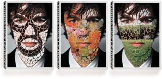
Stefan Sagmeister is an Austrian graphic designer, typographer, and storyteller. He began his design career at the age of 15 when he was writing for “Alphorn”, a small magazine, based in Bregenz, Austria, but quickly realized that he enjoyed working on the layout of the magazine more than writing the articles for it. He received many scholarships and opportunities to grow as a designer throughout his career, and even moved to New York to continue pursuing his design career. In New York, he learned that Tibor Kalman, Sagmeisters biggest and only role models in the design world, was also living in New York, and even had a company (M&Co). Every week for a year and a half, Sagmeister would call the M&Co. He ended up becoming getting to know the receptionist very well. When Sagmeister finally wore Kalman and his receptionist down, they got to meet. It turned out that Sagmeister and M&Co had extremely similar sketches, in concept and execution. The company hired him five years later.
Stefan Sagmeisters work is something that has clearly influenced a very large array of brands when it comes to advertising–especially exercise companies. It isn’t something that’s unnatural though, as his work is typically very bold and unapologetic, which is a message that the majority of companies that specialize in working out want to get across to their customers. All of his work is familiarly unfamiliar in the way that you look at it and say, “I know this person,” or “I knew this would happen,” while simultaneously being able to genuinely say, “I’ve never seen anything like this before”. Stefan Sagmeister is a very surprising and interesting person, because some of his pieces are really just plain weird (I’m thinking of the advertisement that he put out where the flyer was literally carved onto his almost nude body), but they all give you a feeling of childlike happiness and curiosity. His ability to incorporate such unique type with even more unique pictures is something that almost all designers should be influenced by.
