Hi everyone, I want to share the graphics work that I did for the Seventh-day Adventist Church, I really don't know how many have heard about it.
The history
The Seventh-day Adventist Church is part of the Protestant Christian denominations, this church is characterized by the observance of the Sabbath day as the Sabbath and the imminent truth of the second coming of Jesus. Among their common teachings is the Trinity, the Bible as the greatest and only source of truth, and the salvation by grace that is given to us through the sacrifice of Jesus on the cross.
Within the church there are several departments that help her grow and gain more members, including:
Ministry of the Family
We often hear that the family is the basis of society, and this is very true, within the church this is true, if families are in trouble, the church is in trouble. This ministry is responsible for seeing, supporting and strengthening families in discipleship.
Ministry of women
This ministry exists to support, encourage, and challenge Christian women in their journey as disciples of Christ.
A.D.R.A (The Adventist Agency for Development and Health Resources.)
It is responsible for providing a helping hand to the communities that need it most and improving their lifestyle through activities and programs in favor of development.
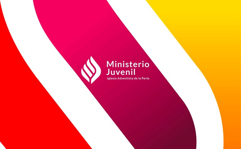
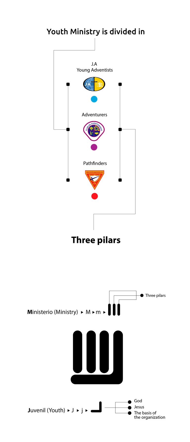
Youth Ministry
This ministry aims to glorify and work for God under the influence of the Holy Spirit, in addition to guiding and enabling each young person to become disciples and share the gospel with others.
This church has many other interesting departments, but I want to focus on the last one since it was with whom I worked. Within this ministry
The challenge
The challenge was to create an attractive visual identity for young people, which would align with the standards already established by the Christian organization. Any badly placed symbol out of context could be frowned upon by older users, who are under the tutelage of youth.
The good thing is that I had a lot of material available in my hand, I could see all the logos they use and I did not lose my way.
As you know in many of my projects for Utopian I like to carry out a previous research, besides making a selection of keywords, this helps me define a concept, after I have that concept, I go for a walk all over the web, first to inspire me, and second not to repeat designs, the truth is a little difficult, it has happened to me that sometimes I have a final design and it turns out that something similar had already been created, the truth is very annoying.
When everything is done and everything seems correct, I start producing sketches with different levels of fidelity, sometimes I make many variants, sometimes not, everything depends on how clear my way is. Sketching will always be the only way to find the correct and balanced way for a logo.

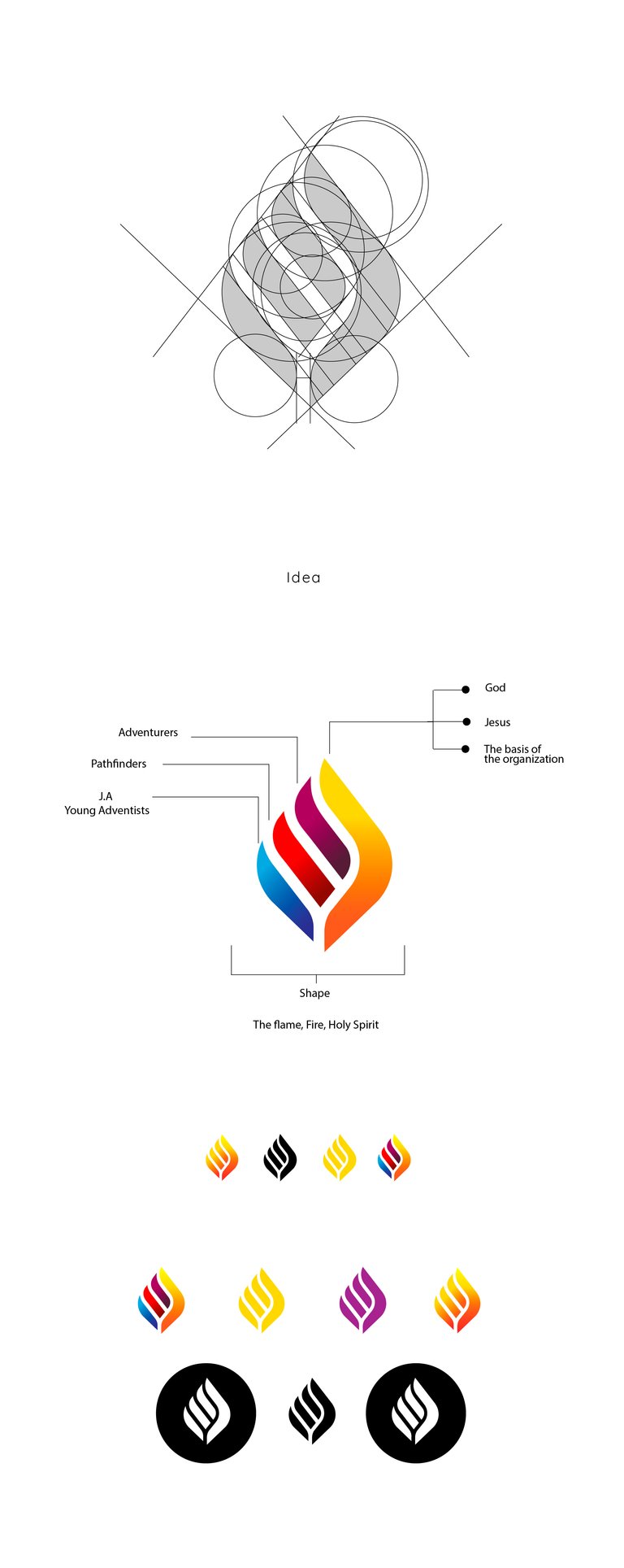
I have to be honest with you, the truth is that the construction of this logo was a little headache, I had to do many tests to get the way I wanted. Normally when you build this type of forms you have to work a lot the visual balance, sometimes being governed only by guidelines is not enough, you must break them a bit.
Typography
Another thing that takes time, you must select one that is in harmony with your logo. In this sense, I chose the font LATO, it has many variants, from HAIRLINE to BLACK, I always try to choose fonts that have at least 4 variants, this indicates that the creator really tried to create them.
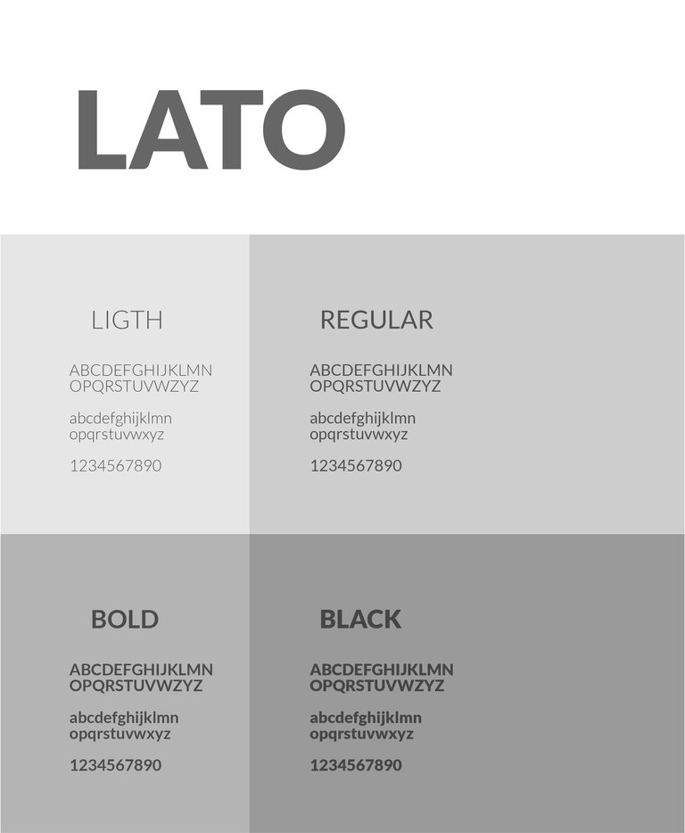
Second the endings of each letter I like and resembles my logo, below you can see what I mean.
The termination is straight at some point and then comes a curve that softens the break.
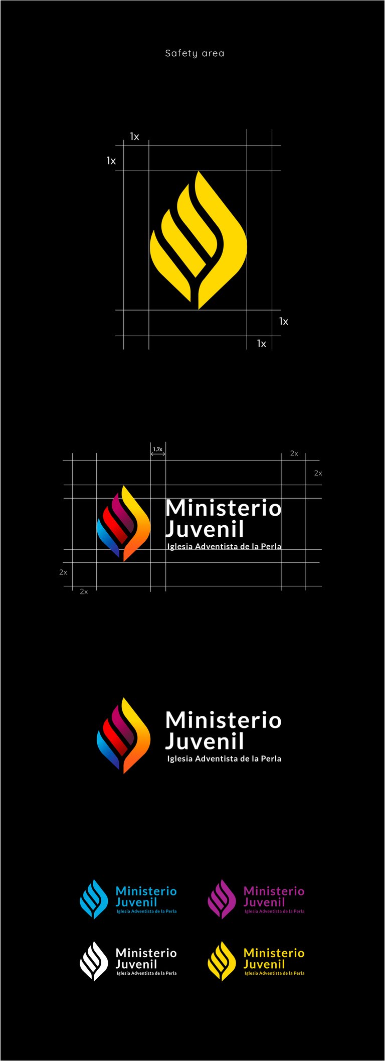
The safety area
Is similar to the space that each person has, in people is about one meter in diameter, any other that crosses our limit we will feel invaded unless it is someone you trust. The same happens in the logos, this area cannot be penetrated by any other brand and guarantees that the logo will be seen among the crowd and nothing will cover it.

Thanks so much for reading
If you want to use and download some of the mockups that I used, click here and it will take you to the resources page.
Congratulations @ggabogarcia! You have completed the following achievement on Steemit and have been rewarded with new badge(s) :
Click on the badge to view your Board of Honor.
If you no longer want to receive notifications, reply to this comment with the word
STOPDo not miss the last post from @steemitboard:
SteemFest³ - SteemitBoard support the Travel Reimbursement Fund.
Another great design!
Posted using Partiko Android
The Creative Crypto is all about art on the blockchain and learning from creatives like you. Looking forward to crossing paths again soon. Steem on!Hello @ggabogarcia, thank you for sharing this creative work! We just stopped by to say that you've been upvoted by the @creativecrypto magazine.