
Gridcoin Branding Update #4
Things have been pretty hectic for this humble designer since the voting-in of the new logo, but here's a quick run-down of what I've been working on since you last heard from me:
- Colours!
- Headers & Themes!
- Icons!
- ...Secrets?
Colours!
The results are in - we're going purple! With the recent "Which colour do you prefer?" poll now having ended, the community has voted for a rather fetching royal purple to represent the 'master' colour for the new Gridcoin logo.
current efforts to rebrand and streamline the gridcoin.us website.This means that you'll start seeing a transition to new colour schemes with purple themes across the board. For instance, check out @cm-steem 's post on the
you can find this here. This will act as an official store for all updated assets in the new colour - chances are if you need something in the future, you'll find it here. I'll be updating this in the coming days to include any new assets I design.For my part, with the help of some members of the community (thanks @barton26!) I have begun work on a Git Repo' for all Gridcoin Marketing materials -
"But what about that cool thing I've seen that's not the right colour or has the old logo!?" I hear you cry - Fear not! Just reply here with an image of the asset you want and I'll be happy to add it to my list of 'assets to migrate' :)
Headers & Themes!
Ahh, headers - helping your Steemit posts stand out amidst a sea of clip-art and misappropriated artwork! I'm now taking suggestions for the kind of headers and artwork you'd like to see make it into the repo' - this will give our community a central store, so you can pick and choose the perfect image for your post! Here's a few examples I've put together recently:
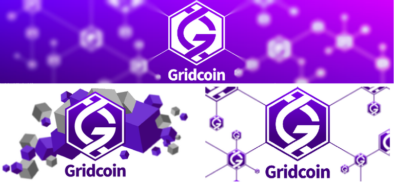
But what would you like to see? Feel free to post suggestions below for me to transform into shiny new headers - quick and rough mock-ups are welcome!
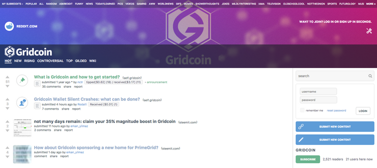
So... What was that you said about themes?
I have also helped re-skin Gridcoin's public presence on a certain other form of social media. This new theme should look and function a little slicker than the old one, as well as integrating the new logo styling. I'll save you a click - here's a quick screenshot!
Icons, icons, icons!
Some time has been spent working on the Gridcoin wallet UI with huppdiwupp on Slack recently - namely providing .svg equivalents to existing low-res .png icons. This means that our high dpi brethren can enjoy a nice looking wallet too - hoorah!
However, this also provided the perfect opportunity to update existing icons to new, shiny equivalents. I can't go into full detail, as these icons may still change, but here's a sneak peek at some of the new transaction icons you could start seeing very soon:
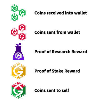
Work is ongoing, so do leave your thoughts on ideas for existing icons or on the examples shown above!
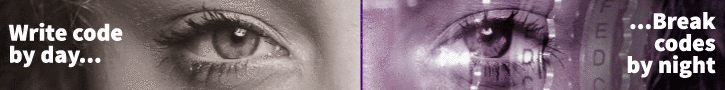
... Secrets?
Have you ever felt like you live a double life? Mild-mannered designer by day - code-cracking, disease-curing, alien-hunting researcher by night?
It occurred to me a few nights ago that we all exist in an odd kind of duality, with the work our computers do in their down time often contrasting our 'regular' day jobs. This idea led me to develop the beginnings of a new advertising campaign for Gridcoin focusing on our 'secret identities'.
What do I mean? Well - let me show you a mock-up:

Secret Identities - Example 1
Although still in its early stages, I see this idea as a creative way to capture the imagination of would-be newcomers to Gridcoin - a way of distilling the essence of 'what it's all about' into a simple banner. I've heard so many stories of what first got people into Gridcoin / BOINC - and more often than not it boils down to "Wait... You mean I can help scientific research while I sleep? Sweet!"
That is, of course, a gross over-generalisation - but I believe that an ad' campaign focusing on this simple idea of our 'dual identities' could bring in a whole generation of newcomers. My proposal is to develop four simple single-word groups that all of our whitelisted projects can be grouped into and build an advert for each - my suggestions are:
- Discover - Discover alien signals, new prime numbers and pulsars
- Decode - Crack ENIGMA codes or help test encryption security
- Explore - Map the universe, track asteroids, explore particle accelerator data and more
- Cure - Contribute to important medical and scientific research - fold proteins, help cure diseases
Clicking one of these adverts out in the wild will link back to a simple landing page that asks the individual "What do you want to do...?"- presenting them with the four themes. Choosing one of these themes will expand into the list of current projects - allowing the user to choose their project (or projects!) and help them adopt their new secret identity (i.e. get started with BOINC and Gridcoin...!)
.gif)
Secret Identities - Example 2
I look forward to developing this idea further in tandem with the community, so do leave your thoughts on the basic premise and mock-ups shown above!
Thanks for reading!
As you can see, it's been a busy few weeks! I have plenty left to work on, so shall be back to update you with my progress in the coming weeks. I look forward to reading your feedback and developing new, exciting designs in tandem with this amazing community!
Catch you next time!
-- Josh
You can donate GRC to this address to support my ever-growing caffeine addiction :)
S4mJngSgfTyGEUsmTaFGNmr6GFJGCRLXvH
Ive been watching this coin. Might be time for me to pull the trigger!!
Yes, now is the time. It is undervalued compared to other distributed computing coins like Golem and SONM that don't even have working systems yet.
I love them. My favourite header is the down right, I like the way it shows that Gridcoin is a network.
The secret identities are great for targeting an specific audience. For example explore for an astronomic website or cure for a medical website. I will change the message for the decode identity, I think break codes has a negative meesage, I would change it for something like verify encryption.
Thanks @ropaga! I like that header too - I have a few designs following that theme that I'll push out for community use so you should see those popping up on Steemit soon :)
You're right - they're a great way to target a specific audience! I like the ideas you've put forward - I'll reconsider 'break codes' too, I just quite liked the play between "write code / break codes" :)
Oh Well this is stunning work my dear ! Especially the ads I really fell in love with them and will use them as soon as possible. Kinda love the idea and since am I coder by day I feel very much intrigued by this one specific ad. Thanks alot ! You ll get my full 100 percent vote ( worth exactly 0.01 and a beer if we ever happen to cross paths ) ;)
Why thank you! Glad you like the idea - I look forward to developing it further and seeing how it tests. Your 100% vote is much appreciated - I'll take you up on the offer of that beer should be cross paths in the future :)
Great work, I like the new transaction ikons.
On the PoS reward one, could you make it look like the % symbol with two small GRC symbols replacing the 0s, sorta like
Except , y'know, done by someone with talent...
And the send to self again the small symbol with a circular arrow sorta like
Just suggestions, Im sure you guys know best.
Nice idea! I might give that a shot and see how it looks. The self-transaction really bugged me - tough to think of any way to display that. Let me have a play with the ideas you've presented and we'll see what I end up with :)
You did such a nice thing with the Research ikon making it intuitive, it seemed good to try something similar with the others
IMO, using the logos in these icons is overdoing it. I would like the logo to exist at the top of the wallet as it does now and in the tray etc but not as part of the transaction icons.
Or maybe it's just because its in all of the TX icons.
Very true - it is a bit much to be in every icon! I suppose I went down that path since that's how the wallet currently does it - a version of the old logo is used for every form of transaction, so I thought I should be true to that design choice. I am, of course, more than happy to work up alternate versions excluding the logo should that be preferable :)
Yeah maybe you are right, it should look good thats the #1 point
Love the new logo!
I will have to check out the site. Back in the day, I ran various programs 24/7. Mostly focused on health issues, like the defunct findadrug.
It is so nice to see that people can be compensated for this work now!
I think I've been running some iteration of BOINC since about 1999 - that old SETI screensaver really captured my imagination! You should definitely check out the current scene - there's plenty of interesting projects you can contribute to and the Gridcoin you'll earn for doing so are a great extra reward :)
I started around that time, also.
Folding@home was my main project. Wish I could collect on that. Lol!
I'm sorry I stopped but my computers were not good enough to be worthwhile.
I am sure you will be seeing a lot of me soon!
Great!! Look more interactive!!! The iconic. The more cute the interface that it have, the more people like to see and eagerly to know. Well done
Superb work. Thanks a lot! Massive improvement!
The secret Identities are awesome. I bet we can grab a lot attention by using them for advertisement
Hope so! I'll be testing them alongside some more traditional banner ad's, so we can easily track their performance all thanks to Google's analytics :)
Thanks for the detailed update and all your hard work on making Gridcoin standout from the crowd.
The new logo with the blocks looks great. I also like where you are going with the banners and if I saw that banner ad I would be tempted to click on it :-)
For the icons can I suggest incorporating arrows into the send and receive similar to Bitcoin core. I also think the research reward icon would look better without the logo in the middle.
Keep up the great work :-)
Thanks @bullshark!
I'll certainly work arrows into those icons to see how they fit, or perhaps reconsider their design and create something similar to the Bitcoin Core screenshot you shared over on Slack - thanks for that! I also have an alternative version of the PoR icon without the logo - in fact, I have variants of that icon in just about every shape flask you could imagine too, haha. Gotta love a good Erlenmeyer flask though ;)
Anyway, I digress - the real beauty of switching over to .svg icons is in their adaptability - they're easy to replace and easy to re-colour, so it becomes very simple to tweak the designs going forwards should we need to :)
Vectors are great.
The secret identities thing is a really great idea!
Nice job, Secret Identities is a great idea and well done banners!
On the other hand, head banner on 'a certain other form of social media' ;) feels too heavy. I'm also not a fun of overusing colour gradients, especially in logos. Gradients make it more difficult to keep visual consistency. For example sign shops may have problems with prints. Flat designs can be also cut in self adhesive foil / film, what is also much cheaper. Gradients may also cause major differences in how design is displayed on different screens and in different lighting environments.
Overall good job!
Thanks for the detailed feedback!
Couldn't agree with you more on the gradients, honestly. All of my original designs used flat colour, as that is my preference, but this was pushed in the current direction through collaboration (and compromise, I suppose!) with the wider requests of the community.
Ultimately - I very much imagine we'll see single colours used in some applications and I have colour codes for that eventuality :).
Good work on the updated stuff.
I STILL think we need to hit reddit and youtube gaming and music production channels HARD. That means reddit advertisements for the subreddit; those seem to be in a box shape on the right side of the screen.
Youtube gaming and music production stuff could use the secret identity theme ("MLG by day... ...GRC by night", with someone wearing headphones or something more clever than that... also, we should try to hit high end Mac users and the like who would be doing music production "make beats by day... ...beat cancer by night"), plus who knows what else.
I don't really have any other specific campaign ideas, but I feel like with the brainpower of the community, a good brainstorming session would keep you busy for the next decade with great ideas.
Nice branding! Gridcoin is lucky to have you working with them!
It would be great to see you at our steemit meet up on 16th September in Birmingham!
If you can make it, there will be a free steemit t-shirt for you, live music from @branhmusic and 150 pounds behind the bar,
Please see link for more details! https://steemit.com/meet-up/@starkerz/promo-uk-steemit-meet-up-everyone-welcome-from-far-and-wide-come-see-the-steemit-laser
all this creative hard work makes me really proud to be part of this community. very well done!
Great logo and icon design, the purple colour is not my favorite though (preffered the green variant) but it's far better than it was before.
Absolutely love the work you guys on the branding team have put in. The "Secret Identities" campaign is absolutely brilliant.
Trade Stocks by Day...
...Cure Cancer by Night.
Thanks @trikkstar! Glad to hear you like it :)
Ooh I like that one.. Might have to steal that for the next ad' I develop ;)
No problem. And go for it, I try and contribute where I can.
Another one to consider:
Fight Crime by Day...
...Battle AIDS by Night
wow that does look awesome !
I like this design, really
Cool re-branding!
It's nice, BUT I need to say that I prefer previous version and I hope it will remain.
I'm only small GRC miner with 15 GRC so you can ignore my opinion, but I felt I need to say it
Cheers for the feedback @flodner :)
I do appreciate the intentions of the old logo - it's not a bad piece of artwork! Its issue was that, despite being a nice piece of artwork, it did not perform its job as a logo. I went into depth about these difficulties back in Branding Update #1 if you'd like to have a read :)
Thanks, I will read, just wanted to say in case in future you might return to it, or may be will use it along with new branding
Congratulations @joshoeah! You have completed some achievement on Steemit and have been rewarded with new badge(s) :
Click on any badge to view your own Board of Honor on SteemitBoard.
For more information about SteemitBoard, click here
If you no longer want to receive notifications, reply to this comment with the word
STOPHoly late auto-reply, Batman!