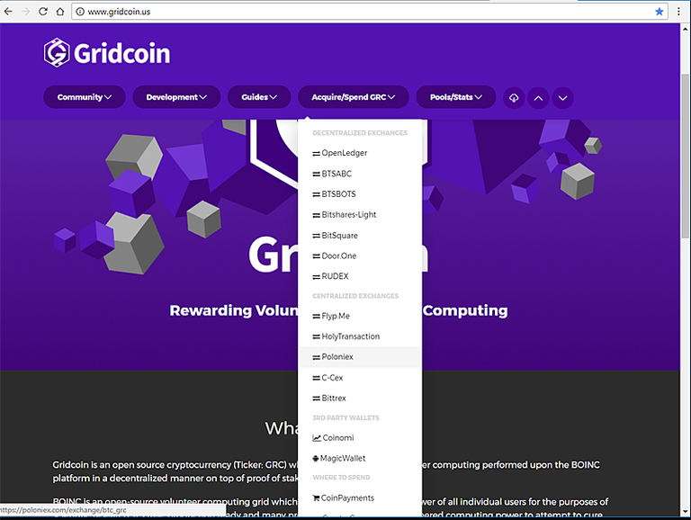
Looking good. Each update is a improvement. I like the cubes behind the logo on the home page and the adjusted color is definitely easier on the eyes - looks nice. The one thing I noticed with the menu updates is since they do not scroll up with the page (top header menu position is fixed) depending on the user's screen the bottom menu items are not accessible.

Thanks for pointing this out, I've split this column into two drop downs now.
That's perfect now :-)