Hello, Pilots!
The "Planet" phase of the Colonization Challenge has just dropped and testers can now access it through their Colonization Pass!
📰News:
Planetary Screen
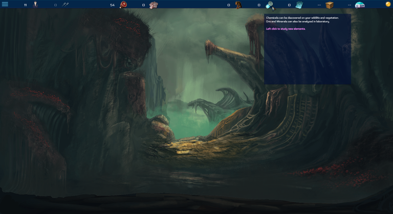
The above is a screenshot of how the Planetary screen looks right now. At the top there are different toolbars which we will go through from left to right.
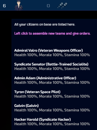
First toolbar is Crew, which lists your total crew at the top then each member with their individual stats when moused over.

Second toolbar is citizens, of which I have 0 right now. Don't think it is implemented properly yet. Will likely be added in a later update.
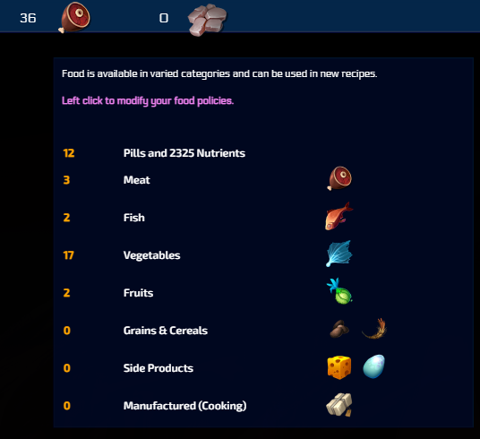
Third toolbar is Food, which has your total number of food at the top and a breakdown of specific items when you mouse over it.
According to @elindos:
"Your generic food is made of 12 units from your ship cantina.
It may have received other food units from your away teams in Step 1.
These food units are made of non relevant wildlife and vegetation.
All relevant wildlife and vegetation are NOT YET included in this total (they await laboratory analysis)
You will receive food units of different profiles, with meat, fish, fruits and vegetables and others, all being separate.
This profile may depend on your planet type."
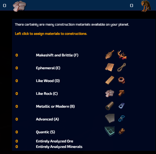
Fourth toolbar is Materials, same as food however I do not have any of these just yet. Assume they will be added in a later update.
According to @elindos:
"Materials should start at 0.
It may have received other material units from your away teams in Step 1.
All relevant ore and minerals are NOT YET included in this total (they await laboratory analysis)
A rarity roll is made for every materials unit you have.
1% of your found materials will be of type S (quantic)
3% chance to be of type A (metallic or modern)
6% chance to be of type B
10% chance to be of type C
15% chance to be of type D
21% chance to be of type E
44% chance to be of type µF
All these units will also be marked with the "generic" type, meaning they are less useful than ore you will identity.
Important:
You will later receive options to "scrap parts" from your ship and generate more metallic and modern parts by scraping some modules and armor."

Fifth toolbar is Captive Wildlife, likely for researching/raising/experimenting on animals. Again will be added in a later update.
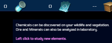
Sixth toolbar is Chemicals, which are the components of wildlife and vegetation. Will be added in a later update.
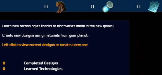
Seventh toolbar is Technologies/Designs. Assume anything you find or make yourself will show up here so you can recreate it. Will be added in a later update.

Eighth toolbar is Storage. This shows you all of your items. Will be added in a later update.

Ninth toolbar is Prefabs/Buildings, which I assume will show you the amount of buildings your colony currently has and their condition. Will be added in a later update.
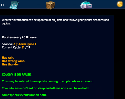
Tenth/Last toolbar is Weather, which has already been added. It shows the details about your planet's weather cycle(s) and what danger is currently active due to the weather conditions. Colonies are "On Pause" for now, however that will change when the Colonization phase is released. Your planet's weather and rotation data has already been generated.
🎁Giveaway:
This week, 3 different people have a chance of winning:
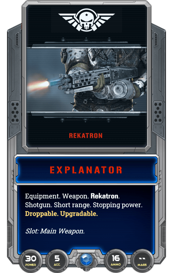
1x Explanator
I usually have 1 or 2 people equipped with an EXPLANATOR instead of a Rekatron SD, as a couple of shotguns can put down a threat faster than any other firearm. However, the low accuracy and short range makes it much better to have them as the exception rather than the rule. If you have nothing else though, there's nothing wrong with using all shotguns! I just know I wouldn't want everyone to have to get that close to the aliens.
🎉Previous Winners:
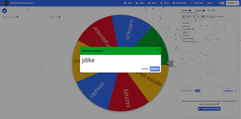
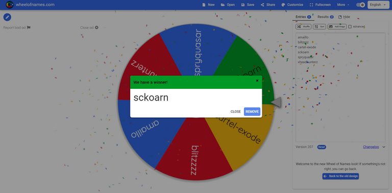
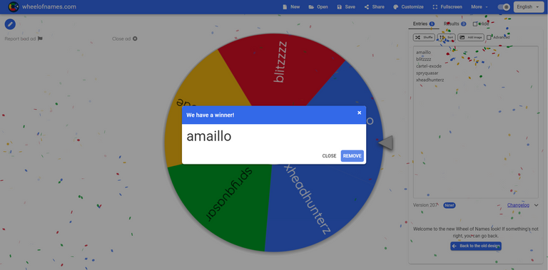
Congratulations @jdike, @sckoarn, and @amaillo. You have been sent Defensive Ammo # 00652c49ba4bda84a633864e0adcf898, # 7e3612103c51bd0fb0851da3e485ddf0, and # 7c0bdf7e0decc0ec844ec448dd0528b9 respectively.
➡️How To Enter:
- Upvote this post
- Reblog this post
- Comment what you think of the Planetary UI
The winner will be chosen by random on Monday, May 16.
As usual, I will be tipping comments with #hivepizza!
EXODE is a real-time strategy space colonization game here on the Hive Blockchain. If you still have not bought your starter pack and signed up, use this Referral Code(c956af8) and you'll also receive 2 free Alpha Booster Packs with 5 NFT cards each and a free Epic Alpha Character. For more information and links, check out the developer's page, @elindos and this post by 🍉 [MELN] Head Scientist @proto26.
nice looking UI but when I try test my planet get black screen.
Had that happen to me as well. Will be fixed later I assume.
!PIZZA
I like the new UI, it has all that was on the old interface nicely laid out. Really snappy response as well, the pop down items are there in an instant, nice list of new info for sure. The picture gives away nice things on my planet:
If you look close there are nice yellow gems imbedded in the rocks. :)
I agree! Very good UI that isn't needlessly complicated.
!PIZZA
Amazing Game
I agree.
!PIZZA
Thanks!
@listik303
You're welcome.
!PIZZA
It is always exciting to see updated and expanded game play elements. The Planetary UI is right in line with the vibe of what I've seen so far. I like it!
One thing I hadn't considered when thinking about what gameplay might be like planet side, was food. Of course our colonists will need to eat, but when I thought of planet side activities I thought of building, growing, and defending the colony. Which just goes to show me that there is a whole lot more to consider when it comes to planetary activities.
For sure. Lot's of stuff that EXODE delves into!
!PIZZA
The planetary UI is awesome! We finally get to see a landscape of our planets! Plus all the hints at how we can further refine our raw planetary materials/food is exciting. Despite displaying a lot of information, it seems simple enough to understand, too. It won't be much longer now.
I am very excited as well.
!PIZZA
Wow, multi winners just started and I am already one of them! Thanks! !PIZZA
I really like the planetary UI, but tbh I find the icons have a different kind of style than before. While the images before all had some kind of "Alien the movie"-look, the new planetary UI ressoure icons have more of a comic-style look. But it looks more modern!
Fair enough, I prefer the new UI myself. Old one is too complicated and not graphical enough.
!PIZZA
Cool! A question I can answer! Right now, it's a still image, music, and the menu bar—unless I am mistaken. I like the art style. I like the music. It has potential and I am eager to see it develop more.
Please include me in the giveaway. And thanks as always. Reblogged and upvoted.
Good luck, all.
Glad to hear it.
!PIZZA
The UI looks nice and neat. It isn't cluttered (which is good). Plus points for the colour theme too. Would be quite a turnoff if it was too gaudy and didn't fit the scifi "serious" vibes of the game.
Definitely agree with what you said.
!PIZZA
The Planetary UI is looking really great, I am looking forward to play it! It manages to show a lot of complexity in an easy and fast way (compare the process of viewing the crew in they previous pre alpha step with this one).
Very true. Much easier which is always good.
!PIZZA
Thank you
!PIZZA
!LOLZ
!CTP
I like the UI, is it specially useful the part that says you the HP, and morale of your team
IGN: @amaillo
!Gif dancing-8bits
Via Tenor
You're welcome.
!PIZZA
oh really that's awesome
EXODE is awesome!
!PIZZA
PIZZA Holders sent $PIZZA tips in this post's comments:
birdbeaksd tipped listik303 (x1)
amaillo tipped birdbeaksd (x1)
birdbeaksd tipped blitzzzz (x1)
birdbeaksd tipped jdike (x1)
birdbeaksd tipped cartel-exode (x1)
jdike tipped birdbeaksd (x1)
birdbeaksd tipped sckoarn (x1)
birdbeaksd tipped eyebroo (x1)
birdbeaksd tipped amaillo (x1)
birdbeaksd tipped shinyobjects (x1)
birdbeaksd tipped taradraz1 (x1)
birdbeaksd tipped kobusu (x1)
@birdbeaksd(12/20) tipped @banya72 (x1)
birdbeaksd tipped tinyputerboy (x1)
Join us in Discord!