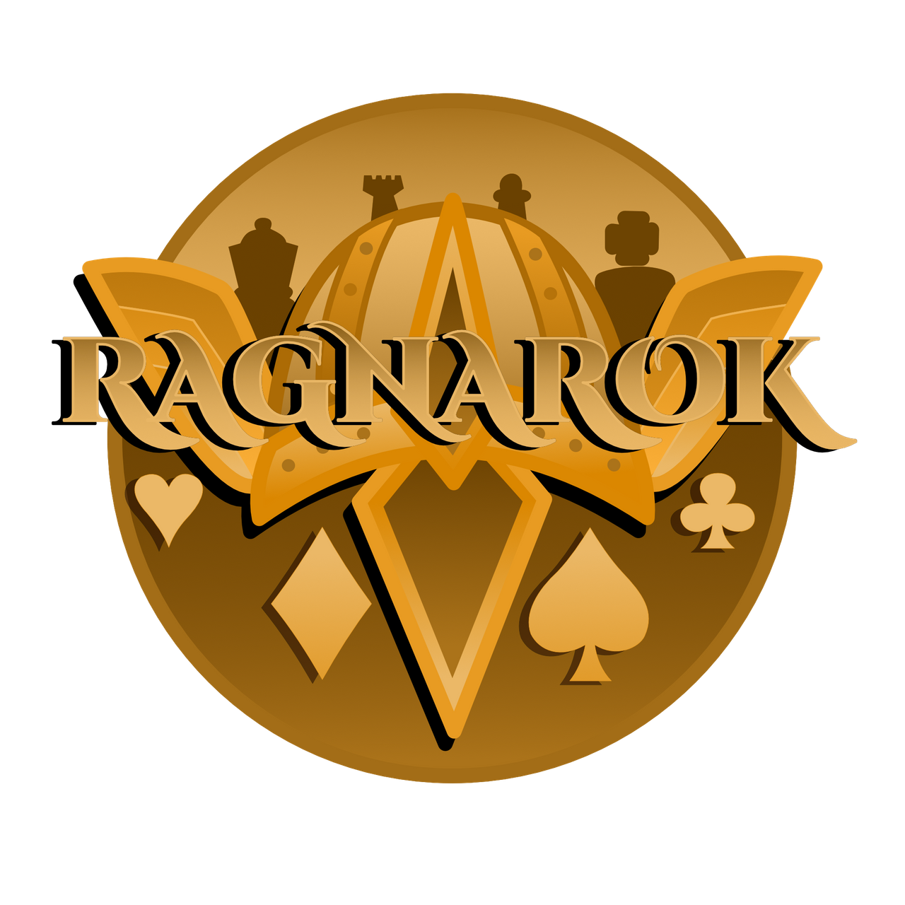
my favorite was @grisvisa , she's included all the games elements of Poker , Chess and Battle (with the war helmet) . Also, nice color choice choosing a Golden color scheme giving it a Royal feel. Lot's of great entries and I'm really impressed with a lot of the designs. But if I had to pick one this would be it. It was also great to see her process and progression with the 3Speak video she included.

nah its a little too girly.. needs to be more hardcore