Stock charts are a specific chart used to track the changes in price of traded assets. Assets such commodities, stocks and cryptocurrencies. They allow you see high and low values over time, along with opening and closing values in the one chart. Excel offers 4 stock charts and to use these, you must have the right sets of data available and you must select the columns in the right order.
The below set of data shows the daily trading information for Bitcoin. We are going to use this data to create each of the 4 stock charts available in excel. You can copy and paste this data into a spreadsheet and follow along with the article.
| Date | Volume | Open | High | Low | Close |
| 13/05/2020 | 45,558,144,023 | 8,805.39 | 9,317.88 | 8,805.39 | 9,269.99 |
| 12/05/2020 | 42,142,717,533 | 8,610.39 | 8,949.90 | 8,569.64 | 8,804.48 |
| 11/05/2020 | 57,119,858,802 | 8,755.54 | 9,033.47 | 8,374.32 | 8,601.80 |
| 10/05/2020 | 63,325,279,337 | 9,591.17 | 9,595.58 | 8,395.11 | 8,756.43 |
| 09/05/2020 | 46,566,121,841 | 9,840.91 | 9,913.86 | 9,580.64 | 9,593.90 |
| 08/05/2020 | 51,780,748,042 | 9,936.16 | 9,996.74 | 9,767.17 | 9,842.67 |
| 07/05/2020 | 61,112,700,562 | 9,261.90 | 9,992.66 | 9,138.32 | 9,951.52 |
| 06/05/2020 | 49,371,886,931 | 9,007.44 | 9,411.47 | 8,966.71 | 9,268.76 |
| 05/05/2020 | 43,148,462,663 | 8,912.83 | 9,062.41 | 8,856.83 | 9,003.07 |
| 04/05/2020 | 45,718,796,276 | 8,895.74 | 8,956.91 | 8,645.02 | 8,912.65 |
| 03/05/2020 | 47,101,785,174 | 8,983.61 | 9,167.78 | 8,830.97 | 8,897.47 |
| 02/05/2020 | 40,134,388,683 | 8,869.06 | 9,007.19 | 8,811.37 | 8,988.60 |
| 01/05/2020 | 44,068,389,997 | 8,672.78 | 9,048.02 | 8,667.76 | 8,864.77 |
Watch related video on YouTube Now
High Low Close (HLC stock charts in Excel)
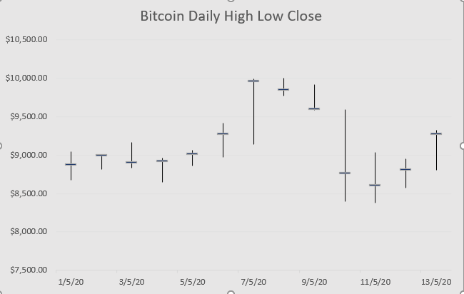
The title of each of the stock charts in Excel tell us in the name, what exactly it is the chart will show. The first chart we are going to look at is the High Low Close chart. As you can probably guess, this chart will show the daily high, daily low and the daily close price over time in our chart. Therefore, you must have these 3 series of data available for each of the date.Although the data we have is daily, traders often use minute or hourly charts, some would use weekly or monthly stock charts.
To insert a High Low Close stock chart in Excel first select the 3 correct series of data and the date column as shown.
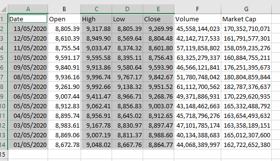
A nifty trick selecting data like this is first to select larger set of data, then pressing CTRL and holding down the left mouse, select the date column. Once you have selected the data, from the Insert Ribbon and the chart group of commands, select the Waterfall drop down. The stock charts are the third set down. The first of the stock charts is the High Low Close Chart.
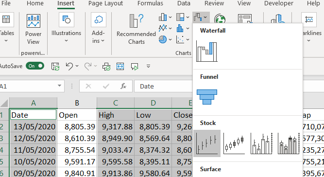
When the chart is inserted to the worksheet, it will need a little formatting.
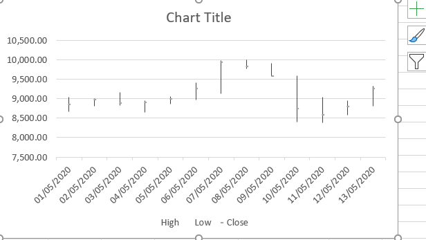
To change the Chart title, we can select the text in the title box and just over type it with the title we want to give the chart


To improve the visibility of the Close price on the chart we will select these data points on the chart, and select format data series.
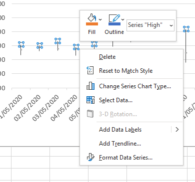
From our Format Data Series options, select market and change the type and colour that will stand out a little more

Other formatting options would include improving the formatting of the X and Y axis
Opening High Low Close (OHLC Stock Chart)
Creating the Opening High Low Close Stock chart in Excel is very similar to creating the High Low Close chart. It is important that you have the data in your table set up in the order of Opening, High, Low and Close.
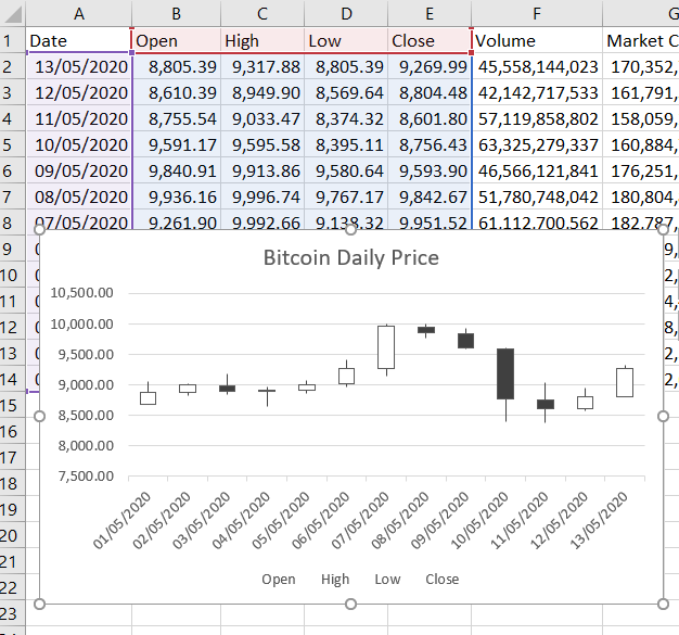
First select the required columns, then from the Insert Ribbon and the chart group of commands, select the Waterfall drop down. The stock charts are the third set down. The second of the stock charts is the Open High Low Close Chart.
This chart is very like a box and whisker chart. The box represents the opening and close prices, the box will be transparent if the price closed higher than the opening and it will be black if the price closed below the opening. The whiskers show the high and the low price for the day.
You will note the chart comes with a legend. However, this legend does not make much sense using the default colour scheme and can easily be deleted. To delete the legend, select it and press delete.
Both the up bars and the down bars can be formatted separately. To do this, select the up bars and select Format Data Series.
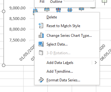
The colour and transparency can be changed from the Fill options.
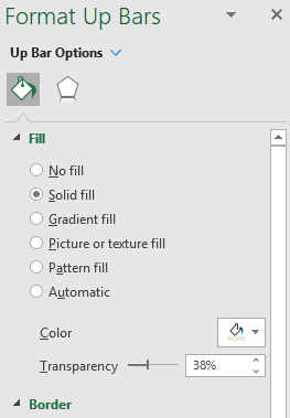
Having the ability to change both the up and down bars means you can really customize how these bars appear
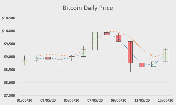
Trend lines can also be added to the chart. As we have 4 data points, we can independently select any of these and create a trend line based on the data point values.
To add a trend line, select the data points on the chart and right click. Select Add Trend line.
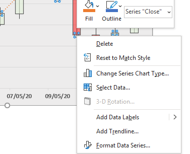
.
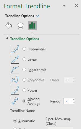
In the chart shown above, we have used the Moving Average trend line based on 2 periods. This is the 2 day moving average of the selected data point.
Volume High Low Close (VHLC Stock chart in Excel)
The third stock chart we will look at is the Volume High Low Close chart. Again it is important to repeat that you must have the data in the correct order. If you need to rearrange your data table, you should do it before you set up your chart.
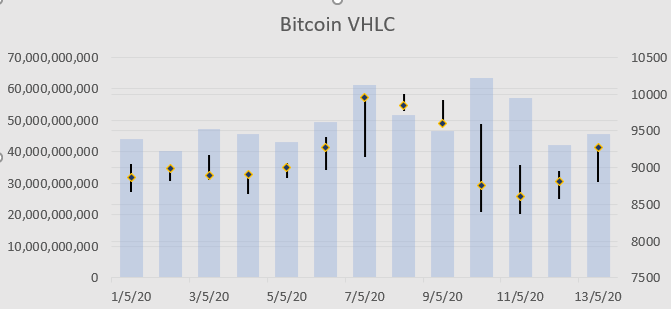
Select the required columns and follow the steps above to insert the stock chart. This time select the third of the stock charts. This is the Volume High Low Close chart.
The blue column bars represent the daily volume. The left axis displays the volume scale. Then the lines represent the High Low and Close. The right axis displays the price scale.
This chart could also do with some formatting. The left axis takes ups a lot of space. We can use formatting to display these values in Billions. Select the left axis, right click and select Format Axis. In the Axis options select Billions from the Display units’ option
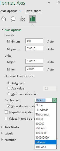
By selecting the right axis, under Axis options at the bottom is the options to change the number format. This can be used to display the values as currency
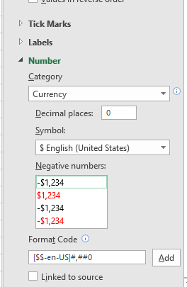
Other formatting options include the fill colour on the entire chart area and the ability to add trend lines.

Scenario – Stock charts in Excel
Now its your turn to create a stock chat in Excel.
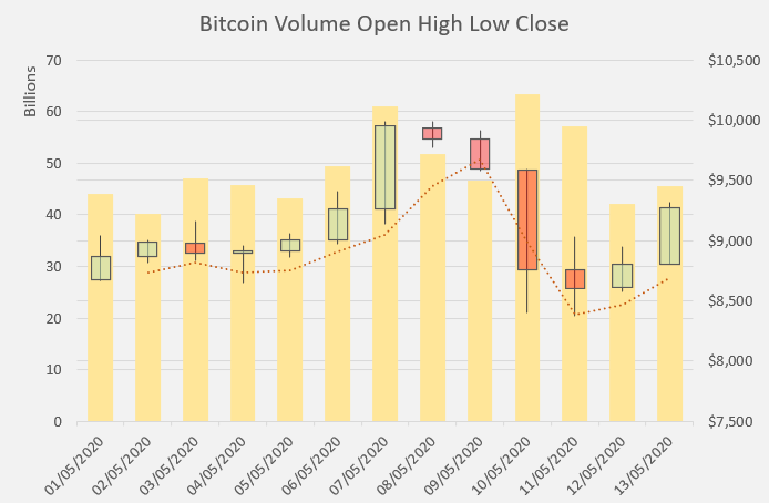
The below chart is the fourth and final type of stock chart available in Excel. Its shows the Volume, Open, High, low and close prices. Can you recreate this chart? Share with the community in the comments below 3 formatting changes you make to receive a similar look to the chart below.
Cross posted from my blog with SteemPress : https://theexcelclub.com/how-to-create-stock-charts-in-excel/
That was actually pretty informative for me. I don't have the excel program, but I have been using LibreOffice, and while it may not have all the tools, such as trend lines for the stock charts yet, I still learned a bit. It was funny to see the post today, as just a couple days ago I was scrolling back and looking to see what chart options since I was just starting to play with the charts in Libre.
Ashers pie charts really got me going today, so I have my first two charts. First my May earnings chart:
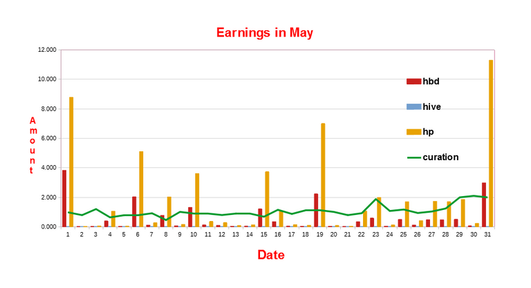 I found that to be a little bit hard to read, so I tried a pie chart, prior to making my pie chart I looked in the market to conver all my HBD's that were earned into Hive, so that it would be more representative of my earnings:
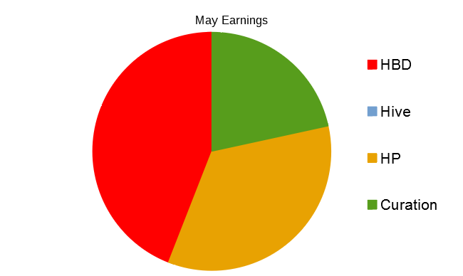
A little bit more work and I might figure out how to get amounts shown in the sections. I could not find a tool for doing like Asher and having the little boxes with percentages, that would have been a nice way to show the actual amounts.
I am learning, thanks for the free help vids and post.
well done you. Your pie chart is nice and round :-)
Although with Libre I do not know how to add amounts to the sections. In Excel you would use the option to add data labels. You can get a free trial version of Excel here https://www.microsoft.com/en-ie/microsoft-365/excel
About an hour or two after replying, I found the data labels, and percentage, so I was pretty happy to learn that, I haven't found how to move the labels but do know how to change them. So On my Friday Progress report post I am going to have the full blown pie with label toppings. ;-}.
way cool. Where are you grabbing the data from? are you manually keeping track or using a service?
Manually, getting the numbers from the peakd tools page, and putting them in a spreadsheet, Asher gives me my monthly vote total, and leofinance has hivestats for the APR. So every couple of days, I enter them, and then on Fridays I make my weekly progress, which helps a lot when it come to the end of month report. Here is the pie chart with the labels and data:
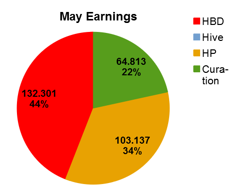
No Hive earned in the Month, and I converted all the HBD to the equivalent of Hive in the wallet market place, to see how the comparison would look.
It took some digging to find how to use the tool, and I hope I don't forget.
This is cool! I like how it’s set up, now to see if I can recreate that!
I may end up doing it with litecoin so I can get the information on my own and then try my hand at getting it formatted and looking similar to that.
😄 I'm glad you liked the post, and awesome that you will give it a try. It's not so difficult really
Congratulations @theexcelclub!
You raised your level and are now a Dolphin!
Do not miss the last post from @hivebuzz:
Support the HiveBuzz project. Vote for our proposal!