HELLO HIVERS🤩,
I saw so many people's posts related to the Ragnarok game logo proposal.so I decided to make one and participate in it. I am not good at the photoshop pc version😐. I bought this laptop 3 days ago. I like to start editing on pc version editing applications. so now I created this logo with an android application called " Photoshop cc"📱. I usually make all editing on my mobile phone. I make youtube thumbnails of my channels and other stuff are made with this mobile phone,#ragnaroklogo
without wasting any time...
let's jump...in 🏃♂️ on to the making part of the LOGO

RAGNAROK LOGO MADE WITH MOBILE PHONE📱
Article. I read the article once and I wrote some points and drew some rough sketches✒️ of what is came to my mind📔.
First, I checked the profile @ragnarok.game ...👈and I find this
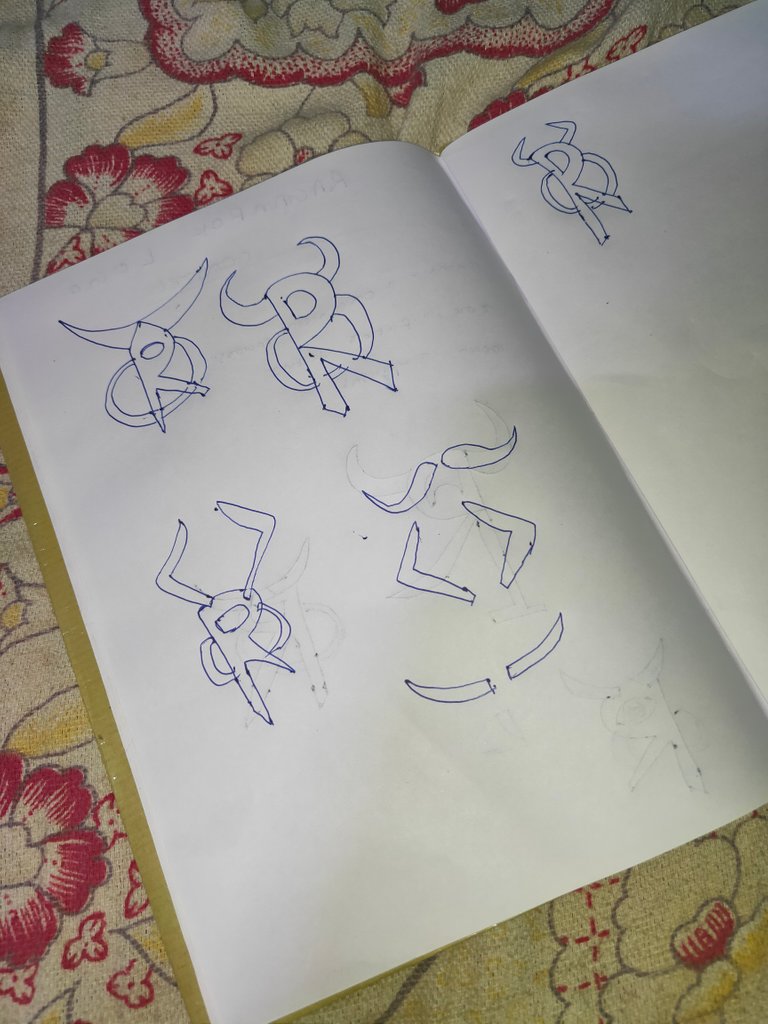
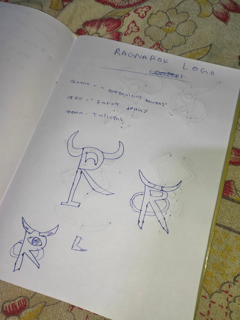
here some pictures
Getting the rough sketch on to real one...📱
I want to make the horn png format for the logo so. with the help of a mobile application "Infinite design" I drew the shape of different horn
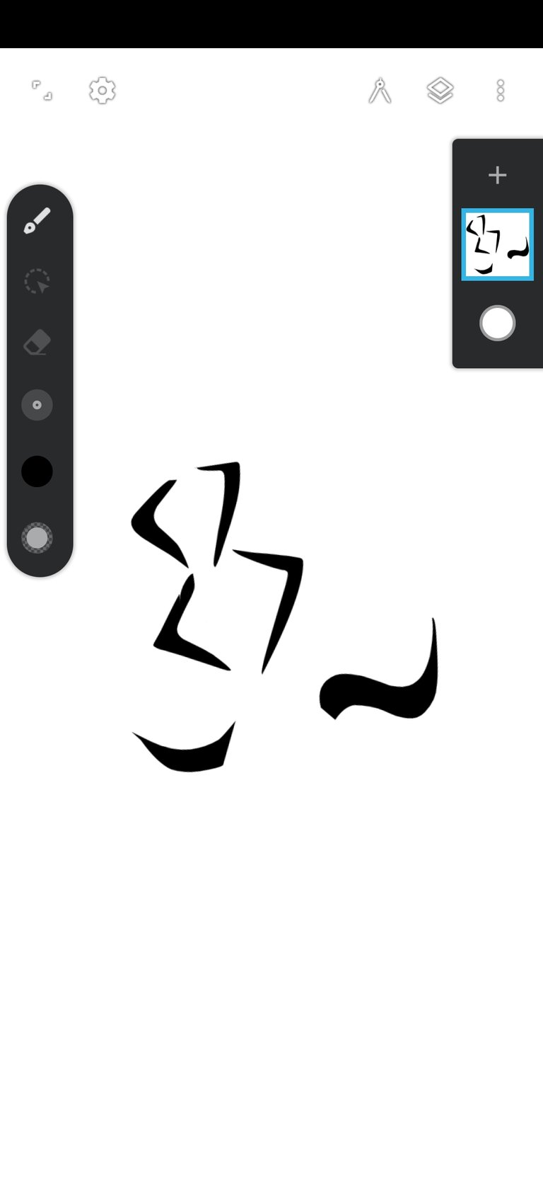
like this...👆👀
It is the main part of our work.
here I opened the photoshop cc and imported⬆️ the horn png which I created on "INFINITE DESIGN"
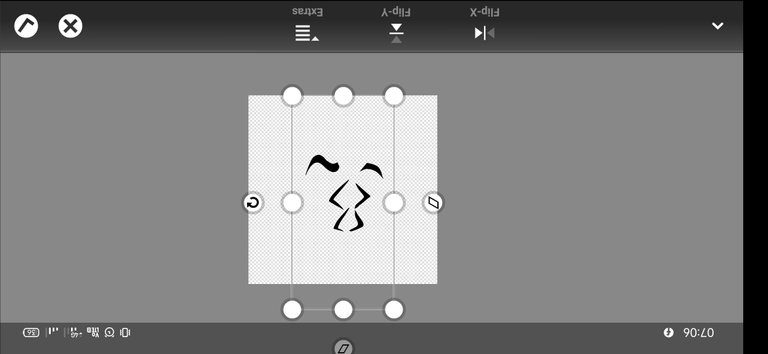
and Hide that layer to make other parts.🏬
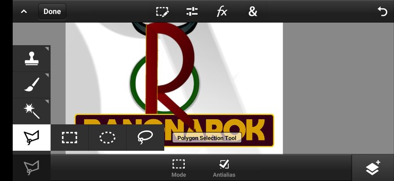
using the help of the "Polygon selection tool" we can create any shapes which we want ...🔶🔺🔴🔳... 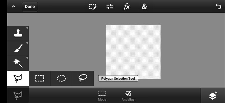
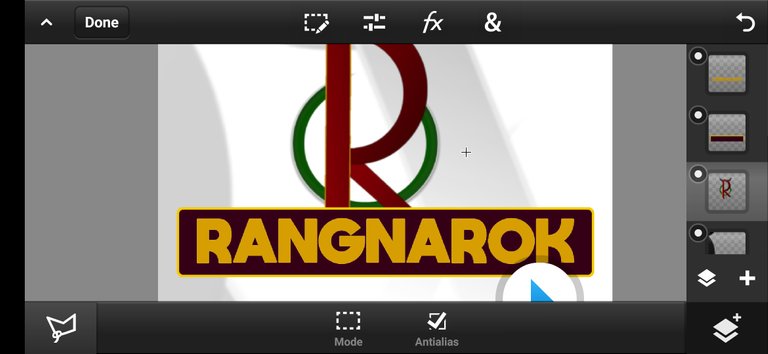
I created a shape like "P" and a small square shape to make it into an "R"
😎
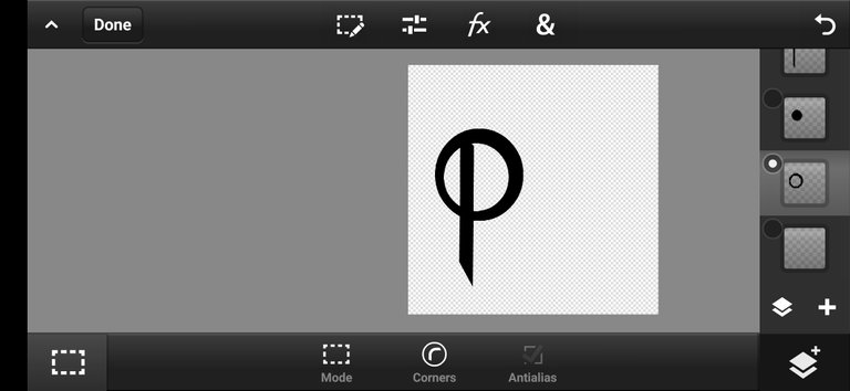
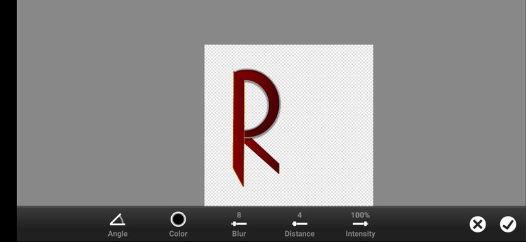
then I colored that shape brown gradient🐴. and added an ash color stroke in a new layer and enabled "shadow", but later I removed the stroke of the mirrored shape of "c"😣
brown: RGB=11304
Then I added a green circle shape on the below "R" layer⭕. and added stroke enabled its shadow, removed some errors
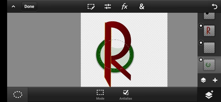
green: RGB=15838
stroke color: =RGB=185189185
then turned on the horn layer,and i choose this horn shape because it is more good comparing with others💀
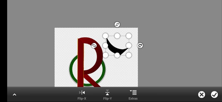
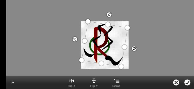
coloring;--
duplicated that horn layer and adjusted both sides
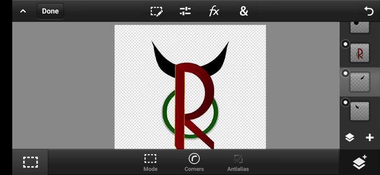
colored this horn into gray🎨🖌️
Gray:RGB=515151
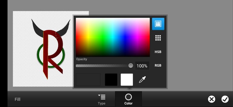
😻our logo shape is ready now. it needs some final touch and a background🤖
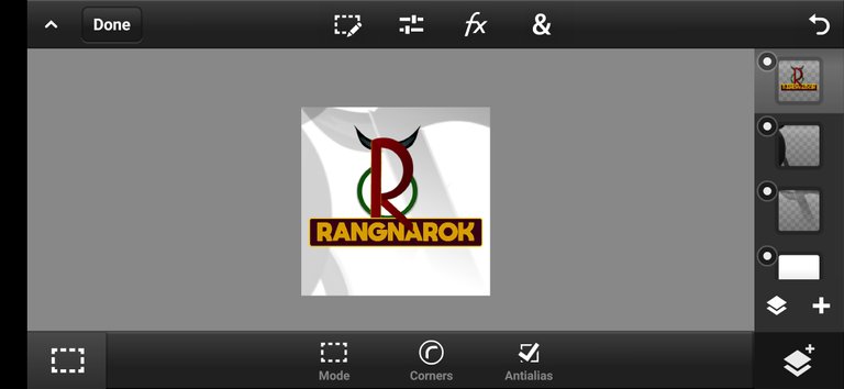
then everything is ready...👀💫
the background is made by simply duplicating the logo and turning that into "Black and white"🔳. and zoomed it reduced its opacity and moved to top right, bottom left corners. 👁️🗨️
conclusion
This is the full process of making this logo, it has taken one day to complete this entire logo.😵
All the logos shown in this post were designed by me. I didn't take any references for making this logo's or font and in case of any issues, you can contact me directly on my Instagram@akshay_ambrose
Congratulations @akshayambrose! You have completed the following achievement on the Hive blockchain and have been rewarded with new badge(s):
Your next payout target is 50 HP.
The unit is Hive Power equivalent because your rewards can be split into HP and HBD
You can view your badges on your board and compare yourself to others in the Ranking
If you no longer want to receive notifications, reply to this comment with the word
STOPCheck out the last post from @hivebuzz:
Support the HiveBuzz project. Vote for our proposal!