icon
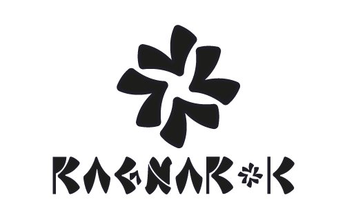
I was checking the logos that are participating in the contest and they are really amazing the level of creativity. I can't pass up the opportunity to create a second logo for ragnarok, this time it's a typography with an original design using the elements of the symbol.
The logo construction is developed in the following way:
I selected a creative text for the construction of Ragnarok.
I selected the colors and typography that transmits the Nordic style.
Here I present size variations
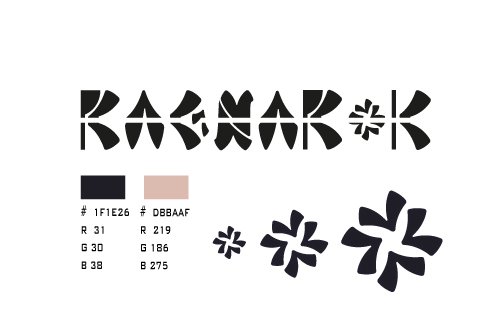
Here I present the Logo without Background
I had a lot of fun, I hope it turns out to be functional for the contest.
My thanks to the promoters and curators of the contest.
The rewards earned on this comment will go directly to the person sharing the post on Twitter as long as they are registered with @poshtoken. Sign up at https://hiveposh.com.