Estoy en un buen momento profesional, tengo varios clientes que me han contratado para desarrollar el sitio web de su negocio.
Yo utilizo siempre el CMS Wordpress, pues es muy sencillo de utilizar y puedes personalizar hasta el mínimo detalle, además, de tener una comunidad super activa que día por día, libera nuevos plugin con las más disímiles e inimaginables opciones.
En este post voy a compartir un problema que se me presentó, y la solución que utilicé, espero les sea de mucha ayuda a los que como yo, incursionan en el mundo de Wordpress.
¿Cómo mostrar un ítem en el menú solo cuando esté en una vista específica (Computadora o Celular)?
Este problema me surge porque el cliente desea que se muestre una opción, solo cuando el usuario esté accediendo al sitio web desde un celular. Busqué algunos plugin pero no me daban la solución exacta que necesitaba, por lo que tuve que utilizar programación. La solución fue añadir al CSS dos clases, que definan cuando se visualiza la web en una computadora o en un celular.
Paso 1: Abrir el archivo menú.css del tema de Wordpress que estés usando.
Paso 2: Agregar este código en cualquier parte dentro del archivo:
/* Ocultar ítem del menú cuando se visualice en una computadora */
@media only screen and (min-width: 981px) {
.ocular-en-computadora {display: none !important;}
}
/* Ocultar ítem del menú cuando se visualice en un celular */
@media only screen and (max-width: 980px) {
.ocultar-en-celular {display: none !important;}
}
Aquí se define el tamaño máximo y mínimo (en píxel) donde se muestre o se oculte el ítem del menú, el mismo puede ser cambiado según la necesidad del desarrollador
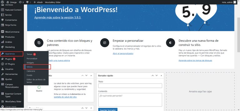
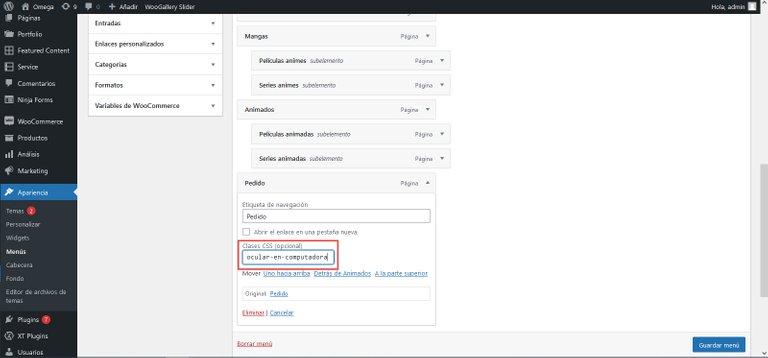
Paso 3: Guardar los cambios e ir a la opción Menú que se encuentra en Apariencia.
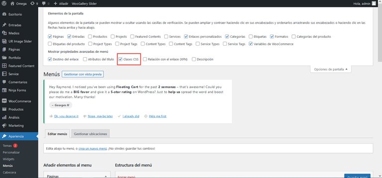
Paso 4: Verificar en las opciones de pantalla que esté activada la opción: Clases CSS
Paso 5: Seleccione el ítem del menú, que desea aparezca o no en una de las dos formas de visualización, y escriba el nombre de la opción que desee. En este caso el ítem Pedidos, el cliente no desea que aparezca en el menú, cuando se visualice el sitio web en una computadora.
Si desea un sitio web para su negocio, le sugiero leer este Post:
Ecency: https://ecency.com/hive-110011/@lapasta/programacion-a-la-carta-ofertas
Peakd: https://peakd.com/hive-110011/@lapasta/programacion-a-la-carta-ofertas
I am in a good professional moment, I have several clients who have hired me to develop their business website.
I always use the CMS Wordpress, because it is very easy to use and you can customize even the smallest detail, besides having a super active community that every day, releases new plugins with the most dissimilar and unimaginable options.
In this post I will share a problem I had, and the solution I used, I hope it will be helpful for those who like me, dabble in the world of Wordpress.
How to show an item in the menu only when it is in a specific view (Computer or Mobile)?
This problem arises because the client wants to show an option only when the user accesses the website from a mobile. I looked for some plugins but they didn't give me the exact solution I needed, so I had to resort to programming. The solution was to add to the CSS two classes that define when the website is displayed on a computer or on a mobile.
Step 1: Open the menu.css file of the Wordpress theme you are using.
Step 2: Add this code anywhere inside the file:
/* Hide menu item when viewing on a computer /
@media only screen and (min-width: 981px) {
.hide-on-computer* {display: none !important;}
}
/* Hide menu item when displayed on a cell phone /
@media only screen and (max-width: 980px) {
.hide-on-mobile* {display: none !important;}
}
Here you define the maximum and minimum size (in pixel) where the menu item will be shown or hidden, the same can be changed according to the developer's need.
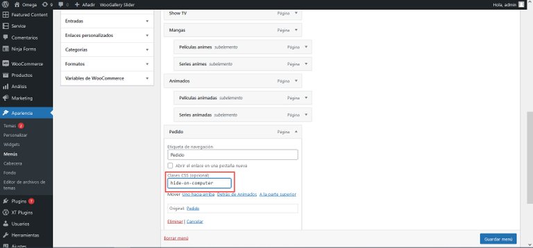
Step 3: Save the changes and go to the Menu option found in Appearance.
Step 4: Verify in the screen options that the option: CSS Classes is activated.
Step 5: Select the menu item, which you want to appear or not in one of the two display forms, and type the name of the desired option. In this case the item Orders, the client does not want to appear in the menu, when viewing the website on a computer.
If you want a website for your business, I suggest you read this post:
On Ecency: https://ecency.com/hive-110011/@lapasta/programacion-a-la-carta-ofertas
On Peakd: https://peakd.com/hive-110011/@lapasta/programacion-a-la-carta-ofertas
Edit image preview Source / Editada fuente de la imagen preview: WallpaperCave
Translated with www.DeepL.com/Translator (free version)

Congratulations @lapasta! You have completed the following achievement on the Hive blockchain and have been rewarded with new badge(s):
Your next payout target is 250 HP.
The unit is Hive Power equivalent because post and comment rewards can be split into HP and HBD
You can view your badges on your board and compare yourself to others in the Ranking
If you no longer want to receive notifications, reply to this comment with the word
STOPSupport the HiveBuzz project. Vote for our proposal!