Hello Everyone,
In this post I am going to submit my logo Proposal for BROCA TokenThis Post by SPK Network. I knew about the logo contest by @spknetwork from
- What is BROCA Token?
BROCA is the Network's gas token to limit spam. It is consumed when the user uploads content to the Network and automatically regenerates each day if the user powers up their liquid SPK tokens.
~ answered by @spknetwork
So I tried to make a perfect logo for the token. I applied 5 different background for the logo to justify how eye-catching the color combination is. I used there are 5 background such as Black, White, Red, Pink and sky Blue background. I want to start with the BROCA banner so that It would be the thumbnail of this post.
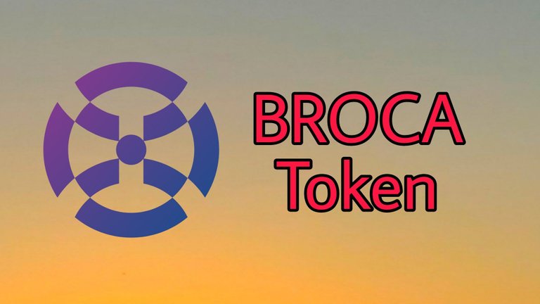
Begin of my Logo Proposal for BROCA TOKEN







- PNG Version of the Logo

At first I want to make a round logo. Because It will be a crypto logo. So round shape is better. Then I made a abstract symbol and put it at the middle of the logo. Since BROCA is the partner logo of SPK Network, and it's a crypto coin so I tried to give the best design on it. I choose a dark gradient as the logo color. Because it will be suited with any kind of background.
I tried my best to make this unique logo of BROCA TOKEN. Before making this post I also checked out all the submission for the BROCA TOKEN. All of them are working so hard to make a better logo. I also want to compete with them. So I made this unique logo. Hopefully you like it and appreciate my hard work.
Thanks for watching my post. If you suggest me anything about my logo and let me know with your respective comments. As a contestant I want to know your opinion about my logo.

These logo samples are my own properties.