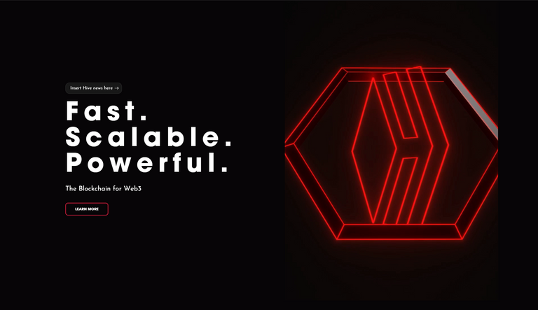
I do like the new website over the old BUT... The animation is a little janked up on my computer.
Like it's cut off on both sides, feels like it should fill the whole area or something. Not sure if it's just me or w/e. though.
I also think there should be little popups on each of the social media links at the bottom just to give a visual text based feedback of what each of them are for those who have been under a rock for the last 20 years and don't totally recognize the logo of a service.
When it comes you UI design for me it's always assume the user is a 5 year old.

Communities I run: Gridcoin (GRC)(PeakD) / Gridcoin (GRC) (hive.blog)| Fish Keepers (PeakD) / Fish Keepers (hive.blog)
Check out my gaming stream on VIMM.TV | Vote for me as a Hive witness! and Hive-engine witness!