Hello guys!
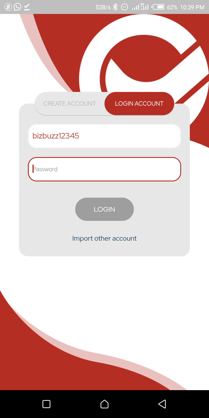
So here's my first review of the ChallengeEOS app. The UI is quite easy to navigate through. I've had the app for over 3 days now and so far the experience has been quite nice.
Although I'm still trying to learn how to maximize the platform, I can say from the short time I've spent on the app so far, that it's been a good experience.
I just wish more of people from my own geo-location would join the app so that it would be more fun for me.
Also I noticed some few things though (I don't know if I should call them bugs or not). When signing up it kept rejecting my username. I guess probably because I have used before as my eos account name.
Also, the sign in with google feature did not work for me. I kept getting an error about my phone number when I hadn't even inputed it yet.
This is my first review of the new v5 of the CHALLENGEEOS app. I will drop more reviews as I continue to use the app
Congratulations @bizbuzz! You have completed the following achievement on the Hive blockchain and have been rewarded with new badge(s) :
You can view your badges on your board And compare to others on the Ranking
If you no longer want to receive notifications, reply to this comment with the word
STOPDo not miss the last post from @hivebuzz:
Support the HiveBuzz project. Vote for our proposal!
Thank you for your feedback. @bizbuzz what you experienced should be a glitch and our developers are currently working on it.