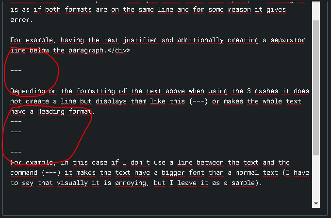
For example, having the text justified and additionally creating a separator line below the paragraph. This is just an example, really, I can't remember which format gave me that problem.
Depending on the formatting of the text above when using the 3 dashes it does not create a line but displays them like this (---) or makes the whole text have a Heading format.
For example, in this case if I don't use a line between the text and the command (---) it makes the text have a bigger font than a normal text (I have to say that visually it is annoying, but I leave it as a sample).
Also interesting are the reasons why you don't use "justify text" in web sir. I love justified texts, but those white spaces (rivers) that are in some paragraphs that are justified, bother me a lot visually, but I think it's something personal, I hope it's nothing serious for me hehe.
Thank you very much for the two articles and for the questions section.
Translated with www.DeepL.com/Translator (free version)
