Please share screenshot about icon size, we will see how to improve them. With more additions, pages are getting too cluttered, we like simplicity for now that what we come up, in future we will see how to make it better and easy to access.
You are viewing a single comment's thread from:
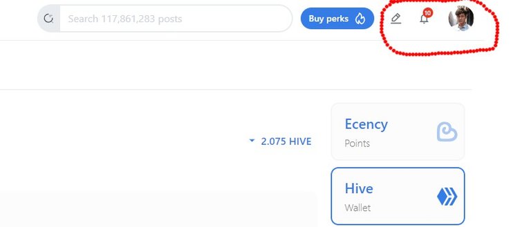
Thanks for your reply, here's a screenshot where I've circled the icons I consider too small.
!ALIVE
You Are Alive so I just staked 0.1 $ALIVE to your account on behalf of @ chapelle. (1/20)@ecency!
The tip has been paid for by the We Are Alive Tribe
 through the earnings on @alive.chat, feel free to swing by our daily chat any time you want, plus you can win Hive Power (2x 50 HP) and Alive Power (2x 500 AP) delegations (4 weeks), and Ecency Points (4x 50 EP), in our chat every day.
For this issue, we will see how big we can make them.
Hi, another problem with the new UI, when we want to edit a post, the update button is covered by the conversations tab as shown on this screenshot:
This issue, we pushed a fix for it.