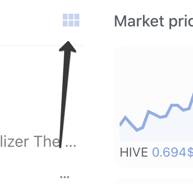
Right, it is in todo list, we are removing those from profile pages in next update. As for view, we have view change option, check it out:

You are viewing a single comment's thread from:
Right, it is in todo list, we are removing those from profile pages in next update. As for view, we have view change option, check it out:

I'm aware of the list view and the tile view on Ecency. Are there more options that I'm missing?
When browsing, I like this view on Peakd:
The big photos in one column are preferable to me. The ability to scroll through an article's photos without clicking into the article helps me decide if I want to read the article or not. It's also helpful for me to see the dots at the bottom to see if the post only has 1 or 2 photos, or a lot of photos.
The tile view on Ecency looks good, but it doesn't really help my decision making process when trying to figure out what to click on.
Alright, added into our list of enhancements. Thanks!