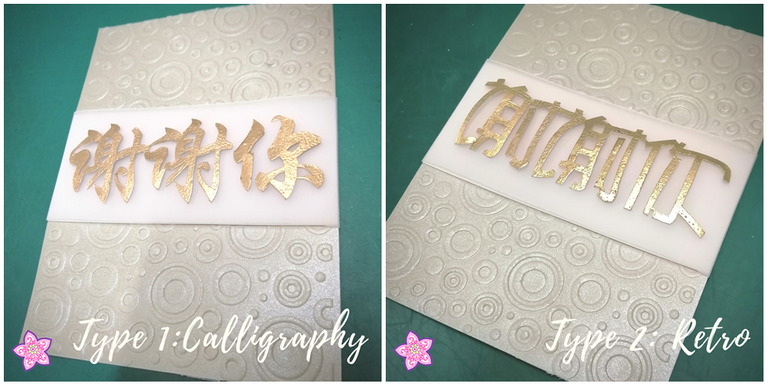
I have a dilemma....
Previously if you have read my earlier post you might have seen that I just completed cutting Mandarin words by hand for the first time, without any aided cutter; where I mentioned that I also have another design in progress...
when both of them are done.... I have trouble choosing which fits the recipient better!

My mom thinks the traditional calligraphic representative of the "Thank You" 谢谢你 is appropriate for its original way of writing; but I find the retro background might not match it... or does it make it stand out?
How about the retro design of the same word where it has grounder edges with squarer display? Would this be more suitable for a not so old professional adult?
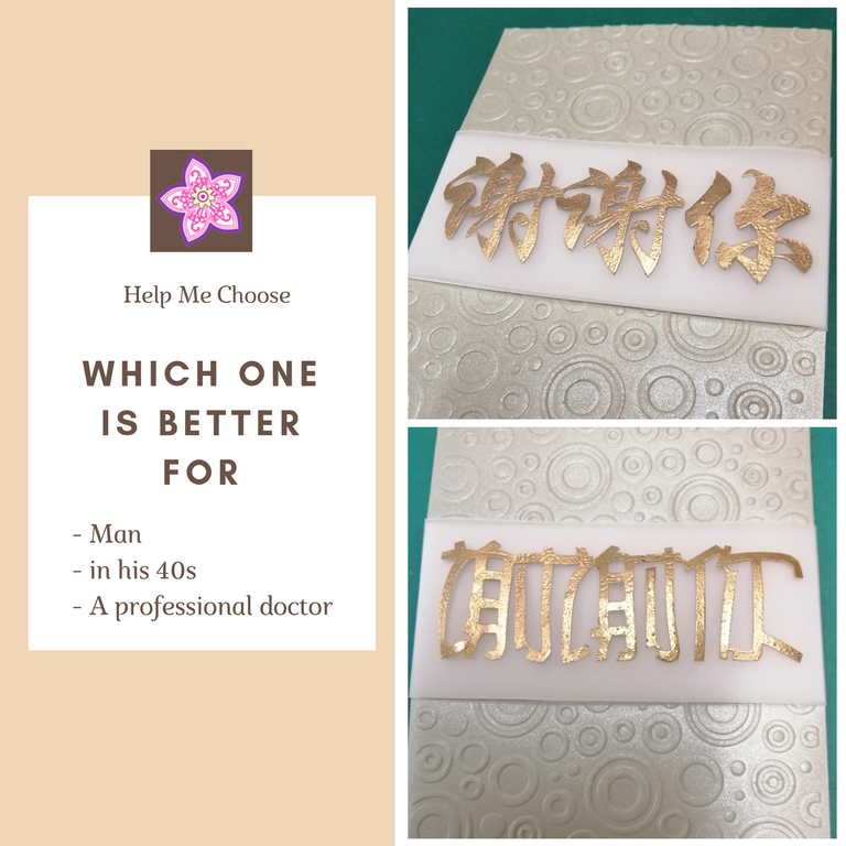
Here is the basic description of the recipient:

Therefore I have decided to seek help from ALL OF YOU to help me choose it, and I need to get it done by Wednesday... 😅
How you can help:
At the comments: Say either
- Type 1: Calligraphy
or - Type 2: Retro
And your comment will be upvoted too as my gratitude for your gut feeling. 😁
Thank you in advance!
%20100px.png)
ps: This is my old (lost and found) account, which I managed to retrieve my password after misplacing it for 1 year. @littlenewthings is my main account now; but this will be my account specially for commercial and charity use.

Type 1. 😏
Type 2 looks distorted.
ah ha ha. That's because I didn't cut through most of them.
Type 1 is much clearer the words.
true, because I stuck the words together lol... I can still cut it back to the original with more distinct look...
Definitely 1!
Apparently we have a winner!
Thank you for your support. Here's a !shop as token of appreciation.