Greetings to the entire Holozing and Hive community! 😃
This time I want to share with you a new fanart illustration I've been working on these days. For this occasion I chose to represent the character Cinelara, following the kawaii emote style I've been working lately, combining some design techniques to achieve a striking finish to the illustration. Before starting with the process, I've been considering making changes in my illustrations, although I'm usually very detailed and I always try to achieve clean and presentable finishes, there are times when I would simply like to draw with a more natural or less elaborated style. I hadn't had the courage to try it but I'm thinking of taking the initiative and see how it turns out. Now back to today's topic, I hope you like this version and without further ado, I leave you with my process!
Saludos a toda la comunidad de Holozing y Hive! 😃
En está oportunidad quiero compartir con ustedes una nueva ilustración fanart en las que he estado trabajando estos días. Para está ocasión elegí representar al personaje Cinelara, siguiendo con el estilo kawaii tipo emote que he venido trabajando últimamente, combinando algunas técnicas de diseño para lograr un acabado llamativo a la ilustración. Antes de comenzar con el proceso, he estado considerando hacer cambios en mis ilustraciones, aunque suelo ser muy detallista y siempre busco lograr acabados limpios y presentables, hay veces que simplemente quisiera dibujar con un estilo más natural o menos elaborado. No había tenido el valor de intentarlo pero estoy pensando en tomar la iniciativa y ver en que resulta. Ahora sí volviendo al tema de hoy, ¡Espero que les guste esta versión y sin mas, los dejo con mi proceso!

Creative Process | Proceso Creativo📘✏️
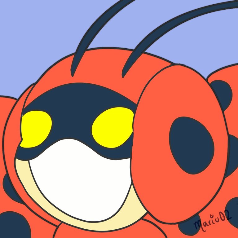
Paso 1:
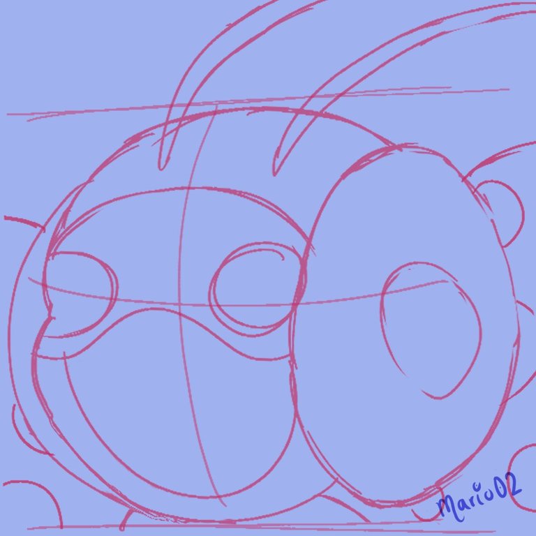
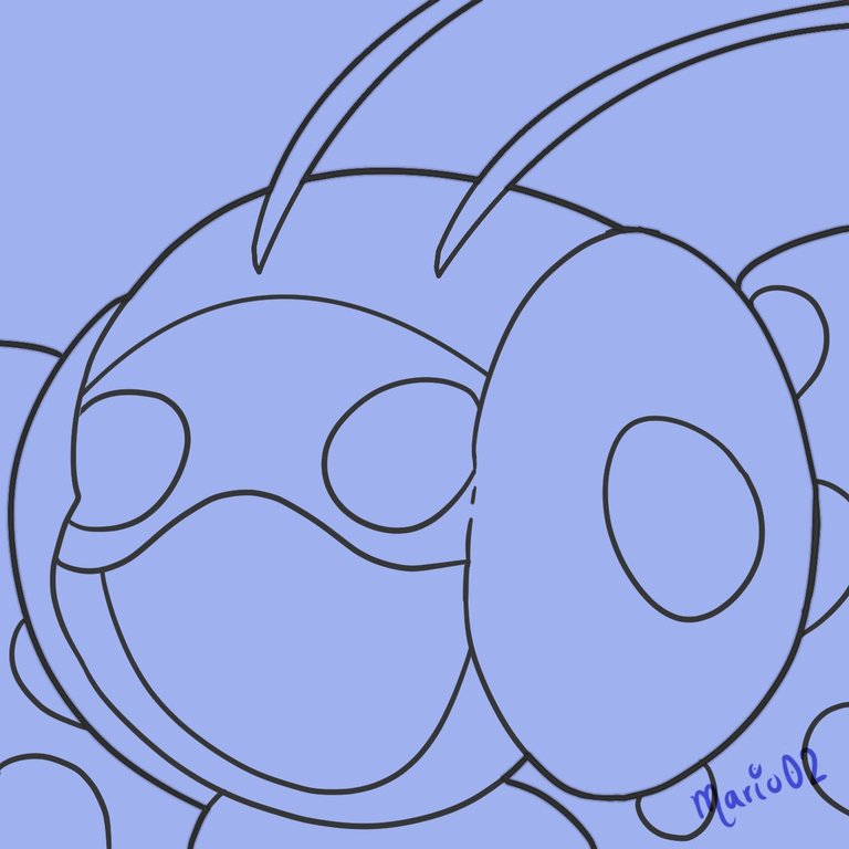
I chose a portrait type composition for this illustration, the idea was to show the character in a 3/4 view, with a simple design and with enough space to add a typography. I started developing the sketch and cleaned it up until it had a cleaner finish, then I made a lineart with thick lines and without pressure to give the final touch to the lines.
Elegí una composición tipo retrato para esta ilustración, la idea era mostrar al personaje en una vista 3/4, con un diseño sencillo y con espacio suficiente para agregar una tipografía. Comencé desarrollando el boceto y lo fui limpiando hasta que tuviera un acabado más limpio, luego hice un lineart con líneas gruesas y sin presión para darle el toque final a las líneas.
 |
 |
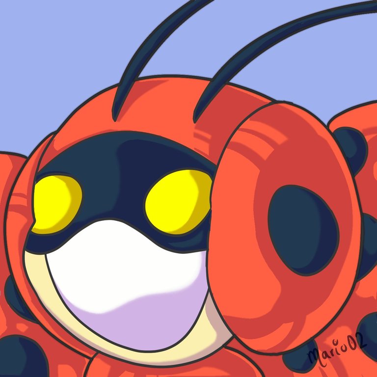
Paso 2:
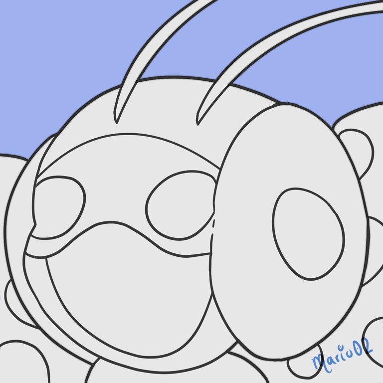
After the lines I started with the color application, starting with a base layer of light gray over the whole character, using it as a mask that helped me to stay within the lines. Then I worked the base colors, these are generally the same of the original reference, but adjusting a little the saturation of the tones.
Después de las líneas comencé con la aplicación del color, partiendo de una capa base de gris claro sobre todo el personaje, usándola como una máscara que me ayudó a no salirme de las líneas. Luego trabajé los colores base, estos generalmente son los mismo de la referencia original, pero ajustando un poco la saturación de los tonos.
 |
 |
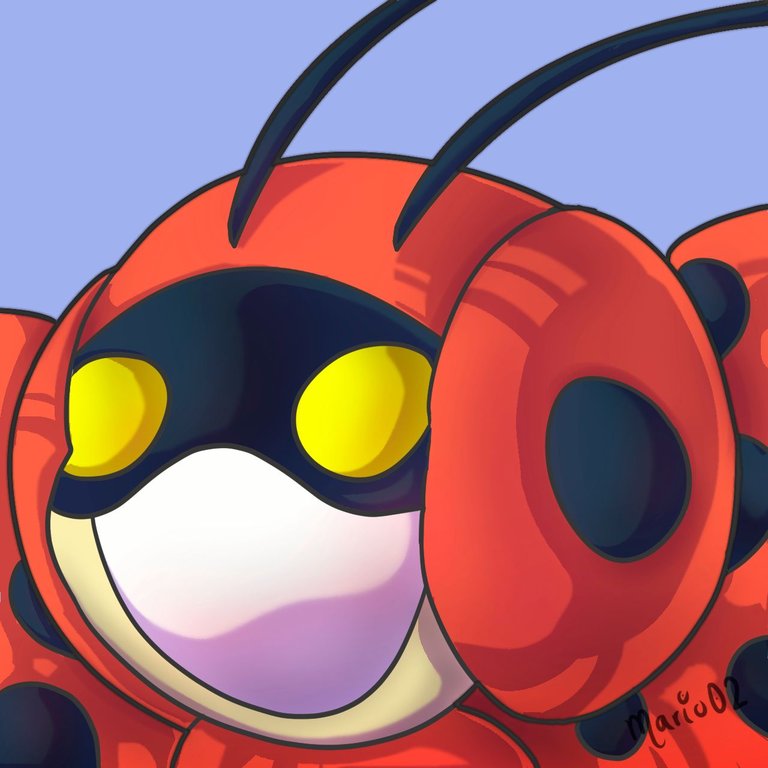
Paso 3:
The next thing was to start working on the shadows and highlights of the illustration. For the shadows, I used a hard brush that allowed me to achieve a cell shading type finish, I also applied some blending modes to give more variety to the tones. Then I made use of the airbrush in certain areas to give some more intense shadows and enhance the contrast.
Lo siguiente fue comenzar a trabajar en las sombras e iluminaciones de la ilustración. Para las sombras, utilicé un pincel duro que me permitió lograr un acabado tipo cell shading, también apliqué algunos modos de fusión para darle mayor variedad a los tonos. Luego hice uso de el aerógrafo en ciertas áreas para dar algunas sombras mas intensas y realzar el contraste.
 |
 |
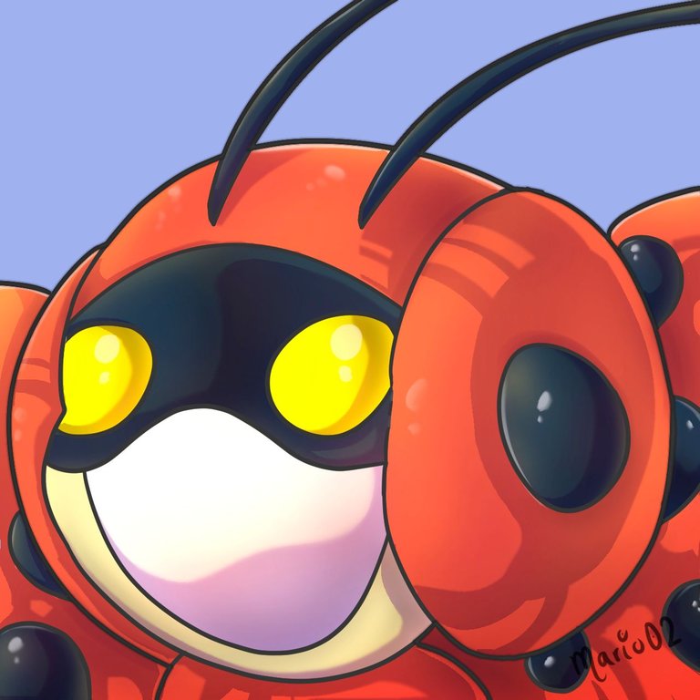
Paso 4:
To finish with the character I focused on the lighting and final details. Here I added white highlights to highlight the most illuminated areas and used the airbrush to apply a general lighting with warm tones, creating a kind of gradient of interesting tones. Then I proceeded to create a text with the name of the character to start working on the background.
Para finalizar con el personaje me enfoqué en la iluminación y los detalles finales. Aquí añadí destellos en blanco para destacar las zonas mas iluminadas y utilicé el aerógrafo para aplicar una iluminación general con tonos cálidos, creando una especie de degradado de tonos interesante. Luego procedí a crear un texto con el nombre del personaje para comenzar a trabajar en el fondo.
 |
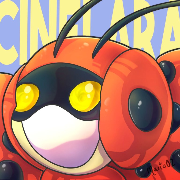 |
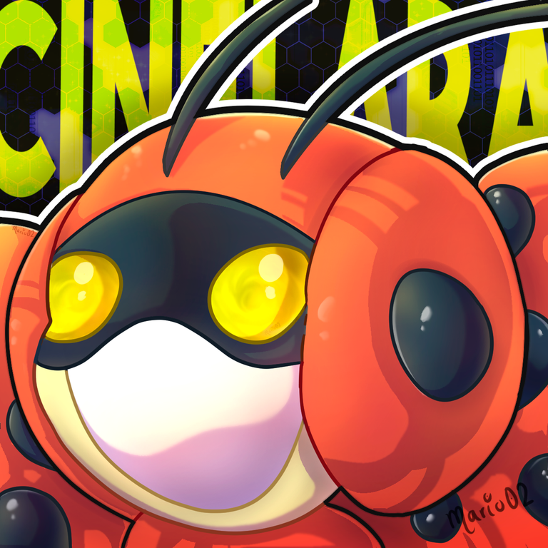
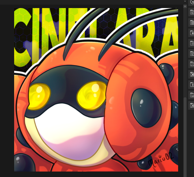
Final Art | Arte Final😉🎨
Finally I spent some more time to work on the background, using textures and resources to create an effect with a technological touch or similar, achieving a good contrast with the character. Finally I applied color to the lineart and added some contours to the character to make it stand out a little more.
Por último dedique algo mas de tiempo para trabajar en el fondo, utilizando texturas y recursos para crear un efecto con un toque tecnológico o similar, logrando un buen contraste con el personaje. Para finalizar aplique color al lineart y agregue algunos contornos al personaje para que resaltara un poco más.
Thank you very much for reading!
See you in a future publication! 🙏
¡Muchas gracias por leer!
¡Nos vemos en una próxima publicación! 🙏


Join Here!
Tools Used | Herramientas Utilizadas:
- Photoshop CC versión 64 bits
- Clip Studio Paint
- Tablet Huion H610 PRO V2

Discord: marioart02
The illustration and separators used in the post are my property.
Translated with DeepL (free versión)
Very nice drawing, I like the finish you gave to the eyes.