Hello Splinterlands Community! For the Splinterlands Social Media Challenge this week, I will share something that I have noticed multiple times for the past couple of days when I am playing some ranked games and engaging on guild brawls. This is about the halloween theme that was implemented on some of the cards in the game which I think is very interesting and exciting as it brings more creativity and new stuff in the game. These cards were designed very well and it the design is very much different from the its original form which makes you think that these are new cards that were added in the game. I will share more about my thoughts and opinions on these cards that was redesigned for this halloween season and hopefully that there will be more cards with this special design soon.

Halloween Themed Cards
| ORIGINAL | CURRENT |
|---|---|
 |  |
Kelya Frendul
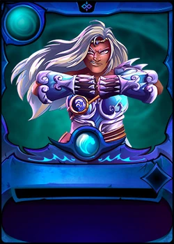
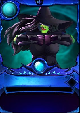
The first card that I noticed that have a different design when I am playing a modern ranked battle is the Kelya Frendul. It is a water summoner from the Chaos Legion set and as a summoner it would be the first one that you need to choose from during the match. At first I noticed that the graphics on Kelya Frendul is very different from the one that I am very familiar with. Initially, my first thought that the display of this card was like that because of my poor internet connection but as I reload the website of the game, the design was still the there and then I realized that Kelya Frendul looks like a witch with the signature witch hat and the skin looking like a witch. This is where I think that there could be some special effects stored in the game for this upcoming halloween season.
The halloween design for Kelya Frendul is very nice, I agree with the idea to turn Kelya Frendul to a witch since it has a very long hair and the facial expression of the original design of this card is very fierceful. At first glance, the card does not look like Kelya Frendul but after careful inspection you can see the similarity with the original design and the added twist for the Halloween concept fits very well with the card. Overall, the design for this card is really great and it still brings the speed and armor buff to the whole team at the beginning of the match.

| ORIGINAL | CURRENT |
|---|---|
 |  |
Uraeus
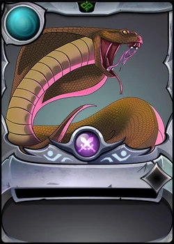
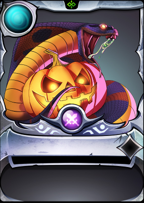
The second card that I noticed that has a different design when I am playing a modern ranked battle is the Uraeus. It is a neutral melee monster which also comes from the Chaos Legion set as a reward card that was obtainable in the loot chests before. I was able to notice the different design for this card when I filter the melee damage type on the filter when building my team composition. Uraeus is one of the cards that I commonly used on my battles as it is very useful especially on low mana battles and it has a great ability which is Sneak that allows this unit to target the enemy monster that is in the last position of the enemy team.
The halloween design for Uraeus is also very nice as well, I was able to recognize Uraeus immediately when I am browsing all the melee monsters that is available in the match. The design is very similar with the original one and there is only few changes that was applied to it. The Uraeus got some visual changes on its skin color which I think makes it more ferocious since it is a snake. Additionally, I like the idea of adding a halloween pumpkin on the side of Uraeus as it brings more fear to the monsters that will stands on it way. The space where the pumpkin is placed is very clever as the original design of the card has the space where the pumpkin would fit perfectly. Overall, the design of this card is well done and the halloween design for this card gives you the feels that it is more powerful and deadly in the battlefield.

| ORIGINAL | CURRENT |
|---|---|
 |  |
Venari Marksrat
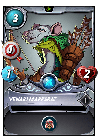
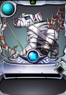
Lastly, I also notice a different design for Venari Marksrat when I played a modern ranked match. It is a neutral ranged monster reward card from the rewards set that is in Soulbound. It was very evident that there are major changes on the design of the card when I was browsing for the neutral element monsters that is available in the match. It is one of the cards that is very useful in the game especially if you want to setup a huge buff towards the heavy damage dealer of the team which provides that unit the buff it needs to carry the team towards victory.
The halloween design for Venari Marksrat is also very nice as well, The halloween design for this card has a very different attitude on the original design as the expression of the halloween card is very intimidating and aggressive. It is much different from the expression on the original design of the card, the change in the color of the eyes also brings more vicious look on the card making it more scarier. The idea of turning the rat to a mummy is also good as it makes Venari Marksrat a monster that was risen from the death and is now turning towards a revenge to the monsters that is on its path. Overall, the design for Venari Marksrat is also well done, the halloween design for this card brings a different aura from this unit and it makes you more persuaded to include this card in your team composition in the battles.

My Battle
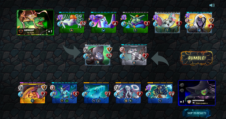
This is the modern ranked battle that I want to share wherein I discover the changes that has been applied on some of the cards in the game particularly on Kelya Frendul, Uraeus and Venari Marksrat.These cards are very useful in these match even though this match has the Silenced Summoner wherein all summoners in this battle would not be able to provide any buff to the team as well as deal negative effects to the enemy. The Martyr ability from Venari Marksrat is very useful in this match as it was able to provide an overall buff to my Djinn Oshannus which is placed in the second position of the team. My Uraeus was also able to deal a good amount of damage to the backline of the enemy team which sets up my heavy damage dealing units to take down the units in the backline. If you are interested on all of the thrilling action and team fight that happened in this match, you can watch it by clicking the battle link below.
https://splinterlands.com?p=battle&id=sl_6f8e8ead07264e275b9bc5250f56798d&ref=hatdogsensei
The monsters and summoner that has the halloween theme design for this year is not only just for display in the game but also shows that they are still potent in the battlefield. These visual updates makes them more fearsome and intimidating when they are deployed in the match. This is the first time that I was able to see this kind of update which makes the game more exciting and considering that there are a lot of events and occasions happening each year there could be more visual updates like this on some of the cards in the game. It would be very exciting to see the difference that has been done from the original design of the unit and bring more enthusiasm in the game.

Thank you so much for reading my post, If you haven't tried playing Splinterlands, I'll suggest to start playing this awesome game right now and it would be really great and appreciate if you can start playing the game by using my referral link below.
https://splinterlands.com?ref=hatdogsensei
Thanks for sharing! - @mango-juice
