
New Splinterlands Mobile Friendly Battle Screen
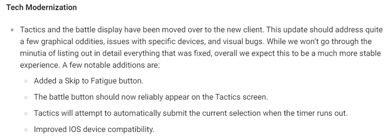
With the recent maintenance update, Splinterlands changed the layout of the battle screen into a sleek and more mobile friendly appearance. This is part of the Tech Modernization phase where SPL code (Vanilla JavaScript) is being changed into modern code (probably a framework of JavaScript like REACTJS). The team finally changed the battle display and I am currently loving it. I know you will too. So let's go and dive in to the update.

Battle Screen Changes
Battle Details Are Now On Top

The Format (Modern/Wild), Round Info, Battle Button, Skip Battle Button and Ruleset are now on top of the Battle Screen. This shows a more organized look at battles. I truly appreciate this change as there will only be one spot for the buttons.
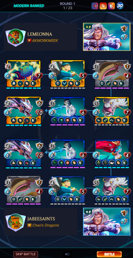
As for the mobile version, the Format, Round Info and Ruleset is place on top while the Skip Battle Button, Sound Option and Battle Button are placed on bottom.
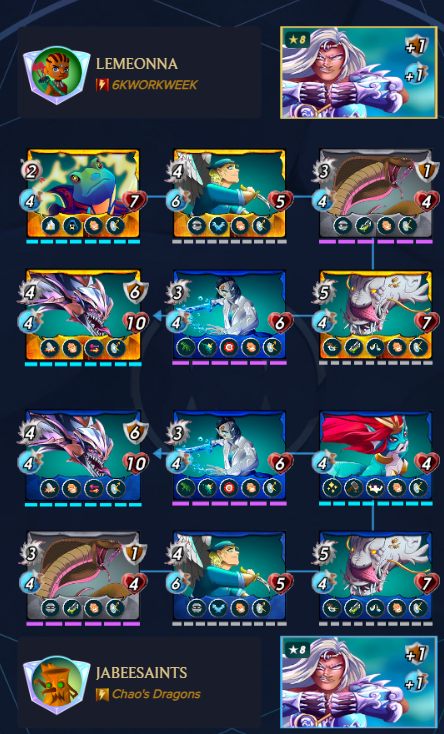
Cards Are All Laid Down On The Table

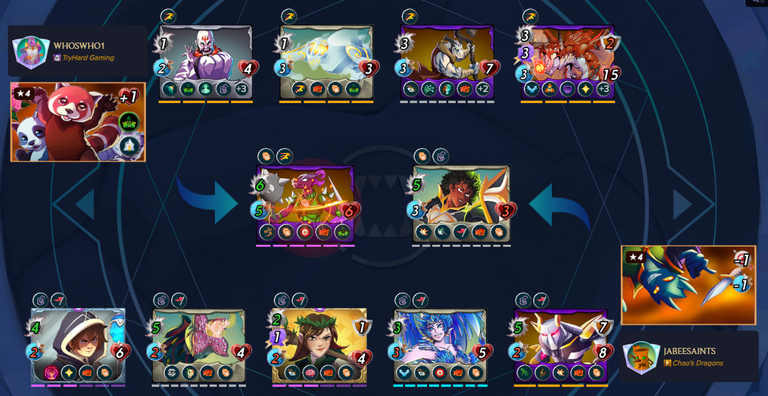
The Summoners and Units are all laid down to the main screen. This allows players to see all of the cards attacking one another.

In mobile view, the cards are staked on each other with the first player's Summoner is on top and the second player's Summoner is at the bottom. The order is a bit confusing at first. But thankfully, there is a guide arrow shown during the battle.
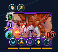

Card Buffs, Debuffs and Stats Shown Neatly

The Buffs and Debuffs are shown on top of the card. The Stats are now neatly placed at the bottom of the card with a plus indicator that tells you the additional stats given to the card during the battle. Just hover on the plus indicator to see the other Stats of the monster.

Closing
Although things might take a lot time getting used to, surely this is a better layout than the previous. Kudos to the team for making this happen. Thank you for your support. Peace!
Not a Splinterlands player yet? Join the game by registering in the Splinterlands Website.
For more tips and guides, you can join the Splinterlands Discord server.
#splinterlands
#play2earn
Sources: Splintercards, Splinterlands
!LOLZ
!ALIVE
!PIZZA
lolztoken.com
Hey, that's false advertising!
Credit: reddit
@jabeesaints, I sent you an $LOLZ on behalf of speedtuning
(3/6)
NEW: Join LOLZ's Daily Earn and Burn Contest and win $LOLZ
$PIZZA slices delivered:
@speedtuning(3/10) tipped @jabeesaints
yes we getting better for new player experience weee
So true :)
o.o yes time to get everyone to play jabee go go go
The new UI look good but many has experienced difficulties of playing and watching their battles. The team still has some fixing to do.
Yes. It's not that perfect and some issues needed to be addressed.
Oh I'll try it
Oh I'll try it
!DUO
You just got DUO from @sudeon.
They have 1/1 DUO calls left.
Learn all about DUO here.
Thanks for sharing! - @mango-juice

This mobile update was heavily needed!