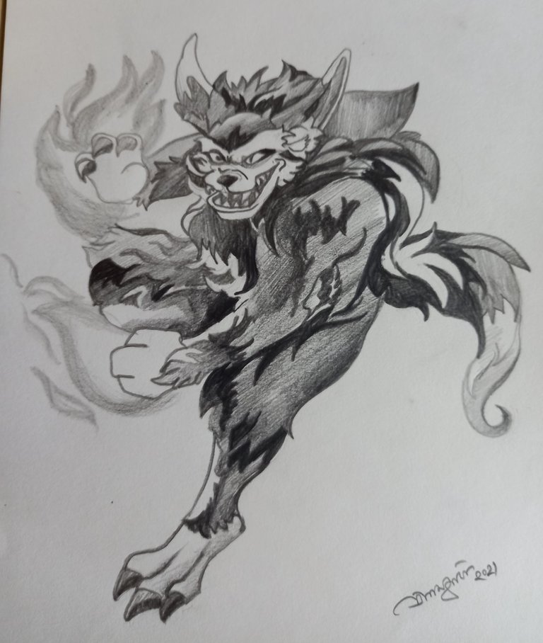
Sketches represent a black and white atmosphere, that sometimes compliments more than colorful paintings or captures. This is my version of Yodin Zaku the black-and-white version. My journey with the Splinterlands game is of a very old one and I am about to complete my one year soon. Zaku has been a strong player, whom I did not use much like Djinn Oshannus but he was my first companion in the race.
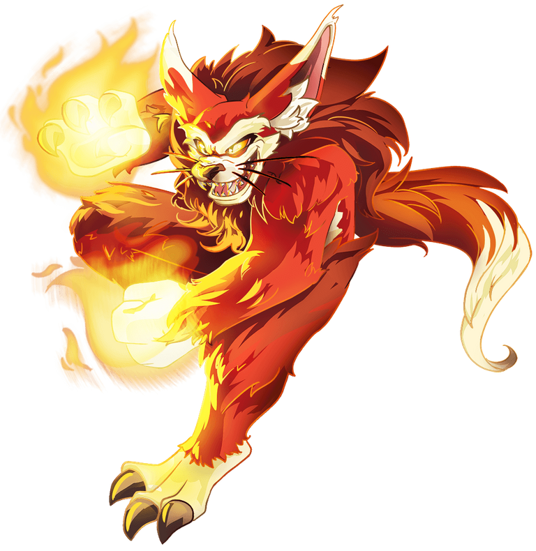
The colorful Zaku is more into action than my amateur sketch version of Zaku. His power of action is what keeps him into the fight and that is much highlighted in this version of his. Previously I have painted my second version of Zaku but in colored form.
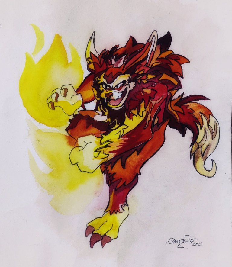
Even here you can spot the amateurish look. This time around I am intending to form a digital version of him, let me see how it goes. However, if I have to compare my art pieces, the sketch version always melts my heart while the colorful one reminds me of the several silly mistakes that I have made, starting with missing the wiskers, his teeth and many more that you can point out.
Duplication is something that is not what I am used to but I do easily mimic a scenario unlike what happens with characters. Zaku was a card I got under myself after many good games. It took me long enough to find him next to me for real and the wait was beautiful and time consuming.
Those of you who are Splinterlands lovers you all must have used Zaku more than once and those of you who own him, definitely regard your power at a whole new level. Today, I am into the mood of talking about how I mixed these two versions of Zaku and my journey with it. Few guidelines and contrasts can be easily pointed by me to help artists to make their art into a professional level. To dive into this follow few steps.
Guidelines-
• Duplication needs measurement and scaling, not my expertise
• Before sketching envision your outline, subject, shadow and light portions
• Once you visualize the image it is easier to sketch with a pen as omission isn't an option
• For starters, I would suggest trying a pencil sketch and to get your hands flexible
Contrasts-
• Sketching highlights the deep and light version of the character with a calm comforting effect while a colorful painting changes the view and gives in the atmosphere for action
• In painting the outlines depict distinction while in sketching, the outlines are part of the sketch, they blend
If you are a die-heart fan of Splinterlands, make sure you spread its wing even in the field you are best in, in my case it is surely art. Long discussion short, try to blend your work and your interest, life becomes more comfortable and smooth, just like the game. The more you understand the players, the more you are able to use your cards. It is not a mere game of cards, it is more than that. If you are a fan, you know the drill.
Thank you-
I hope you all enjoyed reading and observing the aesthetic features of my sketch and painting. You may support me by commenting, reblogging, and liking. You can visit my blog for a variety of artworks, my expertise is watercolor and sketching. However, I like to venture into other mediums too. Do share your review, it will guide me to make better content. Thank you all.

Cool character. Splinterland has soooo many dope art characters. You did a great job with that. Rehived
I love the art style of most of the characters. They did a great job from their side.
It is so cute 😍😍😍😍😍
Thanks pichi. Where are your art pieces? Do post them for us to see.
Wow both colour work and pencil are amazing you very good both side
Thanks pal but I still need to put more effort.
Congratulations @kinab! You have completed the following achievement on the Hive blockchain and have been rewarded with new badge(s):
Your next target is to reach 800 comments.
You can view your badges on your board and compare yourself to others in the Ranking
If you no longer want to receive notifications, reply to this comment with the word
STOPTo support your work, I also upvoted your post!
Check out the last post from @hivebuzz:
Support the HiveBuzz project. Vote for our proposal!