I have continued to build this love project of mine for the Hive community, adding more features in the last month. Some of the things added are requested by the users, others are my initiative.
Let’s take a look.
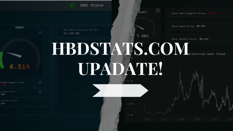
One of the key things in this update is the structural redesign of the page. This was necessary as it now allows me to add more elements/chart on the page in a aesthetically pleasing way.
Positioning and Aesthetics
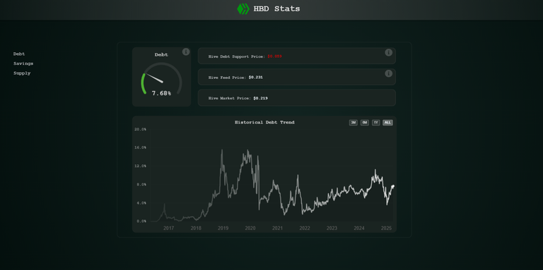
Prior to this update, the gauge chart was sort of the main element, it was centered next to the main debt chart. But this positioning doesn’t allow for adding more elements vertically as you scroll down, because not all of them will have a gauge chart. Most of them are one standing chart, line, area, bar chart or whatever.
So, the arrangement of two charts (gauge and line chart) next to each other is not scalable, so to speak. I mean there are always options, but I wanted it to be simple and nice. Also, the size of the gauge chart was probably a bit too much. Now it is on top of the line chart with smaller size. When it comes to aesthetics a lot of it taste so it’s never-ending. But I needed elements vertically stacked to continue adding new ones.
Another thing that has changed is the background itself, it’s more of a darkish now, going for a more standard dark version then the previous color one, type of green.
New Element – HBD Supply Chart
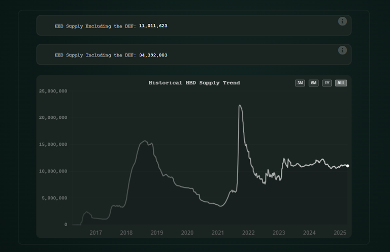
This was requested by users, as the HBD supply chart is something that is not easy to find around.
Up until now there were two elements, debt and HBD in savings. Now we can see the HBD supply chart.
Note on the supply. The chart shows the HBD supply that is freely available and in circulation. It excludes the HBD in the DHF. As of now there is around 11M HBD freely available, and 23M in the DHF. The sum of the two is around 34M. The current values of all the different types of HBD supply are on the web, just the historical values with the line chart are for the freely circulating HBD. This value is used when the debt is calculated by the chain.
There is a dedicated table on the server for this data, and an api backend for it. A full stack 😊.
Going forward the different types of HBD supply will be added as well.
Sidebar
Since there are now more options, I have added a sidebar to easily navigate to. It collapses to hamburger menu when in mobile view.
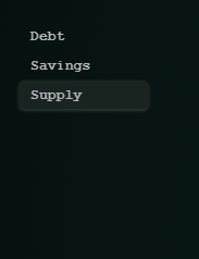
The sidebar is simple and with the style of the page. As all the things here its all custom made. It highlights as you go through the options and collapses to hamburger in the mobile view.
When it comes to the mobile view I have made improvements there as well, for readability and visibility, removed clustering. But I think there is room for improvement, as somehow, I don’t like the view now as much. It all works and shows but hopefully will make it looks nice going forward.
This small web page that is now two years old has went trough its transformation. From a client only web with one chart, manually= updated, to a full stack app with tables and backend with auto updates, with multiple options and now a clear path forward for adding more elements.
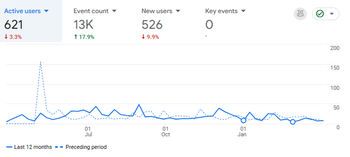
Google analytics shows that more than 600 users have visited the site in the last year, a 10 to 20 users daily, with some occasional spikes to 100. Its quite modest numbers, but I’m somewhat surprised in a positive manner as I haven’t expected to be used as much.
Going forward I will continue to add new things, this was somewhat big update so I wanted to post a longer posts. More charts on HBD supply, and probably at some point I will start adding HIVE data, although the web is more HBD focused.
Any feedback positive or negative is more than welcomed. Do you have something specific that you want to be added?
All the best
@dalz
Man you are part of the magic of the blockchain. I love how individuals and groups can create applications and utilities like this based upon the transparent but often confusing or hard to find stats. Turning the data into information is one thing. Then we can turn that information into insight and share it with each other freely on the chain.
A labour of love for sure. Thanks for all the hard work!
Impressive work, thanks
Thanks!
Very nice update, it looks so nice!
I like it. Looking good!
Nice work on the redesign, it's absolutely fire. The new dark background looks clean and the sidebar would make it easier to check the stats. So cool to see HBD supply added too. GOATED
This update looks very nice. The interface looks much better too. It used to look a bit raw. Thank you very much for your effort.
Thanks!
P.S do you visit often?
I see a repeated stat, not sure if that was intentional.
The stat in mention is: HBD Supply Excluding the DHF.
Otherwise, this is awesome.
Yea its by design ...
Maybe you can get the frontends to add a link so you get more visibility?
Thats an interesting sugestion :)
Didn't know about this web-site. HBD in savings seems to have been stable for a while.
It's good to have some hbd tool!
!PIZZA
$PIZZA slices delivered:
(6/10) @danzocal tipped @dalz
Moon is coming
This is great to know
Thank you for your great work
Congratulations @dalz! You have completed the following achievement on the Hive blockchain And have been rewarded with New badge(s)
Your next payout target is 82000 HP.
The unit is Hive Power equivalent because post and comment rewards can be split into HP and HBD
You can view your badges on your board and compare yourself to others in the Ranking
If you no longer want to receive notifications, reply to this comment with the word
STOPCheck out our last posts: