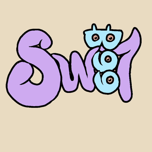
This is just one of the iterations I made on this logo for a friend but did not get to finalize it because the name was unfortunately already been taken. The colors I used here are random as I was sill doing some drafts. I chose this color palette because I think they are literally sweet if that make sense. On the contrary yellow or orange might have worked what do you think? If I remember it right this is for a pastry side hustle and my friend said something about sweet and that was it. For what its worth I still am loving this logo that I created. The shape and feel of the font and the word Bee I think it is cute and sweet.
To my followers they already know that I am using my phone mostly in creating my digital art. This logo is made using my iphone and a drawing app. It is quite difficult because the screen I am working on is too small to execute my ideas on but the passion and willingness to be of help is what keeps me going.