Hello, Have a nice day
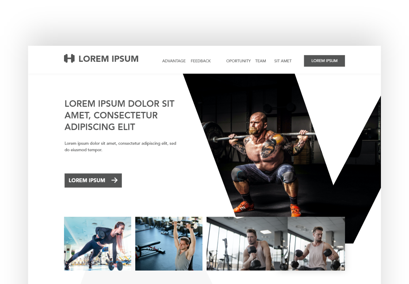
today I want to share an exploratory design about the gym website. Before the explanation begins, please see the design below

The theme of this design is to maximize white space so that the photos provided can be viewed more freely. where it is hoped that the audience will be able to focus more on the images provided to support the given conversion rate. It is also expected that the audience can press the CTA button that directs them to the desired action.
Currently, there are many gym websites that use dark themes to make them look cooler and more professional. I personally am also very interested in such a themed design. but this time why not explore a little so that the website design looks more professional.
for the image to use, of course I got it from free stock images on pexels, and unsplash. thank you for the contributors that I cannot mention one by one. Today's websites really need such a stock treasury, in order to maximize the ideas they want to convey.
Regarding this design, if any of the hivers want to continue it or use it as a web design preference, you can contact me or download it at the link below (adobe xd format) :
https://drive.google.com/drive/folders/1bXM7E8Ijwj704WCaUS2QS333zE0yAcQ3?usp=sharing
thanks for reading, see you next time