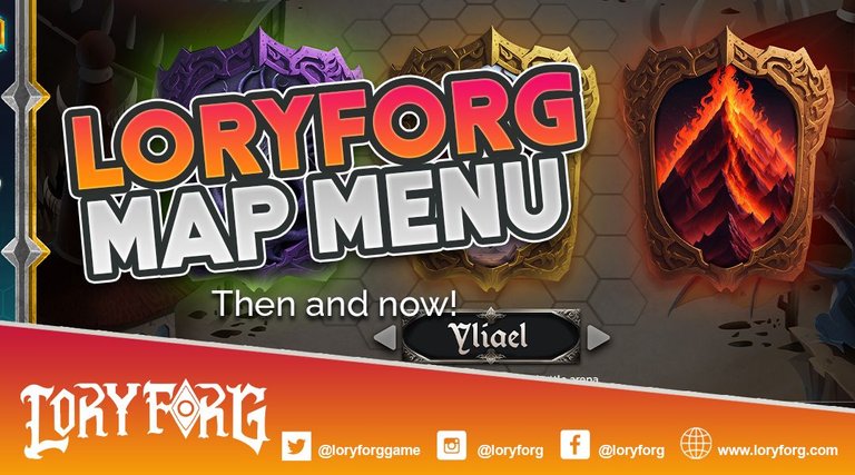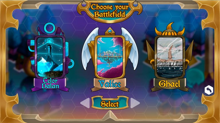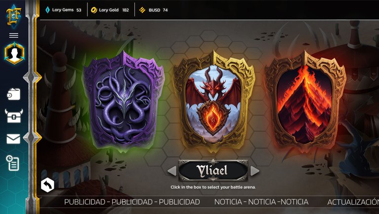
Hello dear community, today we show you part of the progress of the development of LoryForg. Specifically in the map selection menu, a section of the interface that has the function of allowing the user to choose their favorite battle arena before starting a game, below we leave the comparison between before and after.

This is the design we created during the early stages of development:


Ahora recientemente finalizamos este diseño para la fase final:


Tell us, which one did you like the most? leave us a comment below.
Follow us in our Discord group and be part of the LoryForg community, a new TCG on the blockchain that is here to stay.


