ESPAÑOL
Saludos Hivers…
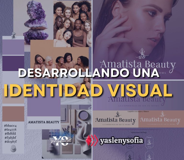
Hoy vengo a compartirles el proceso que llevo realizar un logotipo para el emprendimiento de una prima, la cual seria mi clienta, en conjunto a toda la nueva identidad visual que tendría su página de Instagram y Facebook, siendo sincera porque es un gran desafío que enfrentaba por primera vez, pues realmente yo no estudié nada vez con el diseño gráfico o carreras similares, aunque de la que me gradué si me enseñaron como que las bases, vi dos semestres de diseño gráfico, pero no era como muy profundos. Sin embargo, lo que sé hasta ahora a sido gracias a otra prima, que quien es a la que también le trabajo, por ello sentía mucha inseguridad, pero ella me apoyaba y me decía que cualquier duda, le comentara y así, sin más que decir, les dejo todo el proceso.
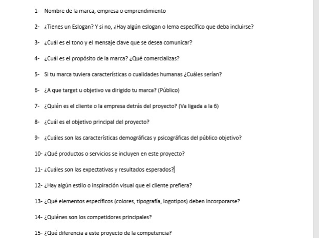
Lo primero fue buscar en internet e instruirme de otros de ver por donde se empieza, apareciendo que hay que hacerle una serie de preguntar al cliente, para conocer de que se trata la marca, a donde quiere llegar, qué quiere transmitir, por lo que manos a la obra, hice las respectivas preguntas, las cuáles fueron las siguientes:
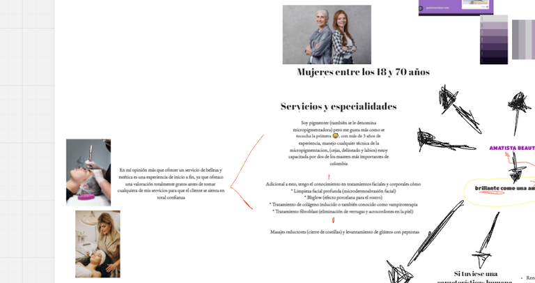
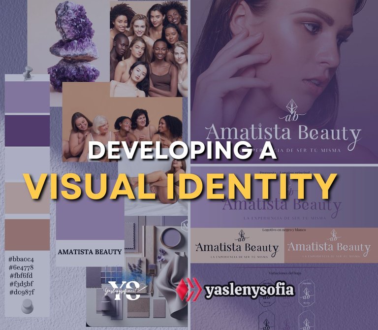
Algunas si las respondió, otras las dejo muy al aire, pues ella tampoco tenia claro su misión y visión (algo que tuve que ayudarla), pero con las respuestas, empecé hacer una lluvia de ideas y para ellos me ayude de la página Miro, que permite gestionar proyectos y plasmar todo ahí, así que adjunto capturas de pantalla de todas las ideas que iban surgiendo, que si imágenes para referenciar las paletas de colores, diferentes eslogan pues el que tenia ya no le gustaba, aunado que incluso ni parecía eslogan. Con esta lluvia de idea, le comenté si quería una paleta de colores monocromática o de dos tonos, ella al inicio me mandó imágenes de tonos de morados que quería, pero que no estaba segura; cuando vio las imágenes se decidió entre morados y tonos nudes, ya que antes tenia la cuenta monocromática y no le agradaba.
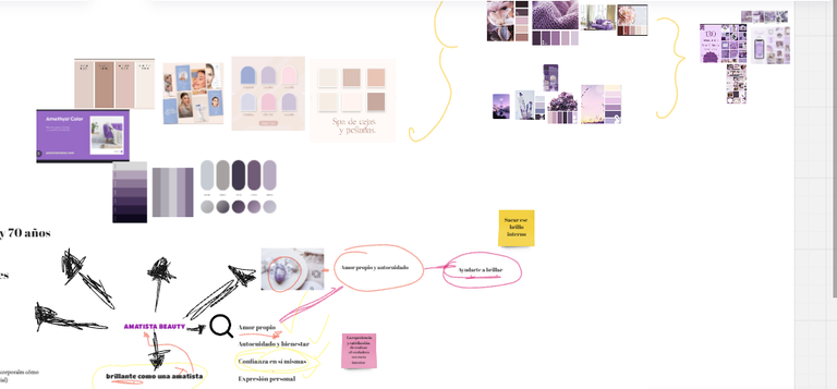
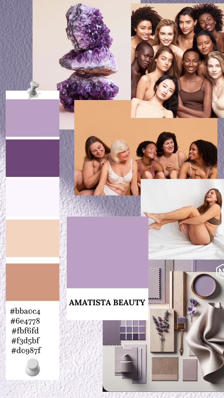
Con esto en mente, en Canva, comencé hacer el moodboard, que es como un collage, como imágenes de referencia, colores, y tipografías para representar esas ideas o conceptos de la marca y con esto ya teníamos la paleta de colores definido y, así proceder con el logotipo.
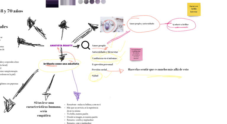
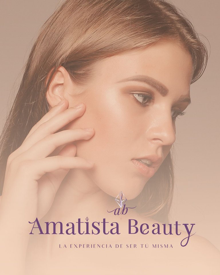
Ya la cliente me había recalcado que el logotipo debía ser sencillo, muy minimalista, por lo que me enfoqué en buscar tipografías que transmitiera su concepto, no fue sencillo, fue como un ensayo de prueba y error, hice varias versiones, ella es pigmenter, y la marca debía simbolizar a ese amor por si misma, y el nombre de esta marca es Amatista Beauty, no supo especificarme el porque lo de Amatista, solo que, para ella, esa piedra, simbolizaba esa autoaceptación y de ahí empecé a partir. Busque dibujos de la piedra, jugando con las formas de la letra, le pedía consejo a mi prima, la cual me decía que no me complicara mucho con formas y eso.
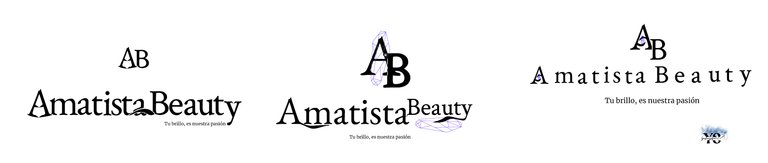
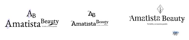
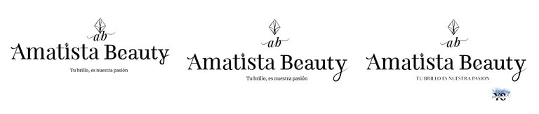
Al final, para la forma de la piedra, me guíe de un dibujo que es como que la piedra más pequeña y la simplifiqué en líneas. A la tipografía solo le hice pequeñas modificaciones, usando la de Playfair Display, incluso a la i, le puse la misma forma de la piedra, es decir, en vez del puntito, era la piedra; asimismo, además de la forma de la piedra le agregué las iniciales: “ab” en cursiva de la misma tipografía.
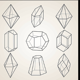
Imágenes de referencia para la forma de la amatista
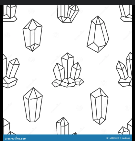
Otra imagen de referencia
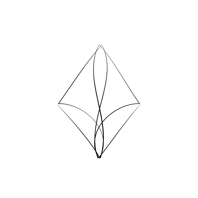
La forma final
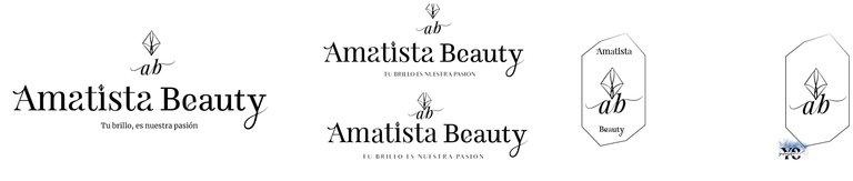
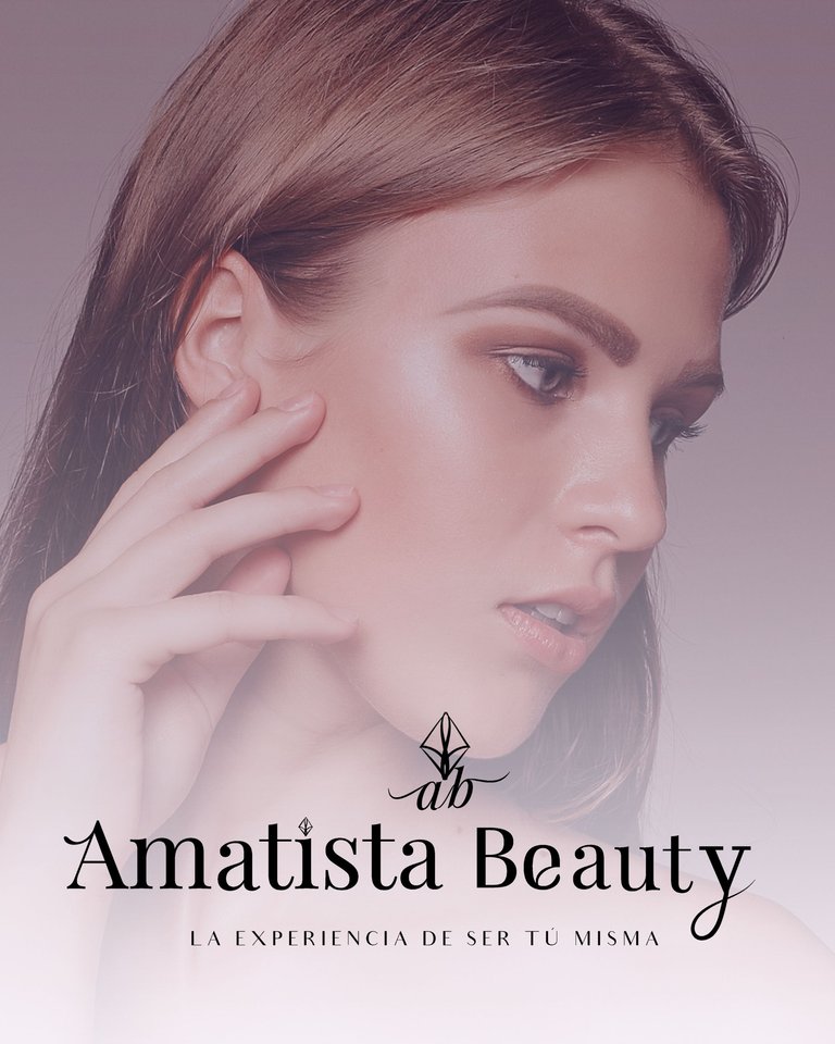
Les anexo como es la tipografía, más como quedó el logotipo, el cual tiene cambiado el eslogan, por decisión del cliente. También le pasé el brandboard, que es como la versión reducida del manual de la marca, que si el logo principal y en formato blanco y negro, además de las variaciones, asimismo cual es la paleta de colores y la tipografía principal y secundaria y el logo reducido, al final, le pasé el logotipo completo, en jpg y png, y el logo si la parte de la forma de la piedra y de las iniciales a y b, en formato en jpg y png.
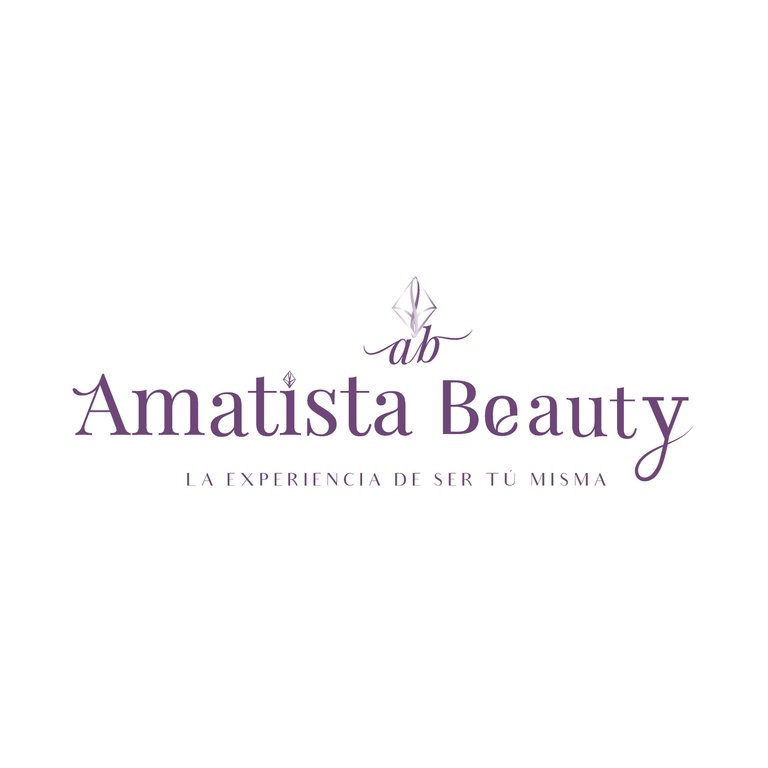
Logotipo final
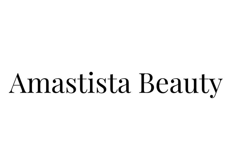
La tipografía sin modificaciones.
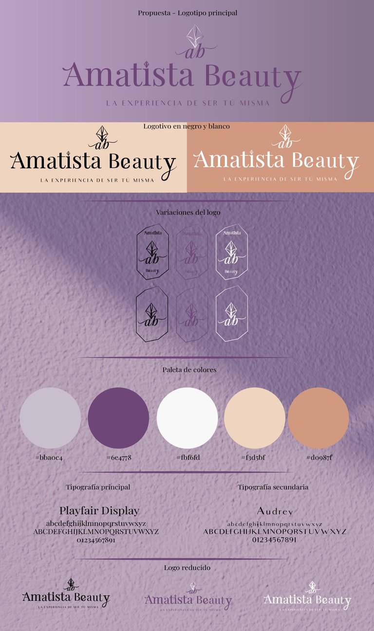
Brandboard.
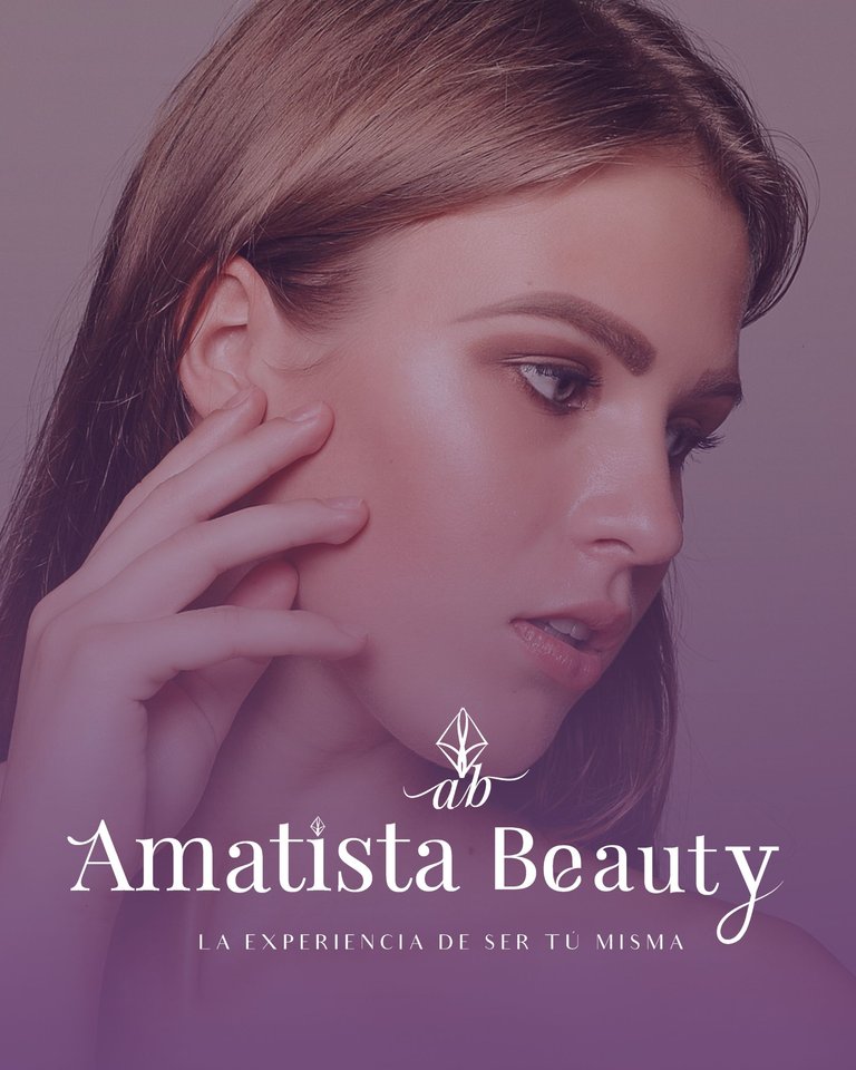
Sé que tengo fallas y en la presentación más, pero me encantó poder disfrutar este proceso y que poco a poco voy aprendiendo. Ah, también me contrató para que manejara sus redes sociales, en el cual acordamos que las publicaciones se hicieran en formato domino y para ello le hice una pequeña muestra de cómo se verían en esa forma y le terminó gustando. Quiero saber sus opiniones.
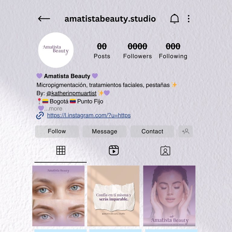
como se vería el perfil
Gracias por leer mi post. Espero que les haya gustado. Estaré atenta a responder sus comentarios. Pueden visitar mi blog, seguir mis contenidos y redes sociales.
FACEBOOK / INSTAGRAM / TWITTER
ENGLISH
Greetings Hivers…
Today I come to share with you the process that I took to make a logo for the enterprise of a cousin, which would be my client, along with all the new visual identity that would have its Instagram and Facebook page, being honest because it is a great challenge that I faced for the first time, because I really did not study anything with graphic design or similar careers, although the one I graduated from if they taught me as the basics, I saw two semesters of graphic design, but it was not as very deep. However, what I know so far has been thanks to another cousin, who is the one I also work with, so I felt very insecure, but she supported me and told me that if I had any doubt, I should tell her and so, without more to say, I leave you the whole process.
The first thing I did was to search the internet and learn from others to see where to start, it appeared that you have to ask the client a series of questions, to know what the brand is about, where you want to go, what you want to convey, so hands to work, I made the respective questions, which were as follows:
Some of them she answered, others she left up in the air, because she was not clear about her mission and vision (something I had to help her with), but with the answers, I started brainstorming ideas and for them I used the Miro page, which allows you to manage projects and capture everything there, so I attach screenshots of all the ideas that were emerging, whether images to reference the color palettes, different slogans because she did not like the one she had, even though it did not even look like a slogan. With this brainstorming, I asked her if she wanted a monochromatic or two-tone color palette, she initially sent me images of purple tones that she wanted, but she was not sure; when she saw the images she decided between purple and nude tones, since she had a monochromatic account before and she did not like it.
With this in mind, in Canva, I started making the moodboard, which is like a collage, as reference images, colors, and typographies to represent those ideas or concepts of the brand and with this we already had the color palette defined and so proceed with the logo.
The client had already told me that the logo should be simple, very minimalist, so I focused on finding fonts that conveyed her concept, it was not easy, it was like a trial and error, I made several versions, she is a pigmenter, and the brand should symbolize that love for herself, and the name of this brand is Amethyst Beauty, she could not specify why Amethyst, only that, for her, that stone, symbolized that self-acceptance and from there I started to start. I looked for drawings of the stone, playing with the shapes of the letter, I asked my cousin for advice, who told me not to get too complicated with shapes and so on.
In the end, for the shape of the stone, I was guided by a drawing that is like a smaller stone and I simplified it in lines. I only made small modifications to the typography, using the Playfair Display typography, including the i, I put the same shape of the stone, that is, instead of the dot, it was the stone; also, in addition to the shape of the stone I added the initials: “ab” in italics of the same typography.
Reference images for amethyst shape.
Another reference image
The final form
I attach the typography, plus the logo, which has changed the slogan, by client's decision. I also passed the brandboard, which is like the reduced version of the brand manual, which if the main logo and in black and white format, plus the variations, also which is the color palette and the main and secondary typography and the reduced logo, at the end, I passed the full logo, in jpg and png, and the logo if the part of the shape of the stone and the initials a and b, in jpg and png format.
Final logo
The typography without modifications.
Brandboard.
I know I have flaws and even more in the presentation, but I loved being able to enjoy this process and that little by little I am learning. Oh, she also hired me to manage her social networks, in which we agreed that the publications would be made in domino format and for that I made a small sample of how they would look in that way and she ended up liking it. I want to know her opinions.
what the profile would look like
Thank you for reading my post. I hope you liked it. I will be attentive to answer your comments. You can visit my blog, follow my content and social networks.
FACEBOOK / INSTAGRAM / TWITTER
Posted Using INLEO