I started this post almost twelve hours ago at around 7:30 am this morning. Now it is 8 pm and we're waiting for pizza delivery. That doesn't happen very often around here and I'm looking forward to it. Usually, I make my own pizza but recently I put Lazy Joe, my sourdough starter, to his grave (a.k.a. drain). Fruit flies found him so yummy they laid eggs and one morning when I lifted the lid - worms. Yukkedy Yuk! I did de-hydrate a bit of him a while back so once we are back from our soon-to-happen vacation, I'll try to re-hydrate and see if I can nurture Lazy Joe's baby - ahem - so to speak.
Anyways, so here I am waiting for pizza and writing this blog post which I started hours ago. Between the start of it and now I had breakfast, a massage, a dentist visit (unpleasant and still numb) and a pedicure. Looks productive but I feel like a wasted a Saturday. Oh well - life.
What I really wanted to write about are some pictures I took not too long when hubby and I went on a bicycle ride on the Columbia Trail. I already shared a few photos previously. But this post here is about
Would you choose the color or the monochrome photo?
I put them side by side below. All of them are taken with my iPhone and imported, slightly edited in Lightroom. My personal preferences are noted by bold/italics below.
| 1A | 1B | |
|---|---|---|
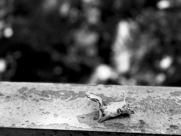 | 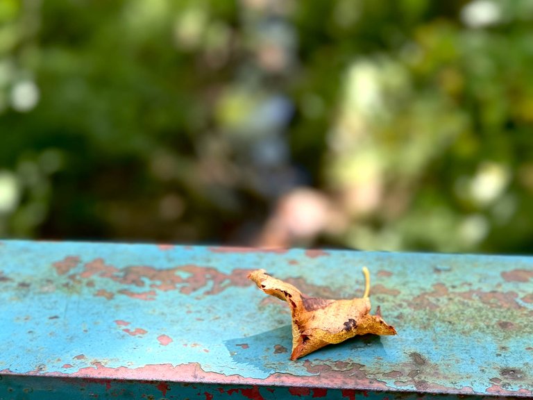 |
In the b&w version the little dried leaf gets pretty much lost among the rust of the same color on the fence i.e. there was no way for me to make it stand out in monochrome.
| 2A | 2B | |
|---|---|---|
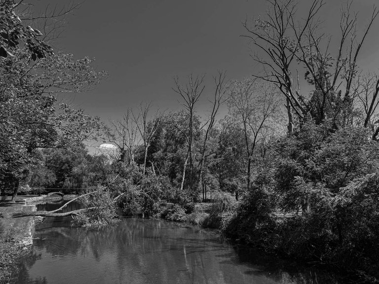 | 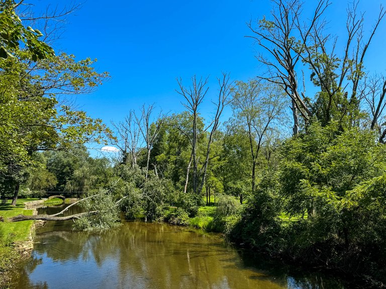 |
Not a good photo to begin with and I again prefer the color version. The monochrome one is just to busy in the background/subject.
| 3A | 3B | |
|---|---|---|
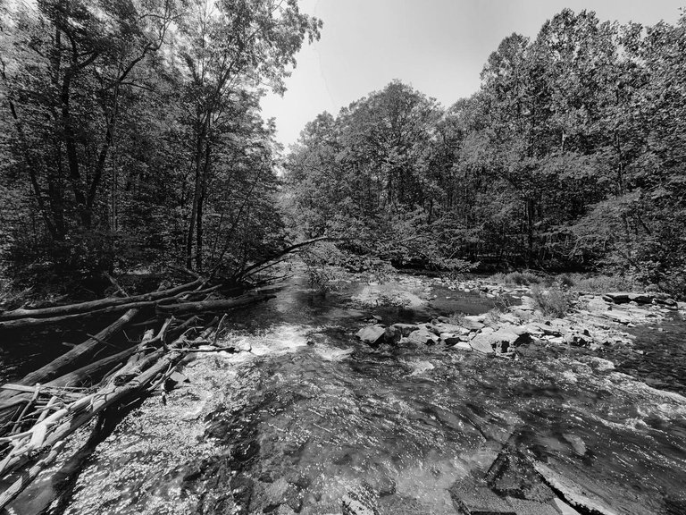 | 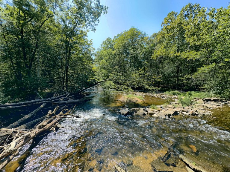 |
Hmm, I am seeing a pattern here. I again prefer color, the photo overall is just very busy and in the monochrome version the trees in the water and the white water just doesn't stand out enough.
| 4A | 4B | |
|---|---|---|
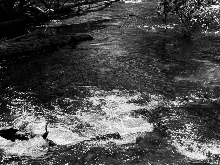 | 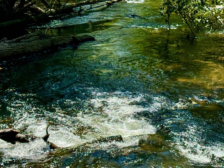 |
Finally, a photo that I prefer in monochrome although the color version is interesting with the yellow, green water reflection. But I do like the white water and dark water in the monochrome.
| 5A | 5B | |
|---|---|---|
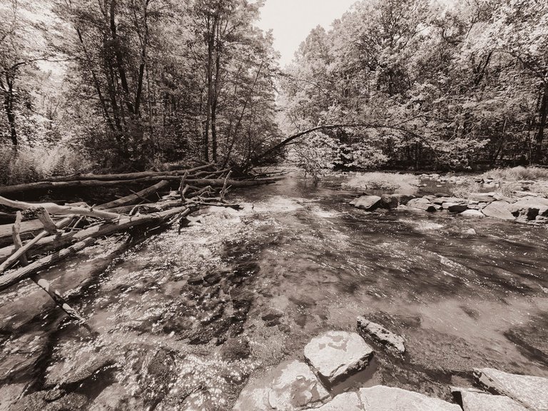 | 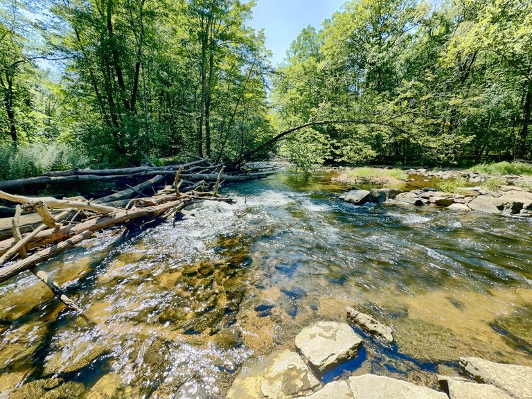 |
This one is pretty close. I do like the clear water in the color version but overall I like the vibes of the sepia tone monochrome photo slightly better.
Pizza got delivered - hurry!
| 6A | 6B | |
|---|---|---|
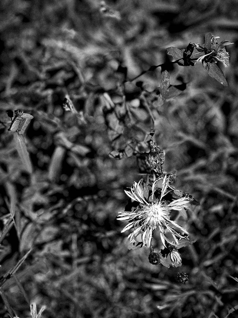 | 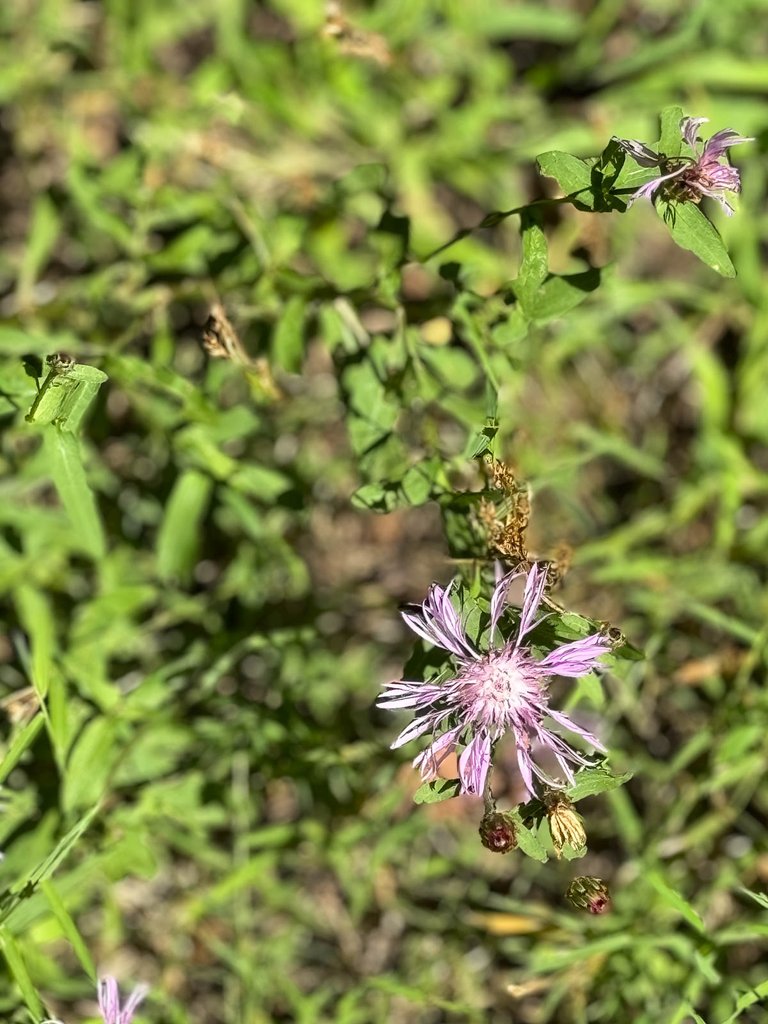 |
This is almost a tie for me, no, actually it is a tie. Due to the blur the in focus flower separates nicely from the background in both photos. So despite the business of the background I also like the b&w version.
| 7A | 7B | |
|---|---|---|
 |  |
I will leave this one to the beer drinkers on Hive. I simply wanted to demonstrate that despite 3-4 beers looking very similar, they are very different also in monochrome.
Now I need to go and eat pizza. Bon appetit!
Till next time!
Have a great rest of your day!
Cheers,
(Ocean)Bee


On #1, I agree with you. The color is needed.
On #2 & #3, though, I like the monochrome, because I love the way the sky looks in them. Plus, the colors are typical of what you would see.
On #4, I prefer the color version, because it is different than the typical you would see.
On #5, I'm torn, but mainly because sepia isn't something I like as much. I could go either way.
#6 could go either way, too. I like the color, but for some reason that monochrome makes it look so different and that flower stands out better.
#7, I like the monochrome, because it makes it look so much different than the original. I'm not a beer drinker, so maybe my vote doesn't count on this one.
The sky in 2 and 3 is really even or flat, right? It was a beautiful late summer day with very clear skies.
#4 that's true and I agree on sepia, hardly ever use it but it fit better here than no tone.
Beer - hahaha, me neither, still, our votes do count!
I hope you are doing well, haven't seen a post from you in a while.
Yes, but when you made it monochrome, it looked more interesting.
I'm doing well, just busy, busy, busy. I think being busy is good, because you know that you are still needed!
I like most of the black and white over the color here, but that may just be my mood or something. The 3 and 4 photo ones the black and white looks way cooler than the color IMO. They give more focus on the shadows that play over the water and bring more of your attention to the flowing water than other elements. The color photos are good for sure but for these I prefer the black and white :D
Edit
That also sucks about your sourdough! Extremely gross. Do you have to leave it out in the air for it to work it’s magic? I’m not the best with yeast and dough stuff.
I think you got that right. A lot depends on the mood we're in when we look at photos and also the devices we watch them on. Last night I looked at the photos on my iPhone screen, and they were so small it seemed to matter a lot less how busy they were.
The sourdough starter was entirely my fault. Yes, it lives and needs everything from the air and water to thrive but if you're not using it you can tighten the lid and also put it in the fridge. I basically neglected it during a fairly warm and fruit fly heavy week until it was too late.
I prefer colour over black and white mostly!
Totally understandable. It's very subjective. I simply love that we do have the possibility to choose between both on a whim, unlike at the beginning of photography.
Such a diversity of photos and I think that the monochrome variant ads some mystery to them. The mind can even interpret in a different way what it sees...
Thank you, diverse describes pretty well what I am doing (in art) 😀. I agree, oftentimes the omission of colors actually adds to a photo's essence. Quite brilliant how that works.
@oceanbee, I paid out 2.233 HIVE and 0.439 HBD to reward 4 comments in this discussion thread.