Farming Tales is an NFT-Game, and their devs have been working hard on their User Interface redesign, which is rumored to be launching soon. I’ve been lucky enough to get a few screenshots of what they’ve been working on, which I’ll share later in this post -- I'm thrilled that they’ve made it smoother, clearer, and more legible.
That said, (without stepping on any toes...)
I’d love to share some UI ideas that I’d like to see...
...explored & considered in Farming Tales, sometime in the future.
Me offering UI ideas isn’t too uncommon, a few months ago I did a comprehensive redesign of PeakD’s user-interface, which led to an interview with PeakD’s founder, and it felt good because they saw some value in my UI feedback.
This time, I was inspired to do a quick redesign of Farming Tales’ UI.
(As mentioned above, FT has a new user interface launching soon I believe, so I don’t expect them to turn around and re-do everything just because I had some ideas. But the main ‘points’ and ‘concepts’ I’ll be exploring apply to any interface, since they’re mostly core foundations of good UI design, and even if some of the specifics aren’t appealing, the concepts I’m covering can still be applied in their own way, on their own time.)
Also, I’m not the world’s best UI-Designer, but I do have many years of experience, and I believe there’s value here.
With that out of the way, let’s dig into it. First up, let’s look at Farming Tales’ main in-game screen, specifically their menu and heads-up display.
My priorities while Photoshopping this were:
- Visual Clarity
- Minimal Screen Real-Estate
- Maintaining the ‘cute’ Farming Tales ‘vibe.’
Here’s the before-and-after:
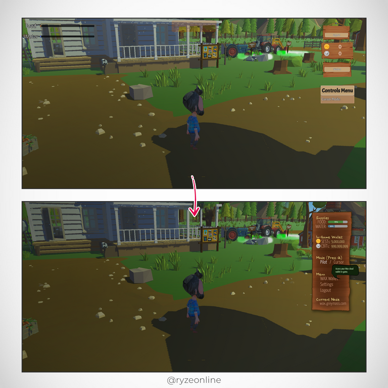
You’ll see the wooden-plank sidebar in the ‘after’ version is much more refined and polished.
Some of the changes include:
- For visual clarity it’s a single panel, so the user knows ‘this is where important info & interaction is located.’
- The food/water heads-up display has been relocated onto this panel, with a clear label (‘Supplies’) and percentage markers so the user knows how close they are to re-filling.
- Next we have the ‘In-Game Wallet’ (another important label, since the game requires a ‘Wax Blockchain Wallet’ as well as an in-game wallet to play it properly. The SEST & CBIT currency icons are also labeled with text in a legible font, and have room for almost a billion tokens held in each.
- Next we have the ‘Mode’ section, telling the user clearly that the ‘Q’ button toggles between ‘Piloting’ your character mode, or ‘Cursor’ & Menu Navigation mode.
- Next we have the game’s menu-options such as ‘Settings’, ‘Logout’, and most importantly, access to the players ‘Wax Wallet’ (as opposed to their in-game wallet)
- Wrapping it up is the ‘Current Node’ section. It used to be a translucent box that sat overtop the in-game scenery, which heavily distracted from the beauty of the game in my opinion, so I moved it to the bottom of the sidebar, where it’s clearly an interactable option that users are welcome to change as they like. It can also have a tool-tip on hover to explain what it is to new users.
- Each section is labeled in yellow so the user will become familiar with the visual hierarchy of ‘yellow’ denoting sections, categories, or secondary things like currencies.
- Each text or button option is ‘sand’ colored when static, and glows yellow when ‘hovered’ or highlighted, and is white when ‘active’ or ‘currently selected.’
- The body font is clear, legible, and ‘narrow’ in order to fit longer words or text if necessary, while the heading-font or accent-font is cute & friendly to keep the Farming Tales vibe.
- The whole panel is edged clearly with a border, has light halo’ing the edges, and fading to a darker would in the middle in order to make the menu options, info, and text ‘pop’ enough for the user to realize it’s importance and to keep it legible at a glance.
- A drop-shadow was also added to it for similar reasons.
- We also have ‘tooltips’ to help newcomers learn the game and as reminders for veterans.
- Lastly, I added a very subtle vignette on the viewing window (this isn’t really necessary, I’m just oddly obsessed with vignettes and think they add a lot to game environments as long as they’re extremely subtle.)
Whew. That was a lot of tweaks made to the Farming Tales main in-game menu and HUD. I hope you like it, and I hope it inspires or sparks some ideas in the @farmingtales team if they end up seeing it. Let’s move onto the second screen I changed, the ‘Build & Harvest’ Farm Grid screen. Here’s the before-and-after:
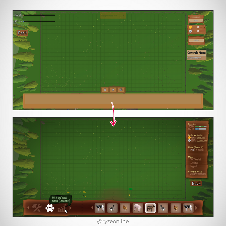
You’ll see the original Farming Tales Build-And-Place UI has been replaced by a ‘wooden-plank’ hotbar keeping the theme of the game’s main-menu.
My idea for a hotbar has:
- Instead of two bars cluttering up the screen, everything’s been combined into a single, intuitive bar.
- Action-Buttons are on the left side of the bar, and there’s room to add more actions, or even scroll through actions if more actions are added in the future.
- Like with the other menu, ‘inactive’ actions are ‘sand’ colored, while ‘currently selected’ actions are white.
- Once a user selects an action, the action’s corresponding options appear in the ‘Option-Bar’, which is the right-half of our wooden ‘hotbar.’ This follows the convention of ‘click something on the left, then options pop-up to the right,’ similar to how we’d read a book.
- Again, we have tooltips popping-up whenever an icon is hovered-over, helping newbies understand the ‘build’ button, ‘animals’ button, or even the (unavailable) ‘boost’ button.
- The option buttons are placed in rounded button-containers, sand-colored with soft inner-glows, and once one is selected it highlights in white, sticking with the visual convention used in all other menus.
- Both the left ‘action’ section of the hotbar and the right ‘options’ section of the hotbar feature scroll arrows (and could even add a ‘scroll bar’ if necessary), to accommodate a growing game like Farming Tales.
- As well, the farm’s ‘entrance’ is clearer with a dirt-path showing footprints, so users can tell where they are and how far they’ll have to walk to their buildings. This helps the user avoid placing buildings very far away when they’re first starting out.
- One tiny change is to move the ‘back’ button next to the by-now familiar side-bar menu.
- Lastly, we have a vignette, less subtle this time, to help guide the user's eyes to the important ‘build-and-place’ grid, and avoid them getting too caught up in noise, clutter, or scenery.
Overall these UI changes should make for a cleaner, easier, smoother, friendlier, more intuitive, lower-friction experience for gamers new and old.
So there you have it, some Photoshop work, some copywriting, some UI foundations, all assembled with the hope of inspiring the Farming Tales team for possible tweaks in the future. They’re already doing such a great job, but extra ideas can’t hurt, right?
Anyway, here’s a sneak peek at a couple other screens they’ve been working on:
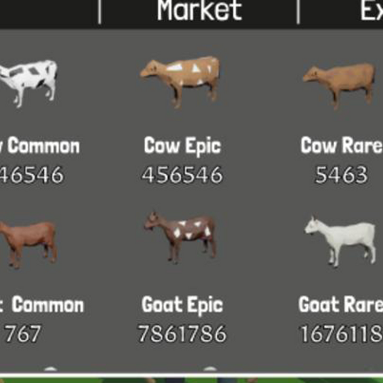
I love that they chose a bolder, more legible font and a more neutral 'grey' for the background, and a darker, more charcoal grey for headings, so that they pop and the user knows exactly what they're dealing with. Huge improvement on the previous UI.
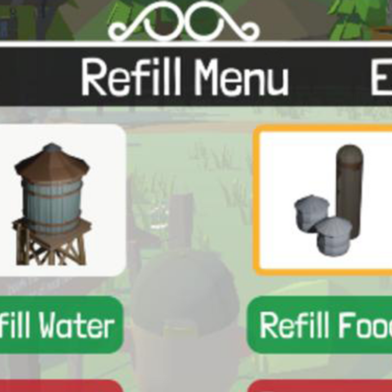
In the shot above, we can also see some nice 'farm-style' ornate detailing on the border of the window. Which I like, so I'm looking forward to seeing what else they release for this next iteration.
I love it when games and apps actively work on their UI, since it’s something users interact with constantly and has a major impact on game-feel. These screens are already leaps and bounds better than the early version of Farming Tales I played, and I’m super psyched for their new UI to launch.
Will some of my ideas be implemented in FT one day? Maybe, maybe not. All I know is I had lots of fun writing this and playing in Photoshop.
Anyway…
What do you all think? Have you played Farming Tales original UI? Have you seen the new one they’re about to launch? Do you think some of my ideas will make it into the game in some form one day? Perhaps you have some UI ideas of your own?
Either way, thanks so much for reading, skimming, sharing, or commenting, and wishing you a great day!
Want to see my other two posts about Farming Tales?
- 5 NFT Games To Watch (That Aren't Splinterlands)
- How To Play & Earn In This Hot New NFT Game: Farming Tales
- Farming Tales & The Power Of Passionate Dev Teams!
Images courtesy of NFT-Game, FarmingTales.io & Envato.com
After reading your post your UI things have also become my UI things that I would love to see :)
!BEER
!LUV
!PGM
@tipu curate
100 PGM token to send 0.1 PGM three times per day
500 to send and receive 0.1 PGM five times per day
1000 to send and receive 0.1 PGM ten times per day
Discord
Support the curation account with a delegation 10 HP - 50 HP - 100 HP - 500 HP - 1000 HP
🙏
(2/5) gave you LUV. H-E tools | connect | <><@libertycrypto27
🙏
Upvoted 👌 (Mana: 46/66) Liquid rewards.
Haha, I love it, more encouragement for these ideas! I'm glad they're documented for the dev team to think about and explore when it suits them, thanks for your comment (and beer, luv, & pgm!) :) 🙏
!discovery farm
Yay! Thanks for the discovery! Farming Tales rocks! :) 🙏
I really don't know anything about UI, and I'm not all too familiar with the game. But I love graphics and I see what you did with the one bar, it's very presentable and it's quite easy to just concentrate on that alone instead of looking around.
I don't even know what I'm saying, lol. But then I couldn't help leaving a comment.
I hope they like your design and make the proposed changes.
Nice one Ryze! ❤️✅
I'm touched and grateful that you'd leave such a nice comment despite not knowing much about UI or Farming Tales, you rock! Yes, I did my best to make it "draw the user's eye" so they'd know what to interact with and focus on, I'm happy you noticed! I hope they find some value in it too, thanks again, wishing you a great day! 🙏
I'm sure they'll find value in it. Like you said, you always help others Ryze, they'll surely Ryze up to the occasion and follow your lead.
Great job @ryzeonline , you're doing pretty great.
Well it's 2am over here but thanks anyways 😂❤️..have a great day too!
(grin) I do indeed hope that's the case. PeakD interviewed me about my redesign of their app but seem to be taking their time on implementation, lol ;)
Thanks for the kind words and vote of confidence. And lol, ok, wishing you a great night then! 😂❤️🙏
😁🙌🙏
Great post bro! How do you think, interface changes will help game coins to growing?
Thanks @purishev , I appreciate your kind words. And that's a great question! I believe that as games refine and polish themselves, they increase their value and mass appeal, so they're extremely likely to grow, but it won't be 'instant' growth. What do you think? 🙏
you made a good point in the game, there are really a lot of buttons that need to be redone. This is especially inconvenient when buying animals. Once it happened that I wanted to buy one animal. It should be a goose but I missed and bought a cow accordingly. I lost a lot of money, so it is necessary to redo these buttons and improve the interface, but at the moment I think that this is not a primary task. the most important task for developers is to attract new players, implement token burning mechanisms, and release a new update. Maybe it should attract a lot of players. If you know, at present, most players in this game generally play using a special taco application and do not go into the browser version of the game
Yes, you're right, the devs probably have more important things to do, that's why these are just ideas, documented for the future.
I've heard of the taco app, but I've never used it. When I play a game, I just 'load the game' and play. If a game needs a separate app, that many people haven't heard of, is that a good thing, lol :) I wonder.
Anyway, it's all good, it's a fun game, and people are enjoying it. Most games love it when fans contribute ideas, so... I contributed mine :)🙏
Your content has been voted as a part of Encouragement program. Keep up the good work!
Use Ecency daily to boost your growth on platform!
Support Ecency
Vote for new Proposal
Delegate HP and earn more
Hooray! I always love when I get encouraged like this, thanks so much! 🙏
This post was shared and voted inside the discord by the curators team of Discovery-it in collaboration with FarmingTales community.
Discovery-it is also a Witness, vote for us here
Create and Share your posts in the FarmingTales community
#honored ty ! 🙏
;)