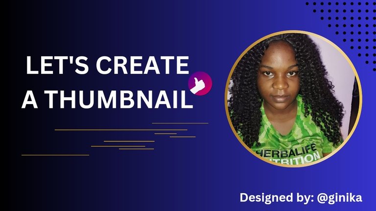
Actually before our meeting last Sunday, I have always created my thumbnail design using either YouTube thumbnail, flyers, Facebook thumbnail or Instagram thumbnail, just any unique design I can find on canva. I never thought of creating my own thumbnail until task 5 surfaced.
@olujay was kind enough to explain the criteria as regards to creating of thumbnails such as the size, use of designs, elements e.t.c. As a result of the lectures we had some questions that were given to us in order to certify how well we understood all that he taught us last Sunday. My partner for this week is @aunty-tosin.
Question 1: With your own understanding explain what you understand by "thumbnail". Hence, discuss why they have to be stunning and of what importance it is in relation to creating content.
Thumbnails are images that give readers or viewers an idea of what a content or post is all about. Your thumbnail has to be stunning in order to attract more readers to your post. It is very important because a good thumbnail will attract lots of readers to your post while a not too good thumbnail could push readers away from your post. In order words make sure your thumbnail reflects what your post is talking about.
Question 2: What are the dimensions in relation to creating a thumbnail? What is the general size(or dimensions) for a thumbnail, and explain why it is so?
The dimensions in relation to creating a thumbnail is the exact height and width of the thumbnail. That is why we are advised to use the YouTube thumbnail because its width is 1280 and its height is 720(1280×720). This size accommodates your write up and design making your design visible. It's easy to upload.
Question 3: For this task, create two thumbnails. Use one as the main and provide the other in the post. Both images should be different but yet relevant to the post. Hence provide a step by step explanation on how you achieved each.
Let me show how I made my first thumbnail using canva…
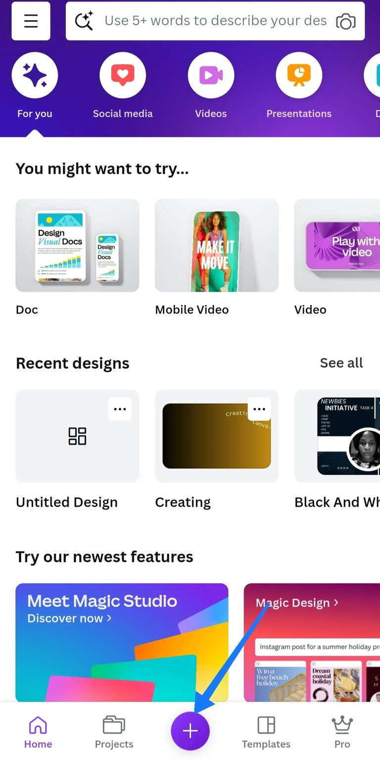
Step 1: Open the canva app. You find the plus sign below 👇 click on it.
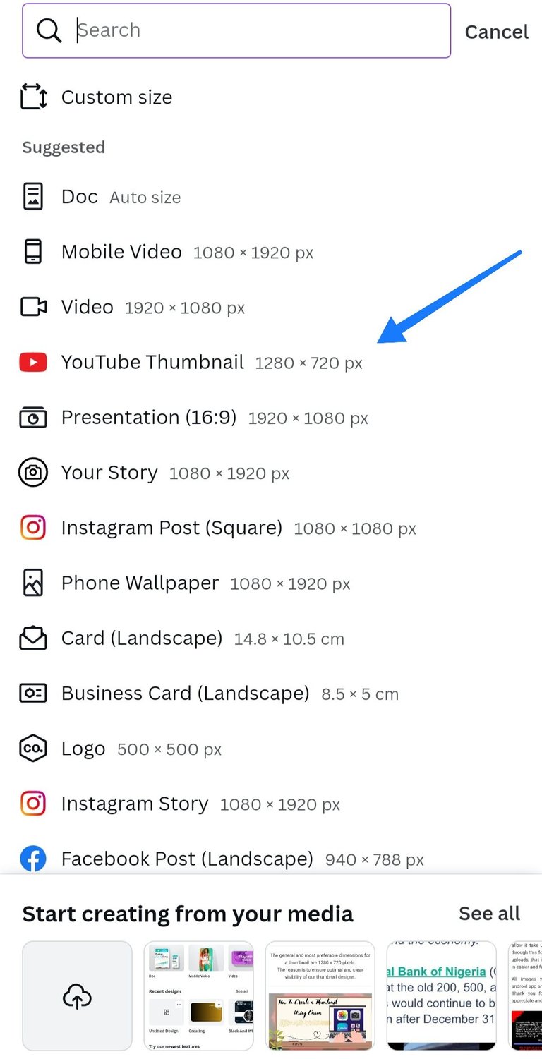
Step 2: Scroll down to YouTube thumbnail and click, it will take you to a plain page.
Plain page 👇
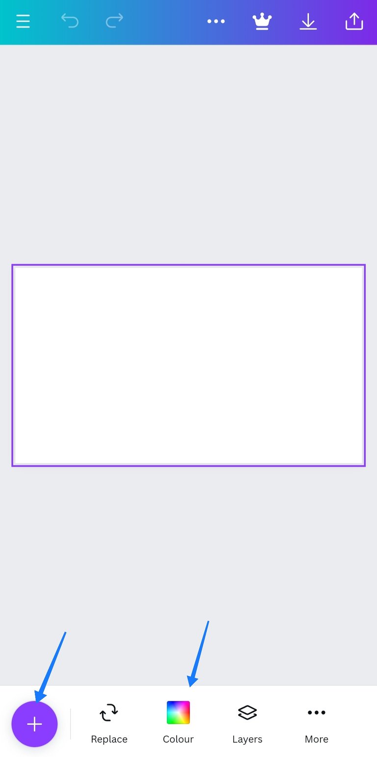
Step 3: Click on the rectangle shape, below it you will find the colour section. Choose your preferred background colour.
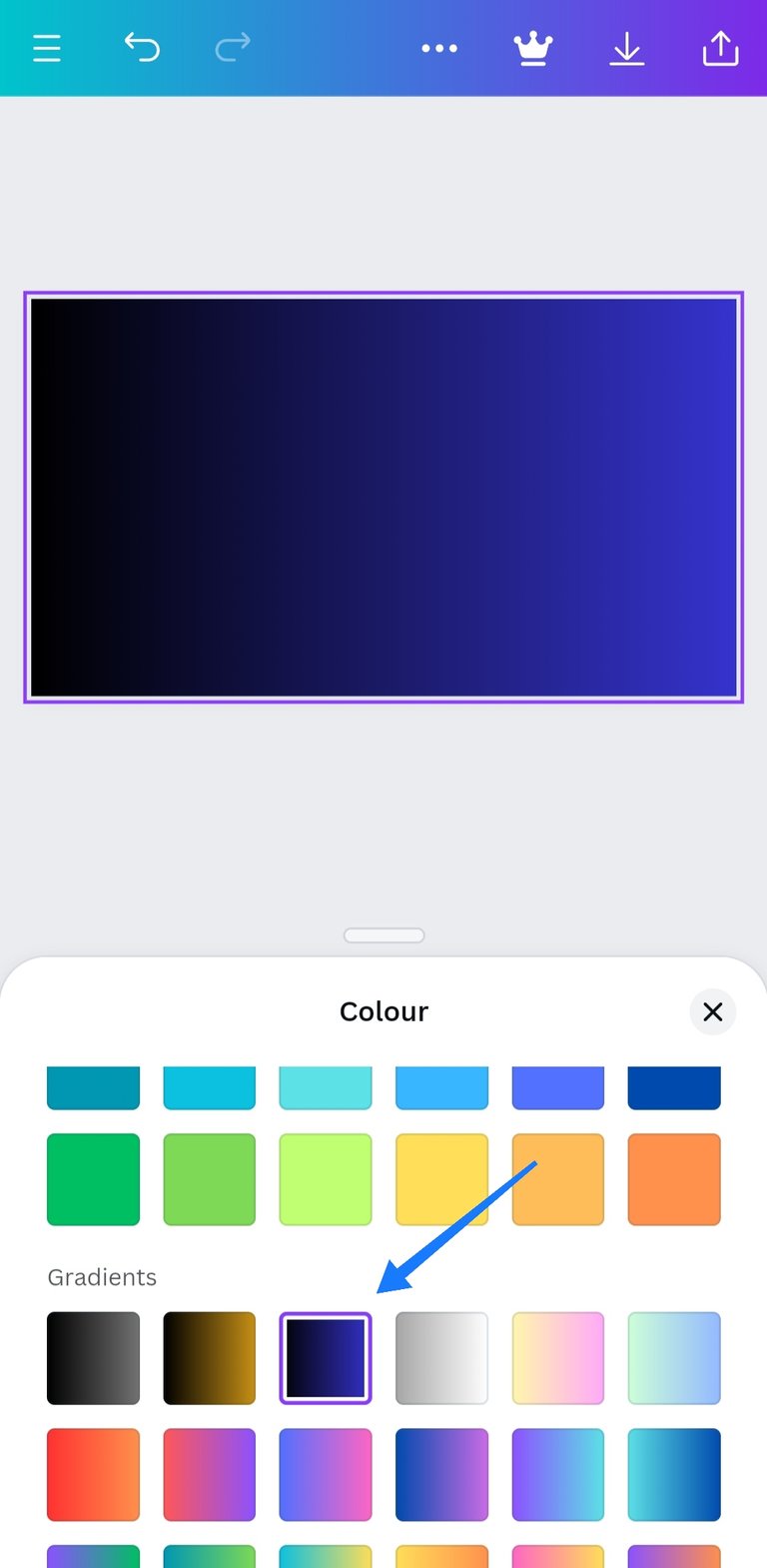
Step 4: Click on the plus sign below 👇
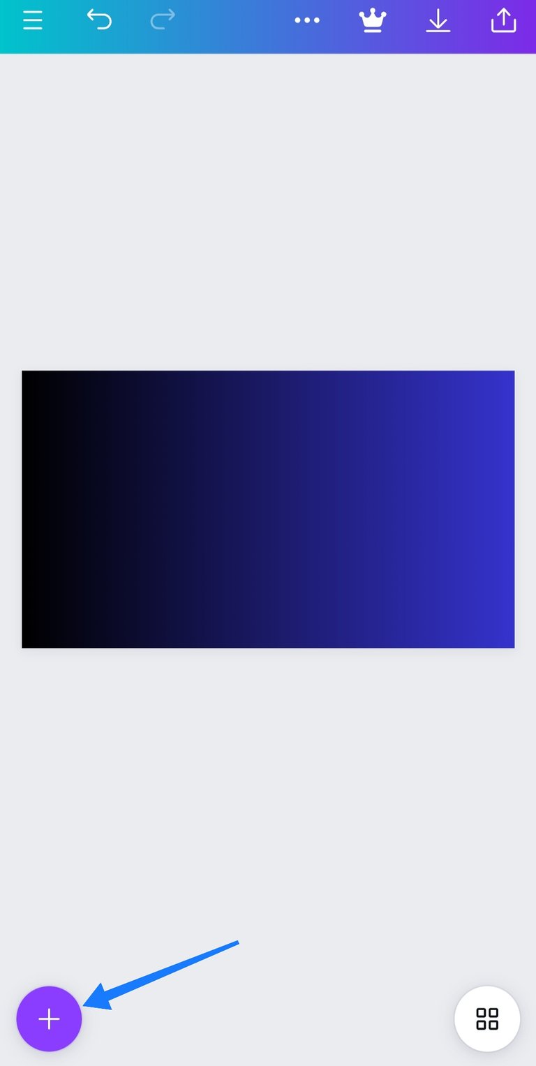
it will take you to Design, elements, text e.t.c
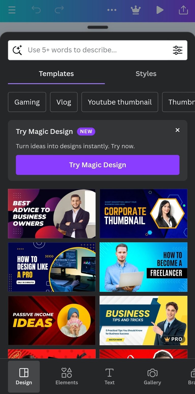
Step 5: Select your preferred type of text.
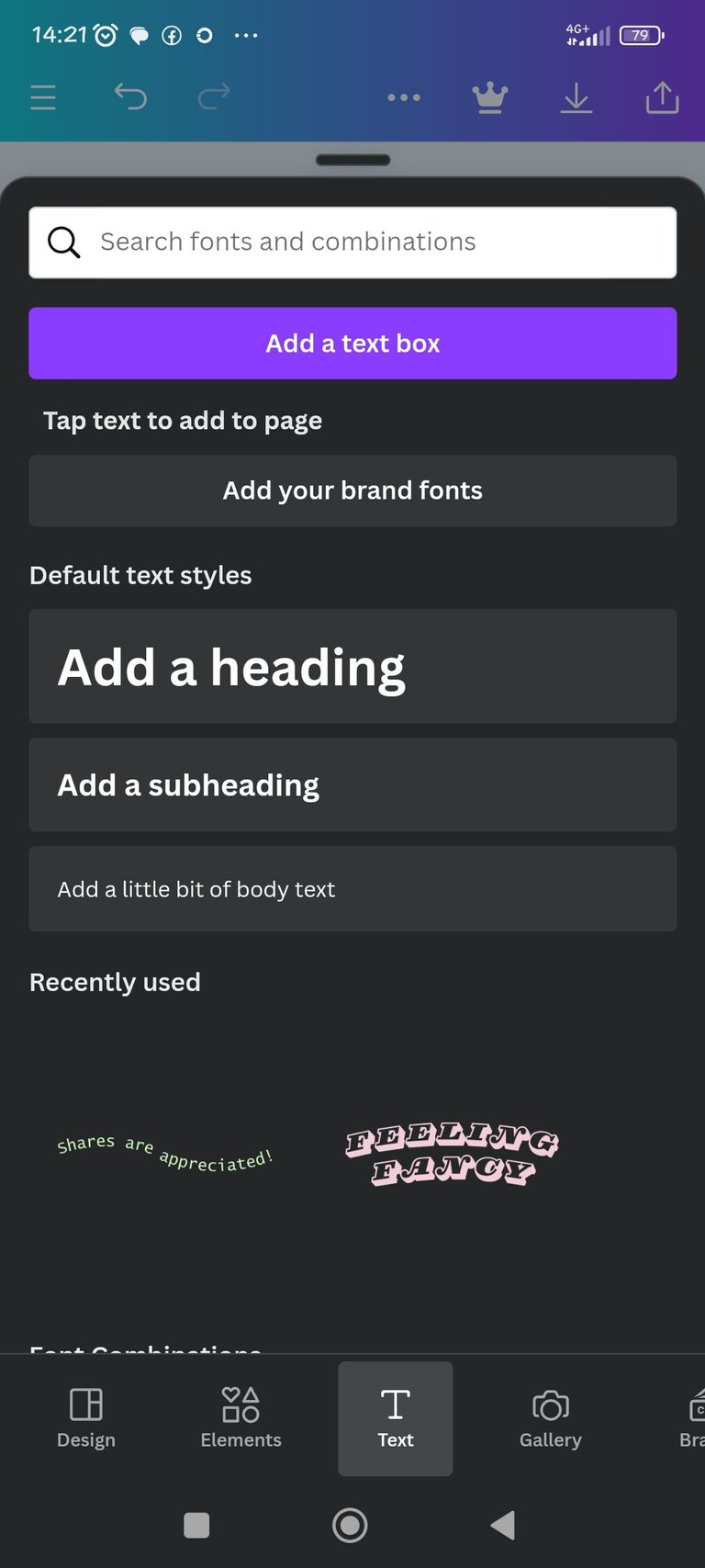
Step 6: click on "elements" type in graphic design and select your preferred.
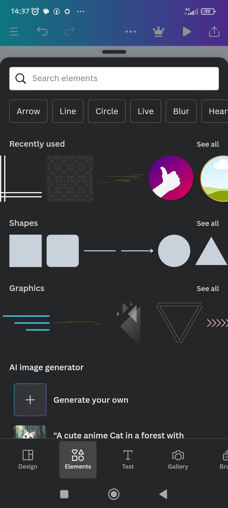
You can also use a corner design, you will find it amongst the options or you can search for it.
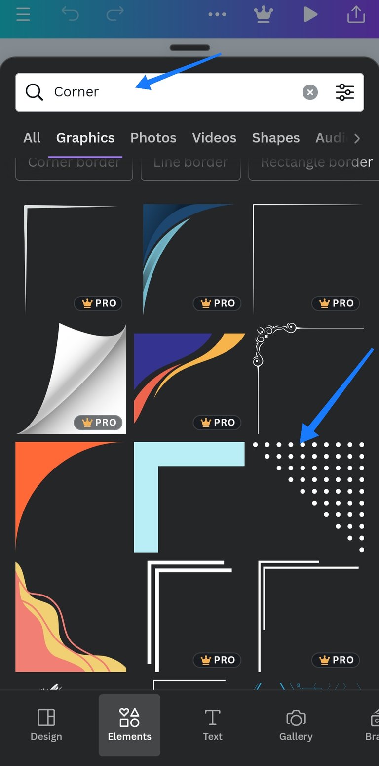
Note: Those images that has the inscription "Pro" can only be used if you pay for them but you use the ones without the "pro", it's free. You can move your images and designs by press and hold then drag them to how you want to position them.
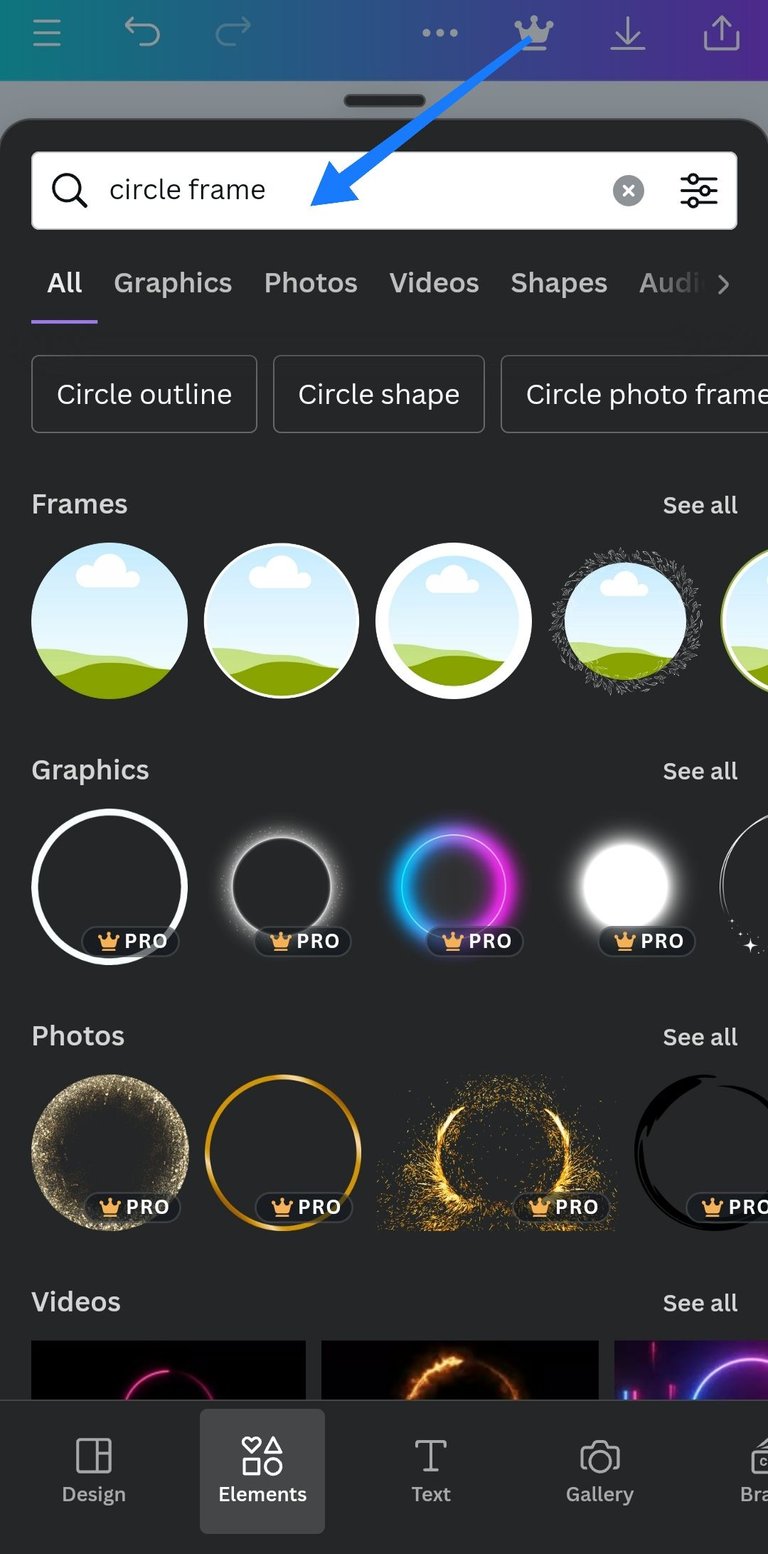
Step 7: Search for any frame of your choice for your image.
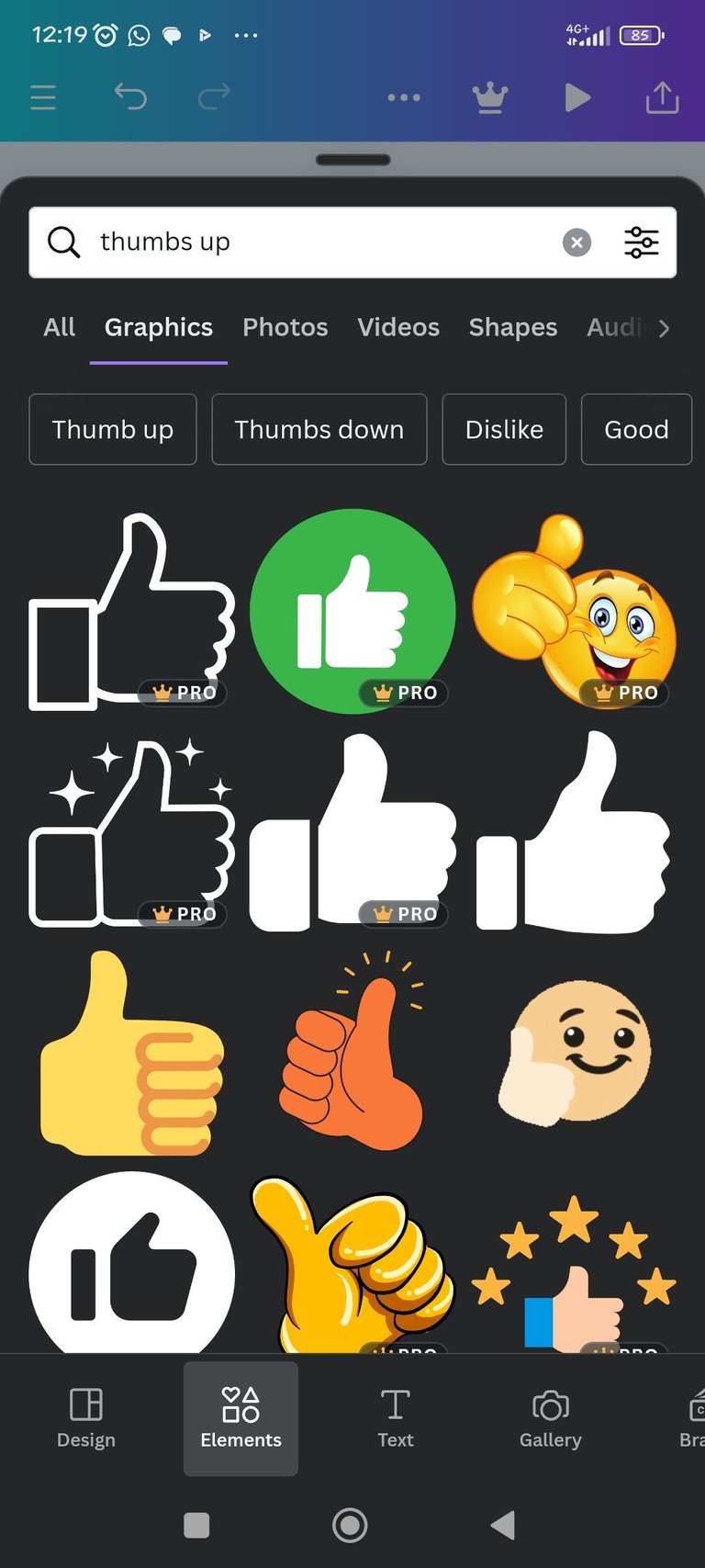
Step 8: You can also use images related to your content by searching for them e.g since I am writing about thumbnails, I would search for thumbnail designs.
Step 9: When you are done click on Download.
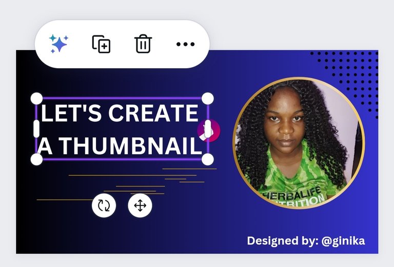
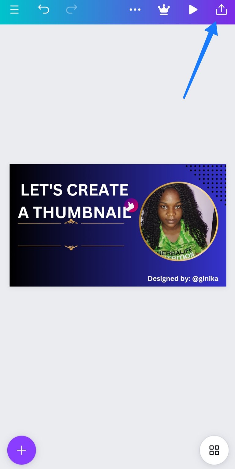
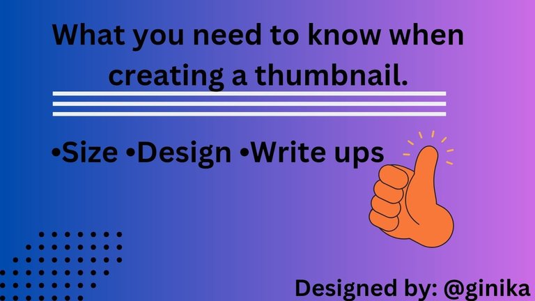
The same procedure goes for my second thumbnail 👇
Question 4: Explain why JPG format should be your preferred export format.
This is because JPG doesn't take up much space and as a result of that it uploads faster. All images and designs fits in properly.
Images were designed by @ginika using canva. All screenshots are mine.
It's fantastic that you're diving into the world of thumbnail creation with Canva – it's a game-changer, isn't it?
We have chosen this post to be curated by MCGI Cares Hive community. We are inviting you to join our community that study the words of God. You can also follow our official Youtube Channel. Keep doing the great job ❤️
Yeah! It's a lot more fun!
I will sure explore the community.
Thank you so much.
Your tutorial is full of color! I love it. Congratulations.
Thank you!
You're welcome!
Wow, this is absolutely beautiful 😍. This shows that you have been doing this before or is this your first design? Well I must say that you really did well in this your design and I believe you can still do better.
Weldone and good luck 🤞.
Yeah! It's my first design and I had fun playing around with it.
Thank you so much boss 🙌