Hello to all online art lovers, and to all existing forms of artistic representation in the world ^ _ ^
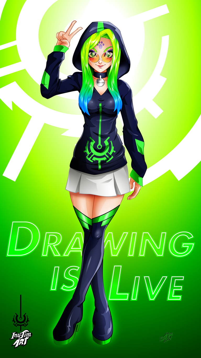
Thanks to the new quarantine easing rules, you can last a little longer on the street and go out a little more often, allowing for the first time in a long time to share with you a second time this week, I hope that This is the trigger for me to stop procrastinating so much and get faster, in finishing my drawings or guides.
This extravagant girl is the other character that I usually use as a reference model in my drawing guides.In fact, she appears in 6 of them so far, she is the representation of the digitization facet of my creative process, that is, when I feel In front of my PC for hours and I begin to convert the photo of the sketch made in pencil, into an image full of color and life, for that reason I decided to call it "Technique" because it is that moment of work in which I apply all the techniques I know and I go on drawing and color; When he created it, he wanted it to have a technological and somewhat elegant appearance, but to show creativity, at first he was going to dress it very futuristically as if it were taken from a video game or anime syfy, finally opt for something simpler and that alluded to a very geeky digital artist that he does livestream while doing a speedpaint (something that personally I would like to try) and I also wanted to try a fantasy color palette in my hair. ^ _ ^
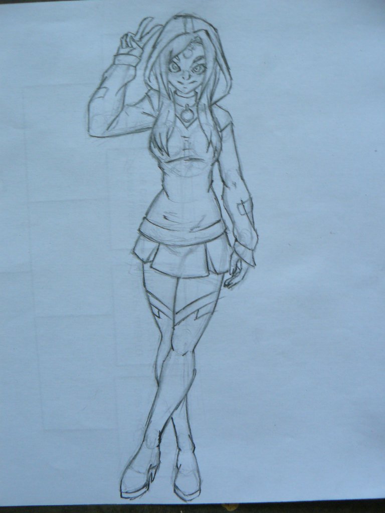
Pencil sketch

Detecting errors
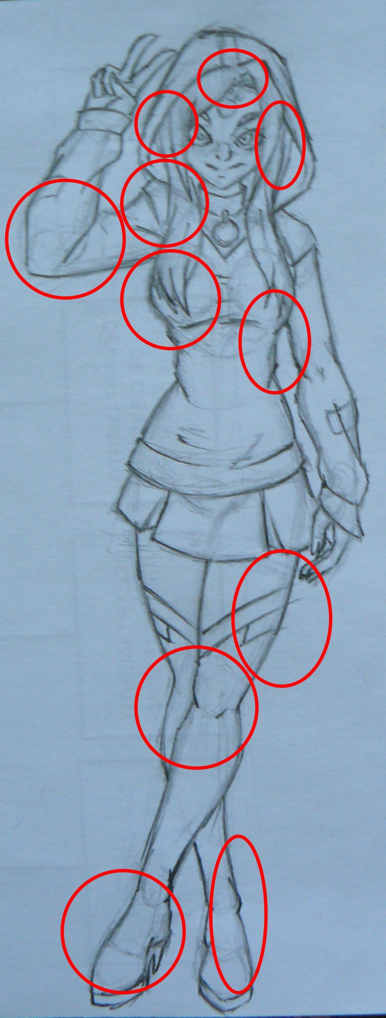
As I mentioned in my previous publication, it occurred to me to apply a technique that allows me to better correct the proportions when starting to digitize, and when using this sketch, I noticed that I made many errors in the anatomy, such as that the right arm is much larger and thicker than the left, the same for the shoulders, has too much volume is his hair in the area of the head, the opening of his bangs is not centered, the waist is too small for his body (as if his ribs were missing), despite the fact that the hair covers you can see that the right breast is notoriously bigger than the left, the knees are too low on the legs, the size of the thighs is not correct, the feet are too small for the proportion of the body, the Very short skirt and by the pose it should not be wavy like that, and the wrinkles of the sweater do not feel natural.
Correcting mistakes
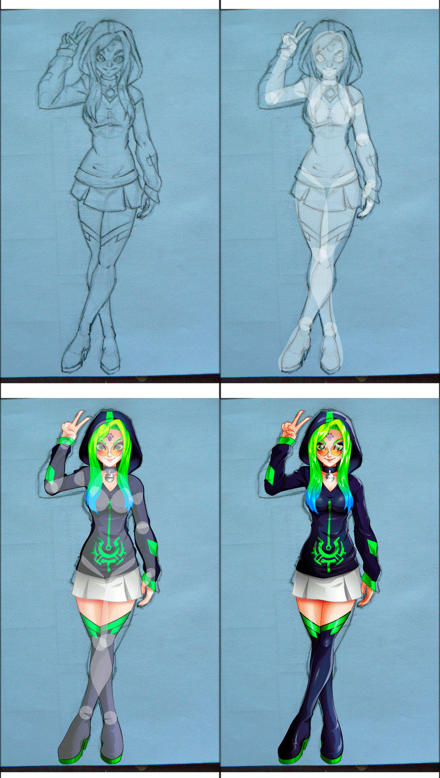
The technique I apply consists of before drawing, create independent body shapes without clothes, that are well proportioned, with the extremities only one is performed and then duplicate in mirror mode, then rotate and adjust them to the pose, in that way You know for sure that both limbs are the same length and proportion. Once this is done, start with drawing and integrating and merging the shapes as part of the drawing (advantage of using vectors ^ _ ^)


Lineart

Flat colors

With this GIF I show you the whole process of the illustration

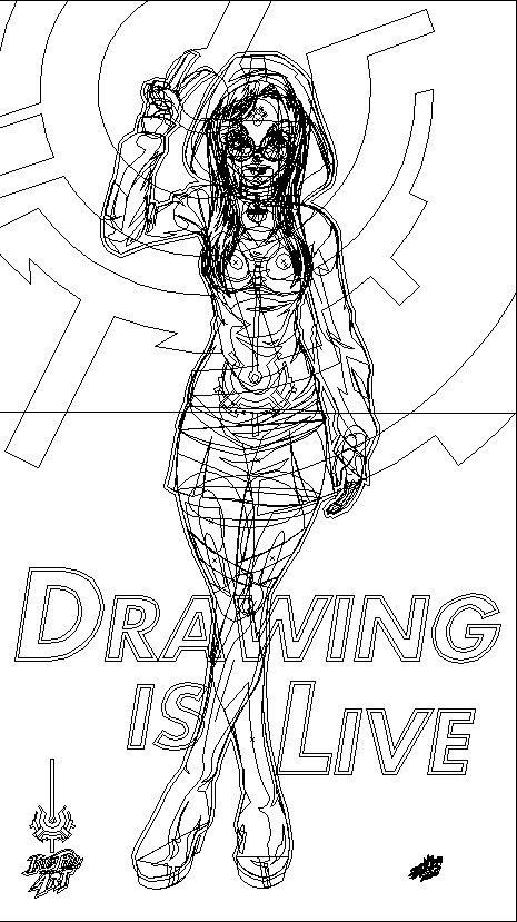
The Contours of Each Vector
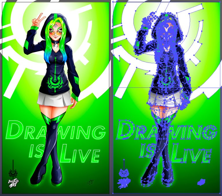
Each path and node that make up the image
Technical information:
Digital vector drawing
Program used Adobe Illustrator CC 2015
Full resolution 3602 x 6424px at 300dpi
Thank you very much for reading my post
What are your criticisms and comments about this drawing, what would you improve?
Please let me know in the comments below.
I hope you liked my work
See you in a future post
Inu-Jim
Copyright @inu-jim –Allrightsreserved
What are your criticisms and comments about this drawing, what would you improve?
Please let me know in the comments below.
I hope you liked my work
See you in a future post
Inu-Jim

Copyright @inu-jim –Allrightsreserved
He visto tu publicación de promoción en nuestro Discord en El Camino Antiguo. Espero que puedan unirse a nuestra comunidad activa, estamos premiando a las personas que comparten su tiempo viendo nuestro video explicado por el hermano eli soriano y dan sus comentarios, porque Tu comentario es muy importante para nosotros. Dios te bendiga
Muchas gracias por el apoyo a mi publicación, ya me uní a su comunidad
Que Dios los bendiga también ^ _ ^
gracias a Dios
Buenísimo 👍
Gracias @rowell ^ _ ^