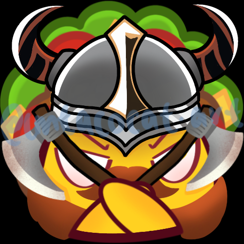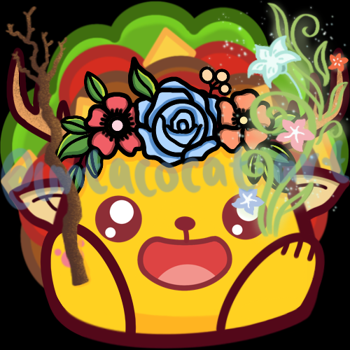
Hey Hive!
We're back again with another Art Attack! If you're new to the series, this is where I share my drawings and the process behind them. A behind-the-scenes look at my artwork, if you will. This is not to say that I'm very good at art, or that I'm a professional in any way. In fact this is the opposite, and serves as a reminder to how I first started, and lets me track my progress too!
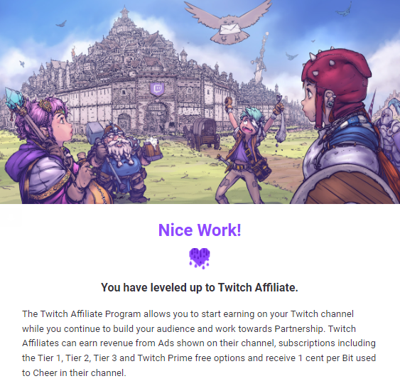
We're continuing on with my series of sharing the custom subscriber badges I made for my Twitch channel! After a month of streaming I was fortunate enough to become a Twitch affiliate which comes with a lot of perks like getting money through viewer subscriptions, ad revenue and the like. Subscribers get benefits such as an ad-free viewing experience but also access to unique channel emotes and a special subscriber badge next to their name in chat!
Since you get to customise the subscriber badges I thought this was a perfect chance to get creative! I wanted a consistent theme across the sub badges and I thought making it gaming-related would be appropriate. More specifically, I wanted my badges to be different classes/jobs you'd see in classic RPGs.

So these were the ones I made and after the first year the badges unlock at 6 month intervals so I had more time to design them. We're down to the last two badges now!
For the 2.5 year badge, I had the idea to draw a Druid which is a pretty common RPG class as well. They're typically spellcasters and act as Healer, Support, and Utility caster like clerics but they wield nature-theme magic.
These were the references I used, and I was envisioning some elf ears, a flower crown and a wooden staff.
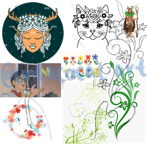
Initially I thought of drawing the pose similar to the meme of the anime guy with the butterfly. I'm sure you've seen it before if you've been on the internet for a while. But I thought of changing the butterfly into a vine of sorts with flowers to show some Druid-like magic.
So this was the sketch I came up with:
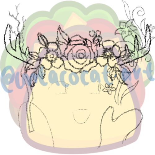
I thought it looked alright, so I worked on the the outline.
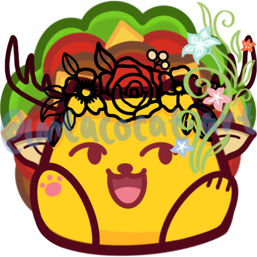
Then I coloured in the flower crown, staff and added some flair to the vine.
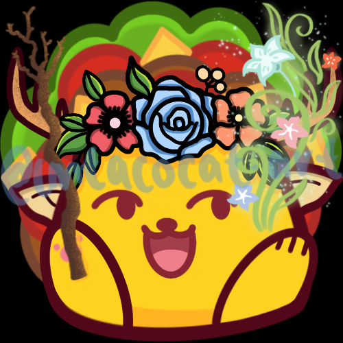
But it still looked a little off to me. Maybe it was the facial expression or the eyes without whites, but I didn't really like it. So I changed the face to a more anime-like one and I thought it looked a lot better.

I did this one fairly recently so I'm not really sure what I would change about it now I think it looks pretty good as-is. Maybe now that I've learned how to draw my TacoCat holding different things I think I'd try changing the paw position but it's not crucial since it's very small on the chat.
For the 3-year badge I asked one of the biggest contributors in my community for a suggestion of his favourite RPG class. I think his initial answer was a mage but since we already had that, he said Tank instead.
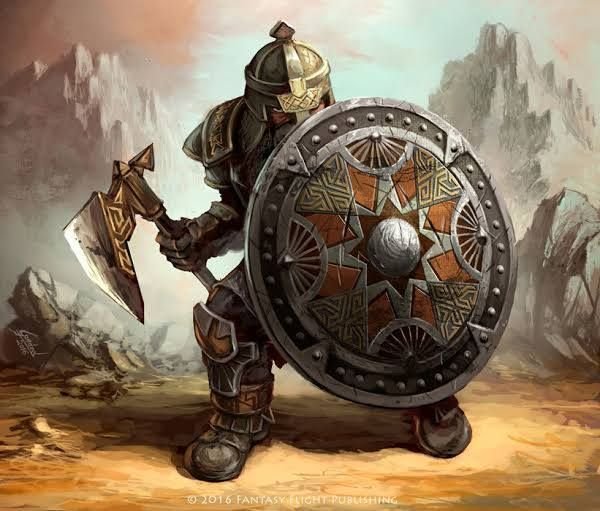
Source: inverse.com
A tank is a class archetype, a role filled in the party by a character who typically has high armor/defense and health stats. Their role in the party is to stand on the front line and absorb, or “tank”, damage meant for other, less defended/healthy players.
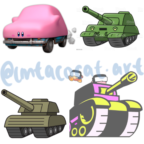
Tanks are typically big characters with a huge shield and heavy weapons but I thought it would be funny if I just drew a TacoCat Tank similar to the Kirby Car from Kirby and the Forgotten Land (which I played on-stream). These were my references:
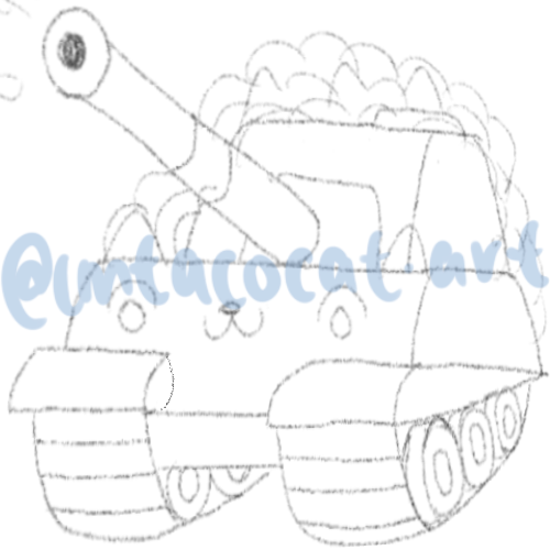
And this was the sketch I did with the help of one of the tanks. I thought it looked pretty good, and I wanted some confetti to come out of the barrel if we could fit it somehow.
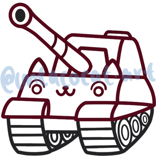
After that it was time to outline!
For the colours I went with off my usual avatar but I referenced the tank pictures for the lighting and I think it came out pretty well!
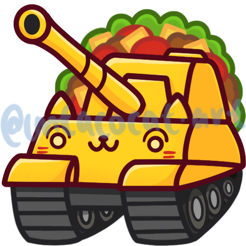
It was still missing a little something though so I tried to fit in some sauce from the custom badge flairs I drew. There are 3 tiers for Subscribers and at tier 2 and 3 you can fit in your own custom flairs as well so I drew a 2 and 3 in guacamole and chili sauce.
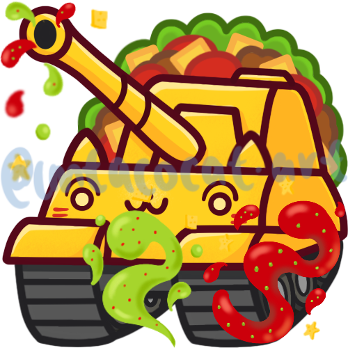
I knew it wouldn't be very noticeable so I just took aspects from those flairs and placed them coming out of the barrel. That's why they look less clear on the picture. It's a lazy way but since the badge will end up being 18px I figured it didn't matter.
In the end, we get this which I thought looked pretty cool!
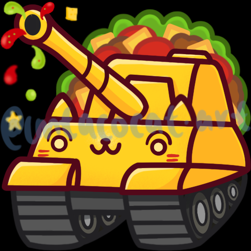
It definitely looked more like a golden tank rather than a Taco though but there was no way I could make the taco shell look like a tank without it being weird, so I thought this was fine, and it looked pretty cute too!
Here's the timelapse for these two badges:
Another two unique badges but I think they both look pretty good and probably the best of them all since I did them fairly recently. But that's it for this series for now! Tune in next week for some different art!
Thanks so much for reading!
To find out more about me, check out my intro post here!
