Hey Hive!
We're back again with another Art Attack! If you're new to the series, this is where I share my drawings and the process behind them. A behind-the-scenes look at my artwork, if you will. This is not to say that I'm very good at art, or that I'm a professional in any way. In fact this is the opposite, and serves as a reminder to how I first started, and lets me track my progress too!
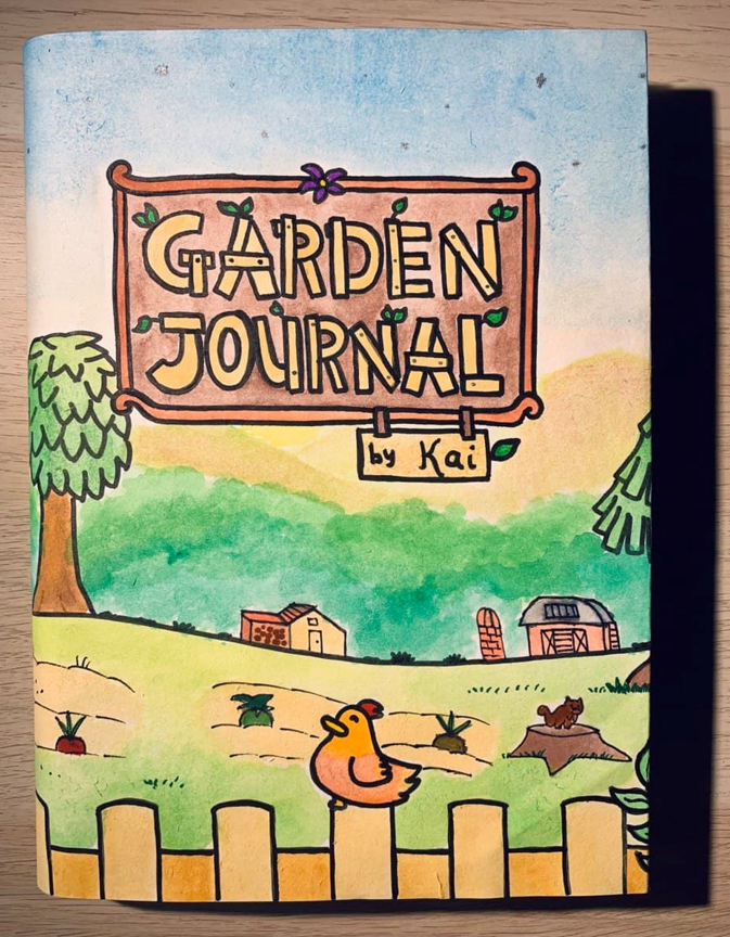
So last week, I shared the first art piece I did in 2021 - a custom garden journal for one of my friends!
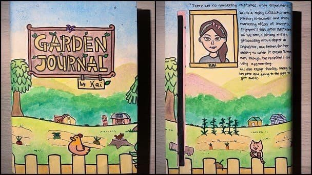
It was one of the first physical art pieces I've done in some time and I unfortunately made some mistakes here and there, but I'm glad Kai loved it nonetheless!
Anyway, since I did so much digital art during December 2020, I wanted to go back to trying physical art again, and also practise my different art styles. So of course I had to do another minimalist art piece!
I've done a couple of these but it's been a while, and the last one I worked on was actually this:
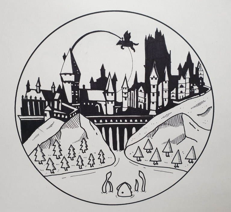
This was from some time back when I was re-reading the Harry Potter series and decided to try doing a Hogwarts piece in this style. And I thought it came out quite nicely!
So back in January 2021, I was writing about our trip to Osaka on my travel blog series! And when we got to the Osaka Castle, it made me remember what it felt like to be there. This was my favourite picture I took from that day:
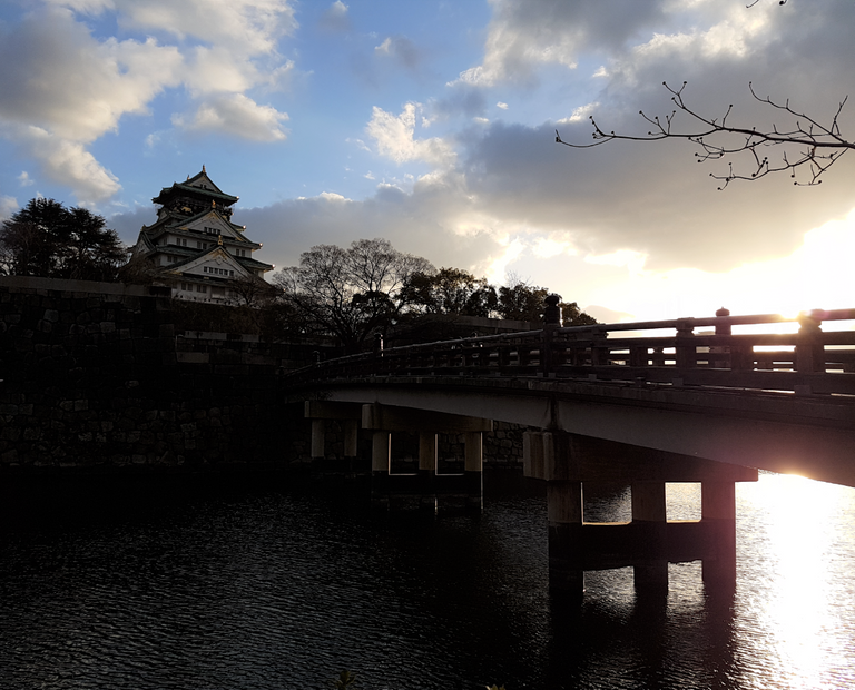
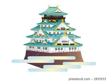
And I thought it'd be so cool to try and recreate this but in my black-and-white minimalist style! I referenced a stock photo of the Osaka Castle as well since it was a little tough to see the details from the photo:
Eventually I came up with this sketch:
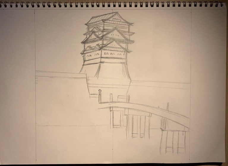
But I realised I messed up on the details of the castle, especially the top part. So I had to rework it, and we get this:
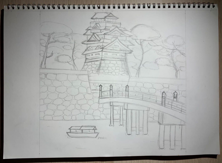
It looked pretty alright, so I started outlining:
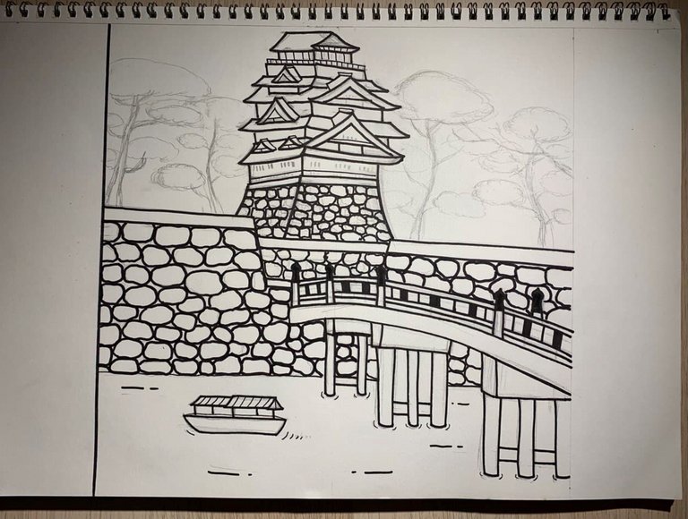
Eventually we get this:
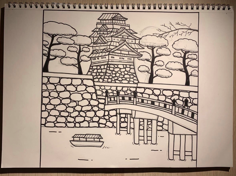
And after cleaning up and erasing the sketch lines, it looked like this!
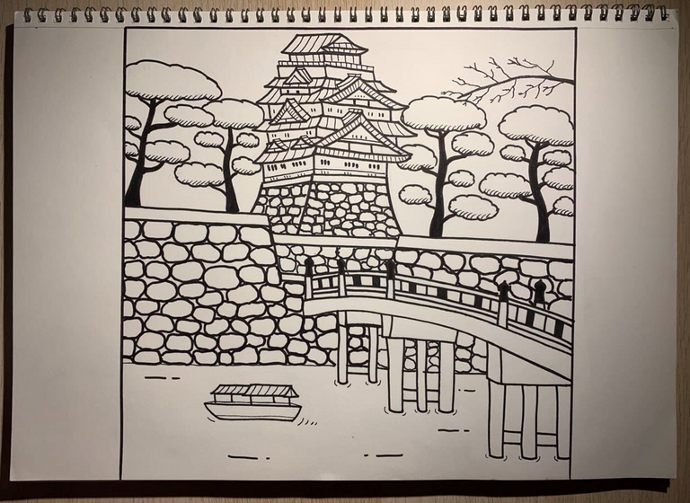
Then just to add a hint of colour, I used a pink marker to dab in some sakura flowers on the branch I had hanging:
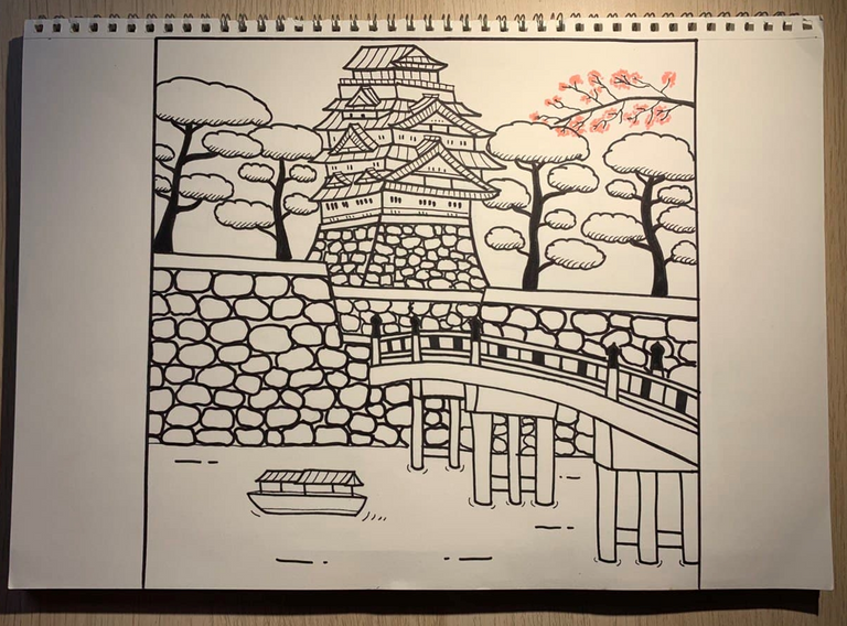
And I thought it looked okay, but the perspective on the castle was a little weird, like I couldn't tell which was the front because of the angle. The trees were also too big and there was way too much of the stone wall. It always felt a little off to me, so I decided to redo it and change the angle of the castle.
So this was my redone sketch:
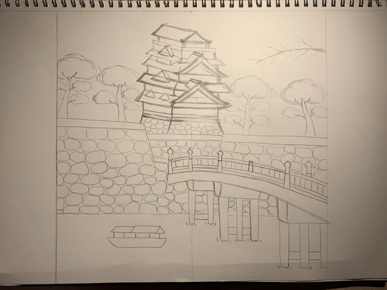
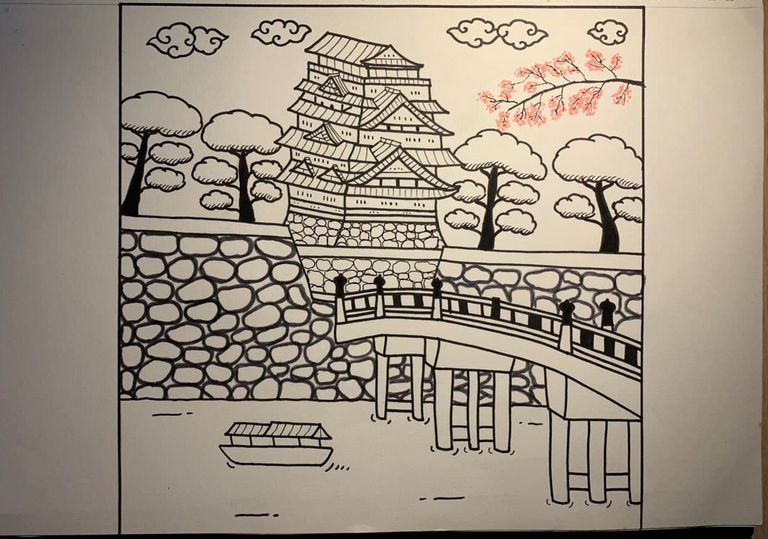
And this was what it ended up looking like!
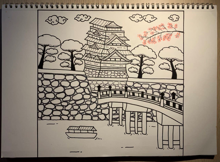
I used different markers to outline the front stone wall to give it more depth but I'm not sure if it worked out alright. And this time, the castle looked a little more accurate I think? And I managed to put in the akatsuki clouds that I wanted to add. To me at least, this version looked better so I was finally satisfied, I guess.
This was just one of those pieces that I just wasn't the most happy with, but after redo-ing it once already I didn't know how else I would change it, and so I left it at that. It still looked cool though, and I guess it gave me a chance to practise this style again so ¯_(ツ)_/¯
Thanks so much for reading!

To find out more about me, check out my intro post here!
