.jpg)
Still working on challenges; I have more I have finished. Here is my last entry for #opalunicorns13daysofhalloween on instagram
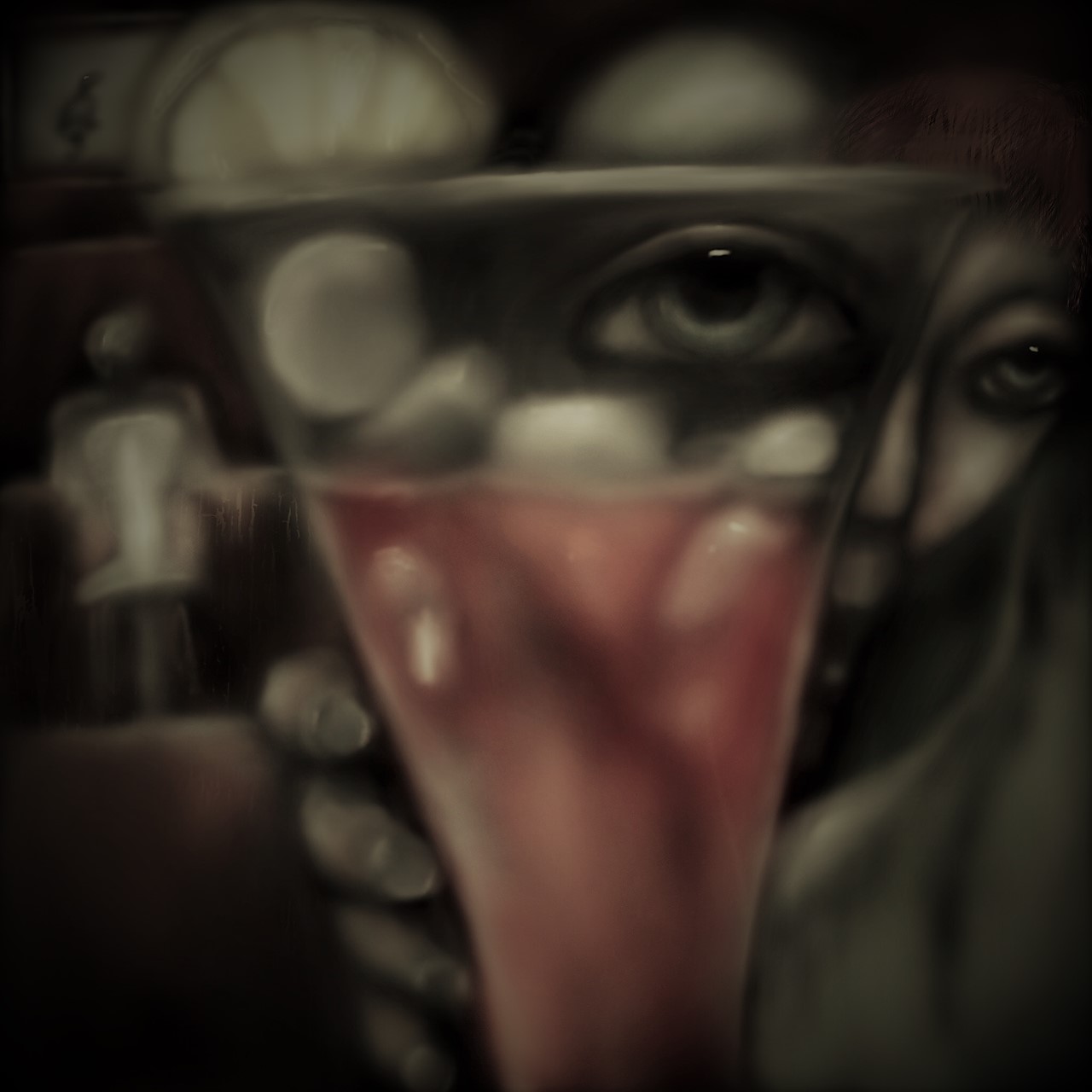
The prompt was "Mystic Bloody Mary" and while I know their is a fascinating backstory in the inspiration for the drink, I had a vision of the drink itself and an eye looking through it. Some people read tea leaves; others read everything. A friend of my father's growing up could read anything and reorganize matter with his mind; kept a secret until his death.
.jpg)
This piece was another digital painting created on my ipad. I mostly use the airbrush with a bit of wood texture. GP Wood I think. May I ask what the norm is in terms of crediting brush creators in Procreate?
I have used various filters on the image. The one above has no filter, below "burlesque" from the windows photo editor makes it look interesting.

I am curious which image you can see the best on your screen. I have my laptop screen at it's brightest but this still looks dark to me. Meanwhile on my phone some look too bright.
This is one of my favorites of yours so far! Super cool effect with the eye looking through the glass! Great job. I am on a laptop too and the contrast blends pretty well. They lean on the darker side... but that first one is the brightest on my screen. I wouldn't say any of them are toooo dark. Great work.
Thank you so much it feels good to hear. I guess my laptop is just not great for graphics, which makes me sad.
Based on the degree of quality you are producing... i would say your laptop and graphics are working just fine. Although, we as artists could always use more GPU and CPU power.
Thank you. I paint on my Ipad and then when I view it on my computer it always looks so much darker so alter or I apply filters. It is hard to know how to edit my work for others sometimes. I would like to make more NFT's but they have to be a uniquely high quality. Half my NFT's look too dark.
It's really difficult to dial those things in just because of the possible devices it may be viewed on. With so many options i would think it to be impossible to really accommodate all those variables.
Figuring out what works best for you will probably translate into what works best for everyone else. You have dark art so treading that line is a balancing act and i think you do fine.
I think it's considerate to think of those things and there is nothing wrong with holding yourself as an artist to a high standard of quality. That integrity is a blessing and a curse if you are as overanalytical as i am! hahhaha