Are you an artist that lives in a closet?
Have you ever thought of becoming a freelancer?
making logos for friends start up businesses is a really good way to break the ice.
I am going to try and inspire you all and show you just how easy it can be so stick with me and read up, let me know what you think in the comments below!!
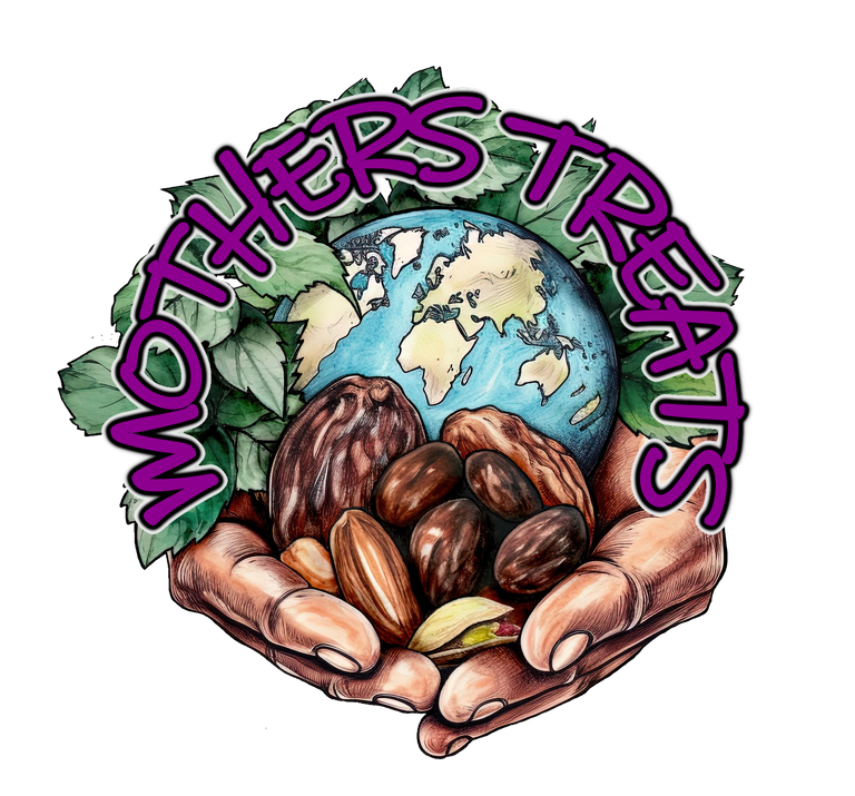
above is the logo i am working on now, it is a logo for an energy ball.
it is not quiiiite finished but i think it is in a good place to share with you all and i will show you the stages, this is not a tutorial.. more of a "hey you could do this too"
The graphic editing program i have used to compile this is called GIMP however almost any graphics editing program will do the trick, to create the elements i used Midjourney AI but you could hand draw, photograph, cut out and collage... you get the point!
Here are the steps i took to create this
First i use midjourney AI to create a base image
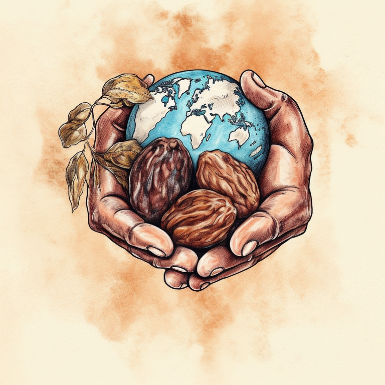
this was the easiest part but by no means did i choose the first image i found. my prompt was fairly simple
"an image of earth with two arms reaching downward forward one arm is holding a bunch of medjool dates and some cashews and the other is holding a cacao bean, watercolour, empty background --s 750 --q 2 --v 5"
Midjourney rarely gets everything you tell it but i stuck with this image as it fitted the colour scheme i was going for and had a good base so i decided to work with this.
cut/mask image from back ground and begin to "populate" it with other elements.
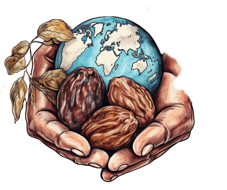
cutting the main image out is tedious, as is any masking cutting and fine work. this usually takes me longer than anything else, a graphics drawing pad really helps as using a mouse is janky and rough... but you can still do it with a mouse.
I know i will be covering up the blemishes, drawing over and thickening the black lines etc so i'm not worried about little things as long as the main image is clear and intact.
My friend wants more fruit and nuts added
so i went back to midjourney to prompt some fruit and nuts making sure i stick to the watercolour theme.
once i got a few i cut out the ones i liked and began layering them over the top of my main image.
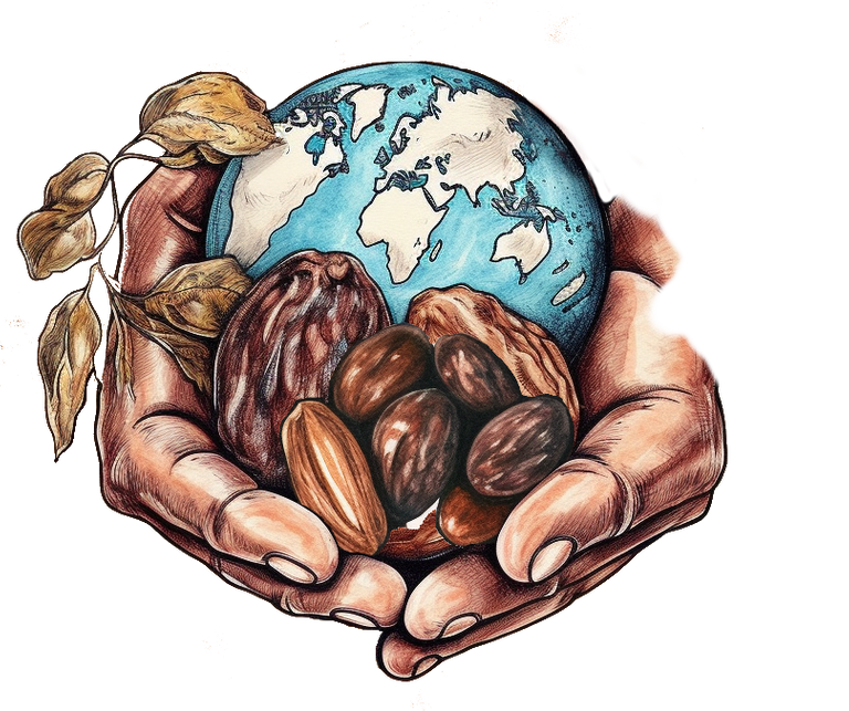
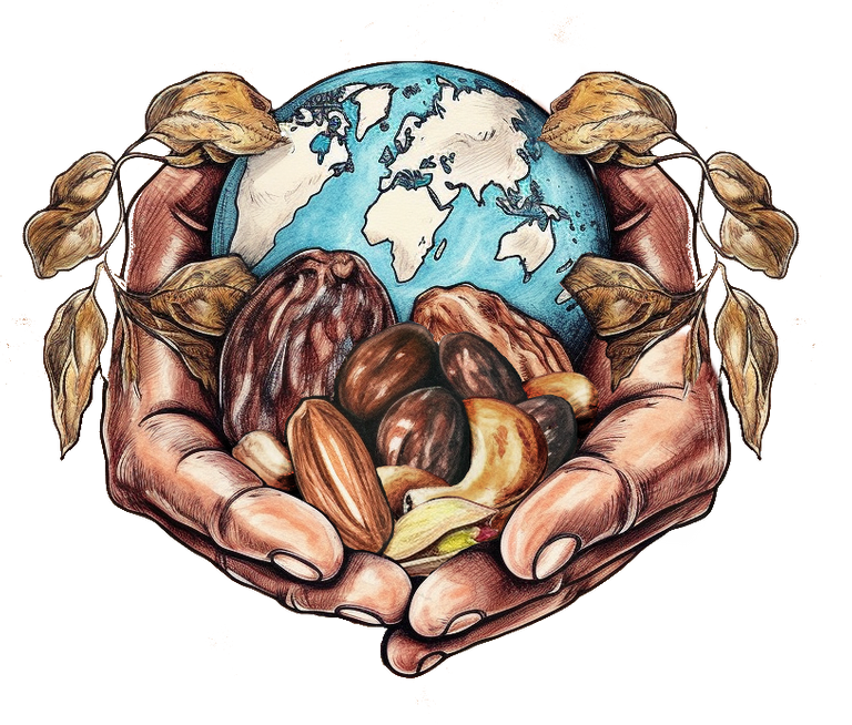
I think i may have gone a little over the top so i reel it back in - this logo will be for a small packet and perhaps only 5-6 cm in size so i need to make sure its clear and not too busy. Remember the name of his business still needs to come in! this is why one should always work in layers, if something you have added doesnt look good.... remove it!!
So i take away half of the nuts and fruit, begin painting them together, finessing the edges and shading the fruit i have added.
I get a call from my friend "Hey can we change the leaves to mint leaves.
sure thing!! back to Midjourney to prompt some watercolour mint leaves.
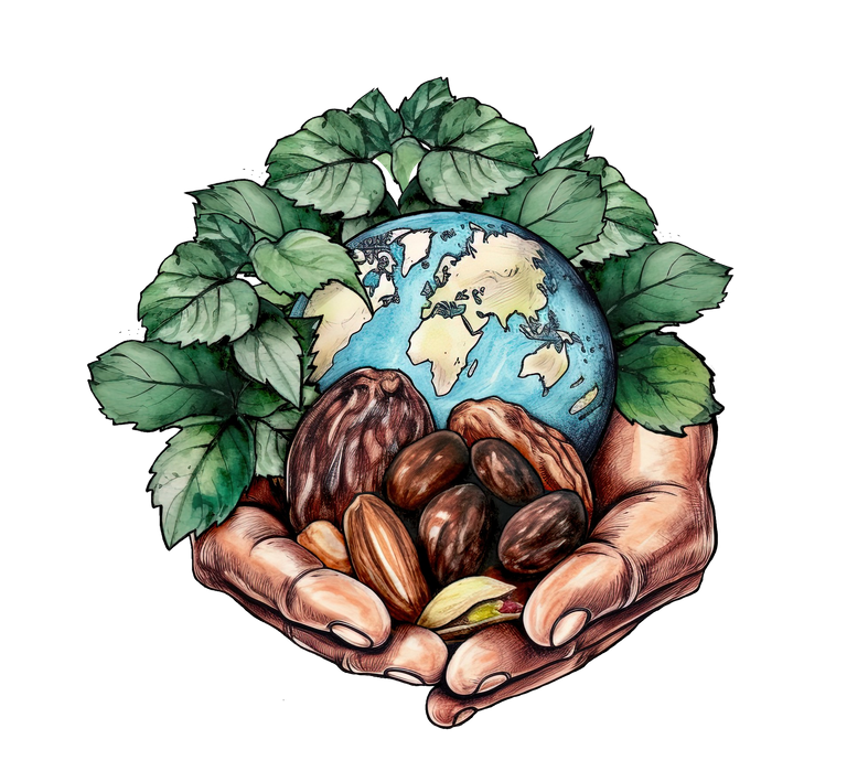
Phew... that took a long time cutting them out and layering them on but they look GREAT and my friend is stoked with the change...
Time to play with some text!
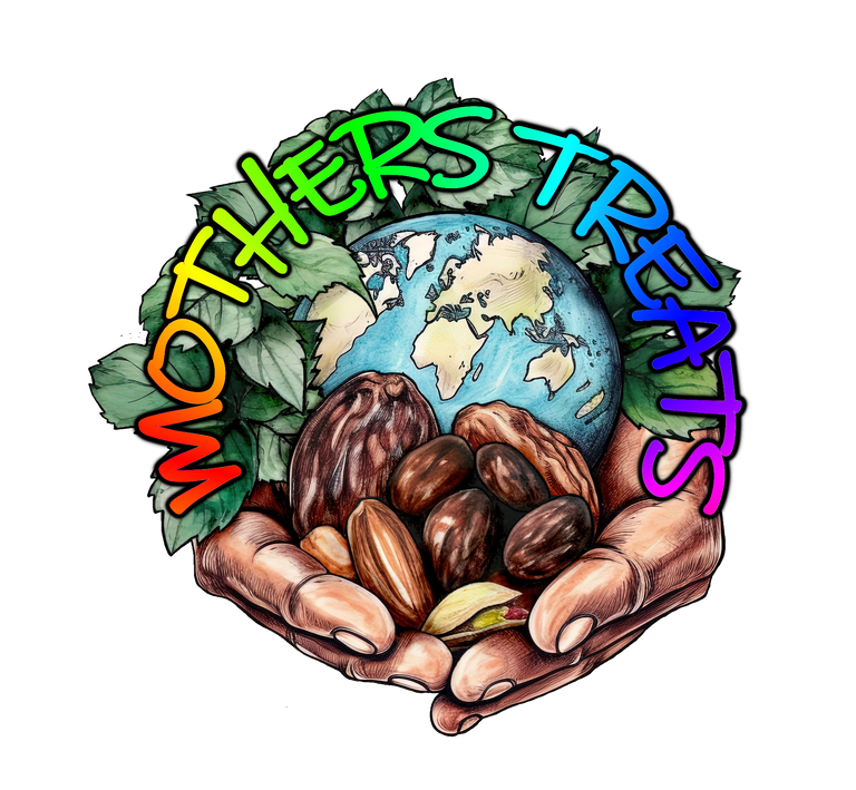
**
I entertained my friend with a few styles, colours and outlines. He is leaning towards more of a purple/indigo feel so we head that way.**
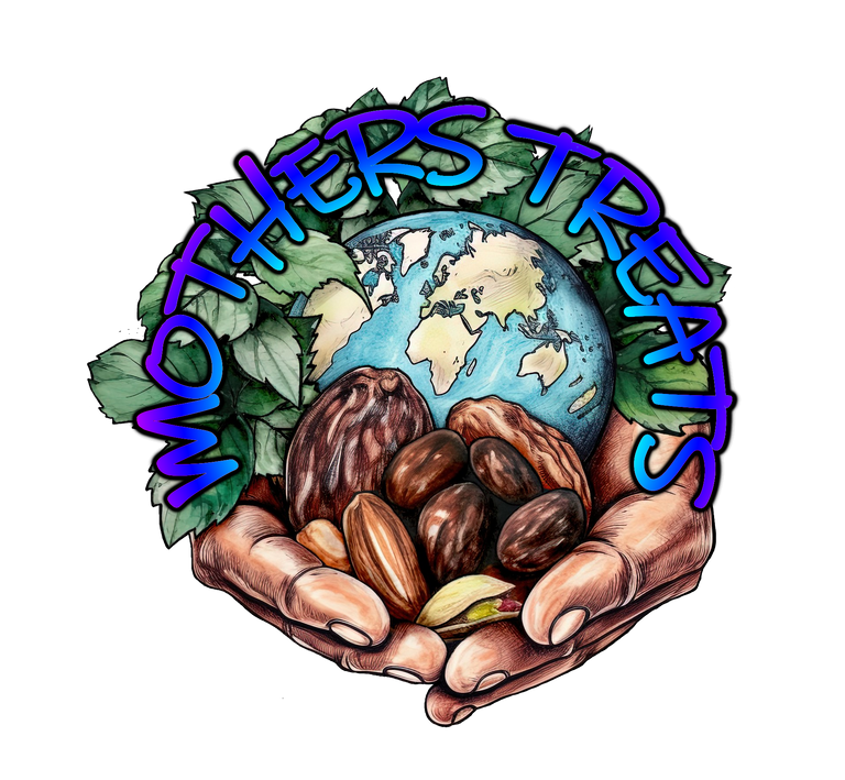
But there is still so much more to do! the text doesn't sit well with me, the blurriness of the text border. and much more too! can you see any blemishes? it is good practice to zoom right in and find anything that is out of place so that you can deliver a sweet and finished piece.... if you have got this far then there's no point in giving up....

I can see a few mistakes.... so its back to the editor to play
KEEP CREATING FAM!!