Clique aqui para ler em Português-BR 🇧🇷
Saudações a todos os Hiveans e apreciadores do que eu compartilho aqui. Dentre todas as loucuras e ocasiões, eu tento aparecer novamente a Hive.
Antes de tudo, minha conta @wlffreitas ou @wlfreitas já foram desligadas, não tenho mas acesso as chaves privadas, apenas a conta salva no PeakD.
Distriator Infographic Contest: 300 HIVE Grand Prize!. Eu estou de férias em casa, então eu gostaria de ocupar minha mente com alguns outros projetos Hobby. Nada melhor que voltar a tentar criar algo legal no Adobe Photoshop. Não posso garantir o melhor é claro, estou muito tento enferrujado, fiquei até mesmo perdido em algumas ferramentas simples.Como raramente vejo as publicações na Hive, fiquei sabendo recentemente sobre o concurso promovido por @coldbeetrootsoup e @distriator.
Vamos Começar
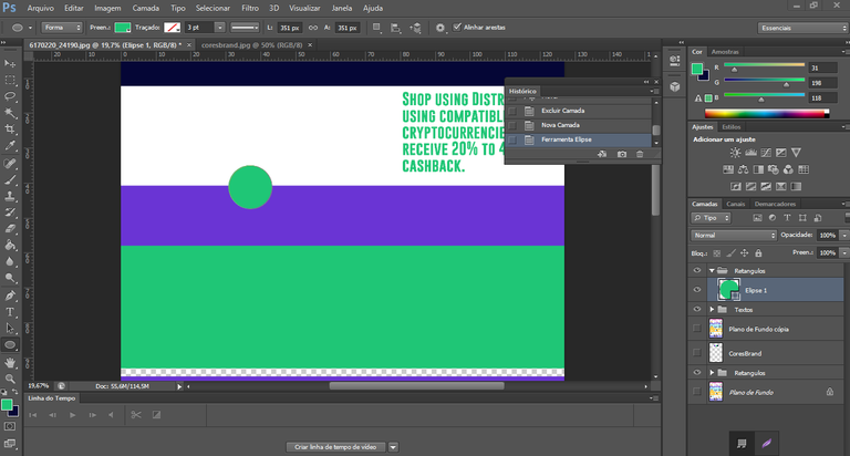
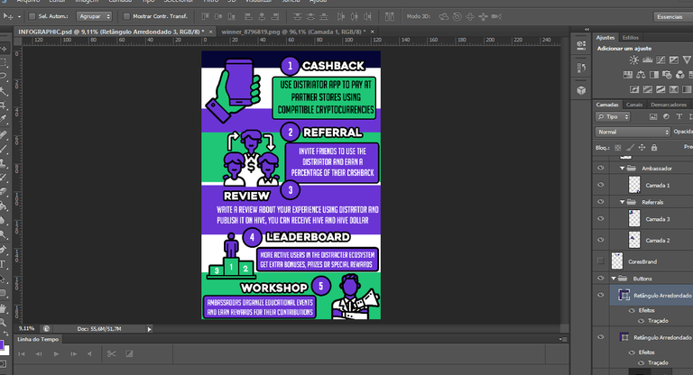
Eu avalie as cores principais do projeto @Distriator, são cores bastante chamativas e que conseguem um bom efeito visual. Então minha ideia era um Infográfico de cima para baixo. Comecei separando as lacunas. Adicionei um pouco de um fundo branco para diferenciar um pouco a repetição, não sei se foi uma boa ideia.
Já começamos criando uma estrutura não é mesmo?
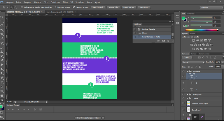
Minha ideia inicial era dividir apenas em 3 colunas de Passo-a-Passo, no entanto após algumas horas tentando encaixar 5 elementos (Cashback, Referral, Review, Leaderboard e Workshop), achei melhor trocar essa ideia para não ficar muito estreito. Mas sim simples e direto. Ninguém quer ficar passando mais que alguns minutos lendo um Infográfico. Ele tem que ser direto para as informações. Pensando nisso eu avanço para o segundo modelo.
Polimento & Estruturação
Eu lembro que comecei a estruturação para organizar onde cada coisa ia ficar era exatamente 10:20 da manhã. Quando acabei o processo já não tinha mais sol lá fora. Eu apenas estava concentrado nisso, foi bom para matar um pouco o tempo. Ei ainda é quarta-feira, então não tem droga nenhuma para fazer na cidade.
Ótimo!
Na minha visão é claro, eu sei que não ficou ótimo.
Mas já estava algo agradável para se compartilhar para o desafio, as cores e a ambientação pareciam encaixar bastante, eu apenas estava ficando chateado em procurar uma fonte certa. Escolhi utilizar Big Noodle Titling, uma fonte que poderia dizer, quadrada cursiva? Talvez algo assim. Ele ainda tem uns caracteres legais para adicionar sem precisar fazer algumas edições.
Antes que eu esqueça, porque em qualquer arte digital, trabalhar com o desenho de uma mão parece um inferno?
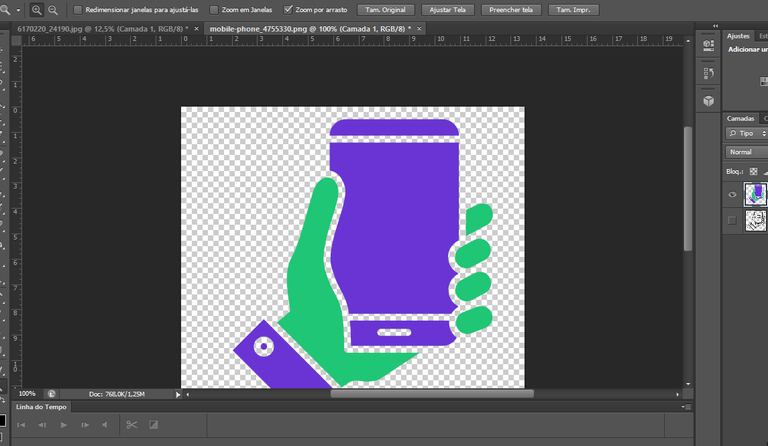
Provavelmente eu tenho passado de duas horas a três, apenas para ajeitar essa mão com um celular. Agora eu entendo porque muitas pessoas preferem partir diretamente para Adobe Illustrator, trabalhar com vetorial é mil vezes mais fácil que a cada movimento, editar camada e pontos por pontos.
Finalmente chegamos a algum lugar.
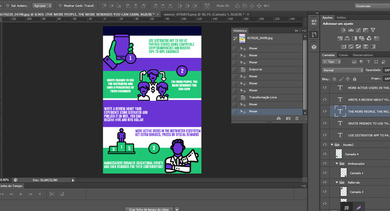
(É, um vermelho chamativo nessa saturação não ficaria nada agradável). Eu não sei se era obrigatóriamente adicionar isso, ou até mesmo o nome bem exposto DISTRIATOR em alguma parte. Eu apenas acho desnecessário, afinal já estamos abordando isso no Infográfico, talvez apenas uma pequena logo? Eu posso fazer alterações mais tarde. Bom é um arquivo PSD, então alterar as coisas nesse momento é tão simples e direto. Eu até poderia soltar algumas versões alternativas. Mas parece que apenas um envio é valido. Então eu talvez faça isso nos comentários.Eu resolvi não usar ícones #Hive ou #HBD, poderiam tirar a harmonia das cores
Resultado
Recursos utilizados
Greetings to all Hiveans and appreciators of what I share here. Among all the craziness and occasions, I try to reappear on Hive.
First of all, my account @wlffreitas or @wlfreitas has already been deactivated, I no longer have access to the private keys, only the account saved on PeakD.
Distriator Infographic Contest: 300 HIVE Grand Prize!. I'm on vacation at home, so I’d like to occupy my mind with some other Hobby projects. There's nothing better than trying to create something cool again in Adobe Photoshop. Of course, I can't guarantee the best results I’m quite rusty, and I even got lost with some simple tools.Since I rarely check publications on Hive, I recently found out about the contest promoted by @coldbeetrootsoup and @distriator or @thedistriator .
Let's Begin
I evaluated the main colors of the @Distriator project they are very striking colors that create a good visual effect. So my idea was a top-down infographic. I started by separating the sections. I added a bit of a white background to break up the repetition a little I’m not sure if that was a good idea.
We're already creating a structure, aren't we?
My initial idea was to divide it into just three Step-by-Step columns. However, after spending a few hours trying to fit in five elements (Cashback, Referral, Review, Leaderboard, and Workshop), I decided to change this idea so it wouldn't be too narrow. Instead, I kept it simple and direct. No one wants to spend more than a few minutes reading an infographic. It has to be straight to the point. With that in mind, I moved on to the second model.
Polishing & Structuring
I remember starting the structuring process to organize where everything would go at exactly 10:20 AM. By the time I finished, the sun was already gone outside. I was completely focused on this it was a good way to pass the time. Hey, it's still Wednesday, so there's nothing going on in town anyway.
Great!
At least in my opinion. I know it's not perfect.
But it was already something nice to share for the challenge. The colors and the overall design seemed to fit quite well. I was just getting frustrated trying to find the right font. I chose to use Big Noodle Titling, a font I could describe as square cursive? Maybe something like that. It also has some cool characters to add without needing many edits.
Before I forget, why is working with a hand drawing in any digital artwork always such a nightmare?
I probably spent two to three hours just adjusting this hand with a phone. Now I understand why so many people prefer to go straight to Adobe Illustrator. Working with vectors is a thousand times easier than adjusting each movement, layer, and point manually.
Finally, we got somewhere.
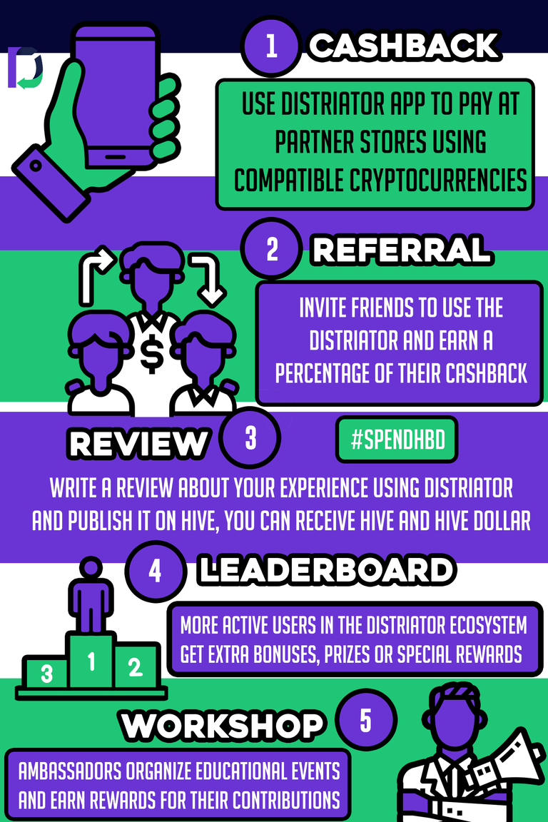
(Yeah, a bright red in this saturation wouldn’t look good at all). I’m not sure if it was mandatory to include them or even to prominently display the DISTRIATOR name somewhere. I just think it's unnecessary after all, we're already covering that in the infographic. Maybe just a small logo? I can make changes later. Since it's a PSD file, making adjustments at this stage is quick and easy. I could even release some alternative versions, but it seems that only one submission is allowed. So I might do that in the comments.I decided not to use #Hive or #HBD icons, as they could disrupt the color harmony
Final Result
Bzzzrrr, @abracadab! Parabéns pelo seu post! Eu adoro projetos criativos na Hive! O seu infográfico Distriator parece ser uma obra de arte. Boa sorte no concurso! #hivebr
AI generated content
Hey yoo, this looks classic man good one!
Thanks dude.
Congratulations @abracadab! You have completed the following achievement on the Hive blockchain And have been rewarded with New badge(s)
Your next target is to reach 50 comments.
You can view your badges on your board and compare yourself to others in the Ranking
If you no longer want to receive notifications, reply to this comment with the word
STOPCheck out our last posts:
Congratulations @abracadab! You received a personal badge!
You can view your badges on your board and compare yourself to others in the Ranking
Check out our last posts: