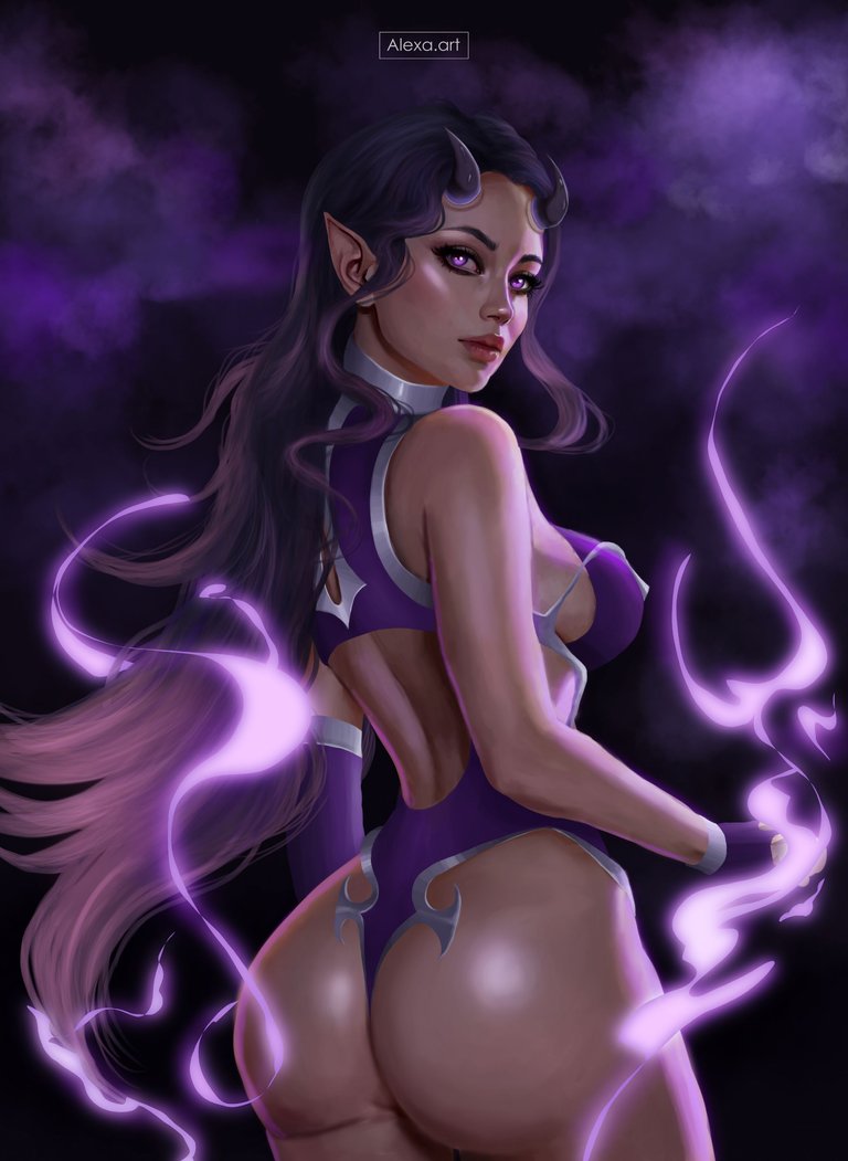
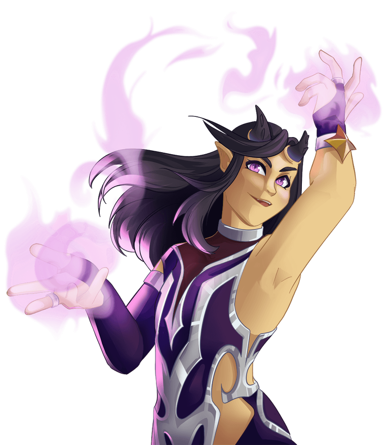
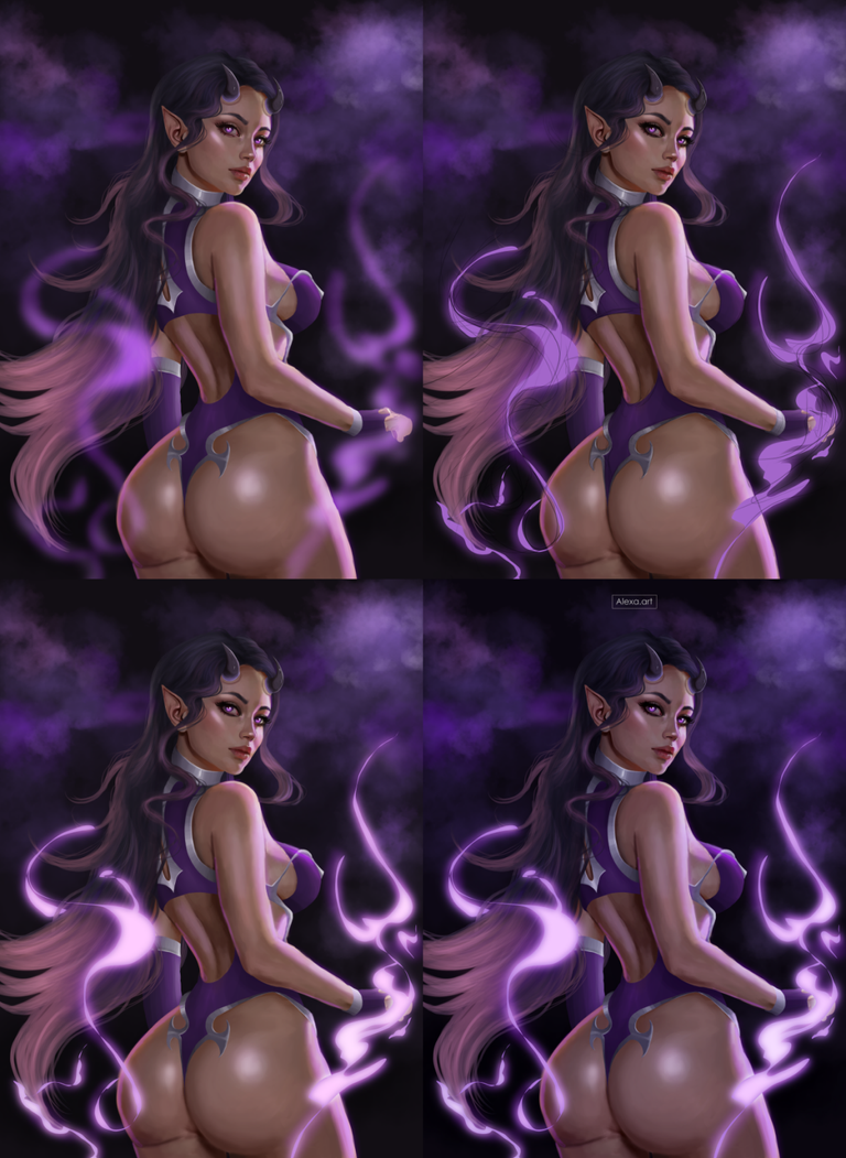
Very good evening everyone, yesterday I felt very inspired to make my participation in the @Splinterlands art contest so since yesterday and all day today I was working on this entry for which I chose Larissa Kerato card, last week although I received very good and nice comments about my entry, I was not very satisfied, so I wanted to do something really shocking this time, so two days ago I started the sketch and yesterday I started painting all night and finished today in the afternoon, this time I wanted to make a more daring version, so I made changes in the costume, always following the original to try to keep the essence of the character but giving it a different perspective, I wanted to be too detailed this time, I wanted to see a skin as realistic as possible, as well as all the elements that make up the drawing, I loved working with this card, because it also has one of my favorite colors which is purple, the process had many changes but i really loveeeee the fianl result, I hope you like it.

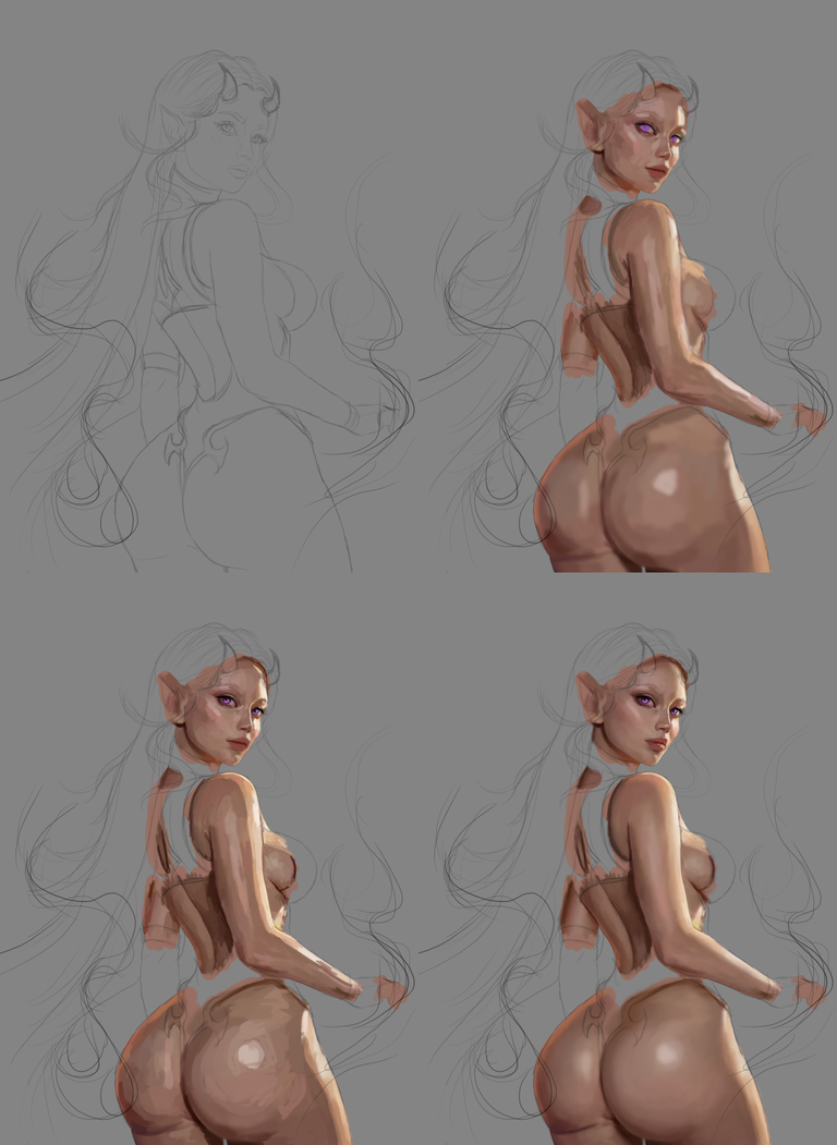
I made the sketch two days ago, I took it calmly and left it to paint the next day, at first I started to paint with warm skin tones, since I had another idea in mind, then I placed the colors adding lights and shadows, in a new layer with a harder brush, I applied more tones to finish forming the skin completely, this time I did not want a rustic texture, so I started to mix the colors with the help of a diffuse brush to give it the softness I was looking for.
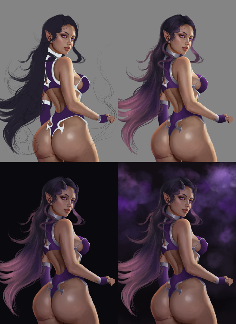
After having the skin ready, I started to paint the hair as well as the clothes, using as reference the colors of the original card, I liked the idea of doing a redesign of the costume, in which I wanted to show something more sexy and flashy, then I added clipping masks in each piece I painted of the clothes to start giving it more shape adding lights and shadows, on the hair I painted with dark and light purples and also some desaturated pinks, I painted the horns and changed the background to a dark color, almost black, then I took a brush with a cloud texture and started painting with different shades of purple.
Now it was time to draw the purple flames, first I made the shape and added a blur, I duplicated the layer before the blur to have a more solid version of this purple fire, but I changed the color setting to "Color doge" so it would shine much more, then I added a layer of lights to highlight the lights that bounce on the body, for this point I decided to change a little the tone of the skin making it a little darker and with a slight purple color, because I felt that the drawing did not look very good with the atmosphere that I put in the background, at first I wanted to make a light background, but the dark background called my attention more, I think it was a good idea to change that aspect.
Finally I edited the image adding more lights and adjusting the exposure making everything darker, besides adjusting the colors of the whole image to give it definitely more blue/purple tones.

Tools:
- Photoshop CC 2019
- XP-PEN deco 01 v2
Herramientas:
- Photoshop CC 2019
- XP- PEN DECO 01 V2
Foundation: alexa-artx
Rarible : alexaart
KnownOrigin: alexaart
Terra Virtua: AlexaArt
Opensea: alexa-art
Makersplace: alexaartx
Ghostmarket : alexa
NFT Showroom: alexa.art
Twitter: Alexa_Ys
Instagram : artx.alexa

Felicidades y te quedas con mi voto .Muy bien todo @alexa,arte .no estoy familiarizado con el arte digital y tal parecía al leer que realizaba la obra de caballete. Solo el término de enfoque y desenfoque delata tal variante del arte actual .el resultado es muy bueno y ajustado a tu preferencia por esa gama de colores que de verdad muestra un producto exótico y sensual.
Muchas gracias por tus palabras @davidsantafe Saludos!!
Me encanto! El diseño está increíble y sin duda supero al anterior. Mucha suerte ✌️
Heyyy Muchas gracias @mario02
Support Splinterlands by Submitting a positive review about Splinterlands on Gam3s & also nominate Splinterlands for the People's Choice Awards on Gam3s. Don't forgot to take screenshot & share those on Splinterlands GAM3 Awards Challenge! Comment section to earn some delicious upvote from Splinterlands.
Thanks for support!