It had been a while since I last put my fingers to work on pixel art or any other type of digital art, to be honest.
But, as with any good story that starts with "I was just casually browsing the internet" or something along those lines, mine also took an unexpected turn. There I was, wandering aimlessly, digging through Hive communities and stumbling upon posts in the Alien Art Hive community. These posts featured amazing digital art for the Splinterlands Art Contest Week 320!, and some of them were even in pixel art. At first, I thought it was beyond my skills but I was wrong.
And then came the epiphany.
I don’t know much about Splinterlands, but I’m not clueless when it comes to doing some research. Naturally, I visited Splintercards and explored a few creatures. One that caught my attention was Bera Dellin. I liked her particularly because she seemed straightforward enough to use as inspiration, among all the creatures with wings, horns, giants, and other features.
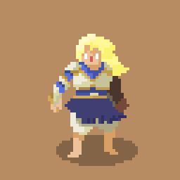
You can check out the final result below:
Resources used
It had been three months since I last touched pixel art. For anyone who’s tried it, you know how every detail demands patience, precision, and a healthy dose of obsession. Coming back after such a long break without any practice was quite a challenge, so I started with a sketch that wasn’t exactly easy on the eyes.
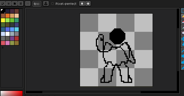
Dang, it looks like a cursed turtle lol. I might save this sketch for a future Teenage Mutant Ninja Turtles drawing.
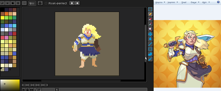
Anyway, as you can see from the sketch, I initially thought about drawing her exactly as depicted in the card image. But I decided to make some changes so it wouldn’t look like a copy-paste job. After all, I believe the challenge is meant to inspire us, not necessarily to create a mini replica of the original, right?
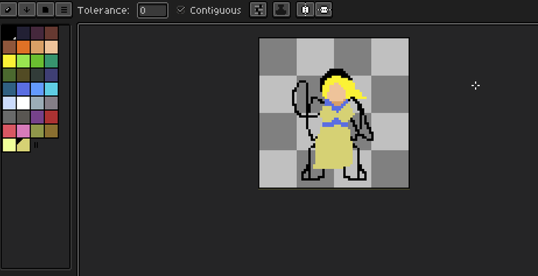
So, I began fixing this horrible sketch to try and shape it into Bera Dallin. I defined the light source, highlighting her face on the left side, while her hair flows to the right with the wind. I opted for slightly less saturated colors since I really dislike overly bright and saturated tones in pixel art. Of course, for other art styles like collages, mixes, or psychedelic pieces, those vibrant colors might be more fitting.
I could stop here, couldn’t I?
Just kidding.
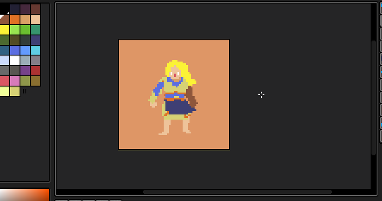
At this point, I could finally call it pixel art, though it wasn’t quite at the level I wanted to share.
Next came the finishing touches, adding shadows and highlights. I really wanted to create an interesting background that would make the image stand out as a whole, not just focus on Bera Dallin.
But I came across this contest a little late. There were only 3 hours left to submit the artwork. So I didn’t have time for anything fancy just some polishing.
You can see the result at the beginning of this post.
Here’s a comparison of the images:
Congratulations @alienpunklord! You have completed the following achievement on the Hive blockchain And have been rewarded with New badge(s)
Your next target is to reach 200 upvotes.
You can view your badges on your board and compare yourself to others in the Ranking
If you no longer want to receive notifications, reply to this comment with the word
STOPThanks for sharing! - @isaria
