
🍒Hello Hello community🍒, I hope you are great, if you are new here welcome to my blog, a shower of sparks you will find here, today I bring you another practice with the watercolor technique this time a drawing inspired by a project I have in mind, where love and the colors red and pink are very present.

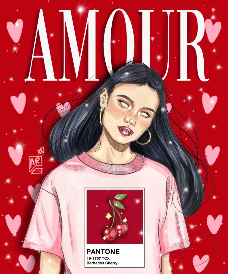
The composition of the work is a girl with thick black hair wearing a pink t-shirt with a PANTONE color print and cherries, with skin slightly kissed by the sun, on a background of hearts and the word love written in French.
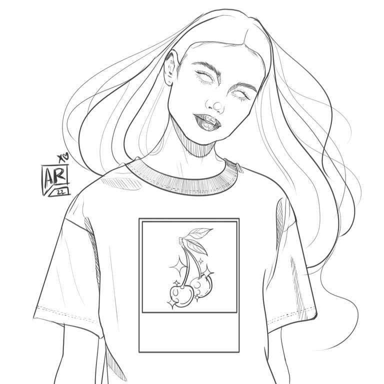
First I made the line art to have a clear guide of the coloring segments of the drawing, after that I poured the first layer of color defining each element to work later on the lights and shadows, the secret of the watercolor technique is the layers and not to be too perfect, let it flow whether you try it in a traditional or digital way.
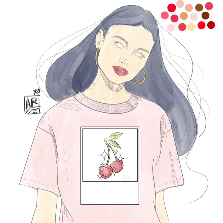
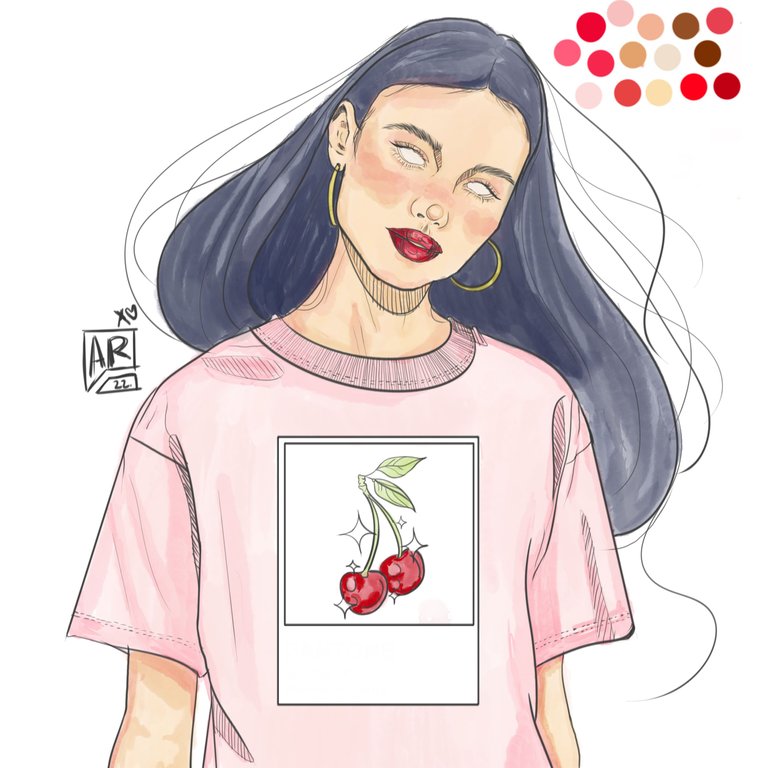
For the makeup this time I used pink and peach tones in a subtle way, with blush applied on the cheeks, nose, chin, fine cat eyeliner, eyelashes with subtle volume of very natural look and peach shadows with application of brown for depths.
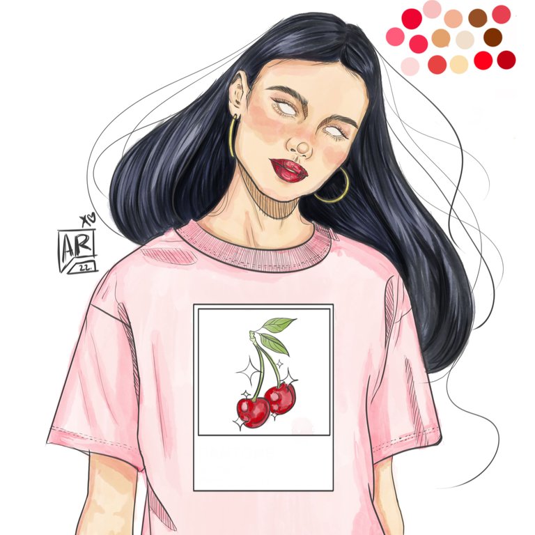
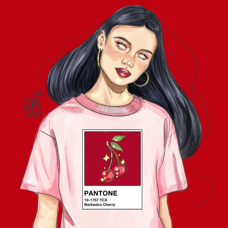
The t-shirt is in pastel pink with darker shades, it alludes to a graphic t-shirt very fashionable and a classic in every wardrobe regardless of age, it is a very versatile garment that can be combined in many ways, it reminded me of a Parisian walking through Paris in the middle of the afternoon on Valentine's Day, full of love in the streets, I was very inspired by that feeling.
If you have made it this far, let me thank you for your support and accompaniment, it is very important to me, I send you kisses and shines to wherever you are and see you in a future post, I send you my best wishes.


Puff, suelo ver post como estos en Behance a diario y no deja de sorprenderme la habilidad que tienen algunos ilustradores para expresar tanto...
Me encanta el estilo, me encanta como simplificaste las sombras dándole un tramado con líneas negras, debo admitir que hay elementos que no entiendo en la composición, o detalles de luz que se me pierden, pero si algo aprendí del arte es que te gusta o no, no hay espacio para criticas pues lo importante es lo que el artista quiera mostrar, mejorar o compartir. Por ejemplo me habría gustado ver mas dinamismo en el pantone de la camiseta, algo de movimiento, pero a final de cuentas es el rostro lo que realmente destaca y lo que entiendo protagoniza la composición
The rewards earned on this comment will go directly to the people sharing the post on Twitter as long as they are registered with @poshtoken. Sign up at https://hiveposh.com.
Wow que pieza tan increíble me encantan los detalles del cabello esto te quedó brutal 😍😎🔥🙌🏻 definitivamente tienes paciencia para hacer estos diseños, éxitos y bendiciones 🙏🏻😇😍😎🔥
It looks great and it would be even better if the graphic on the shirt was contoured to her body because it looks perfectly rectangular now.
Thanks for the comment, I am still learning how to place the patterns in a more organic way on the body, but I really appreciate your opinion because it allows me to keep growing.