Welcome to this week's Splinterlands art submission😌
How are you today? Hope you are feeling good!
Here, I'd like to share to you my Art entry of the weekly contest in Splinterlands. You could join the Contest by clicking this👉 LINK HERE👈
Join me walk through the process of creation and hope you have fun as the art progress from the start to finish.
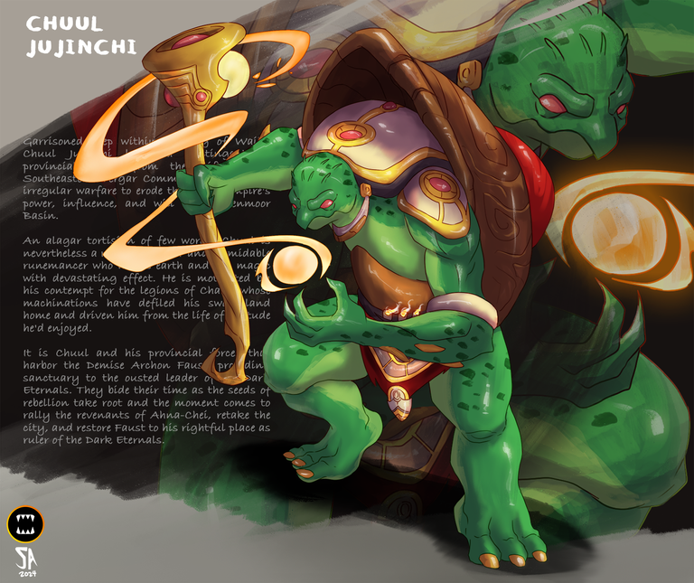
CHUUL JUJINCHI Fan art submission to Splinterlands Art Contest.

Card Reference:
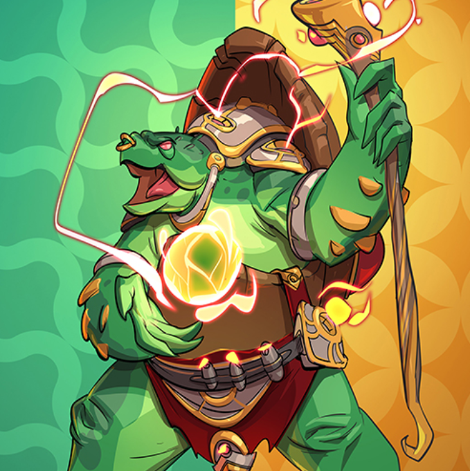
Digital Art Process
 |  |
|---|
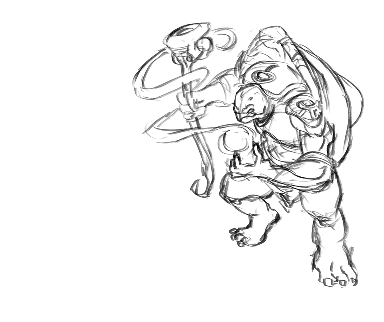
As always, I started with a sketch for the pose and composition of the character in a layer. 🙂 I made it straight forward with a semi top angle view. Holding his wand and doing some casting magic form. In sketching phase I just keep my pen strokes loose. And when I'm happy with that I move on to the next process.
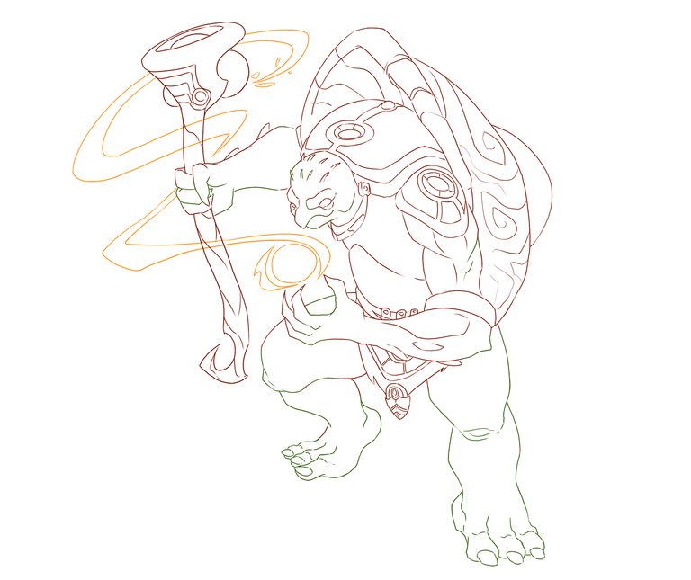
After that I create a new layer on top of the sketch layer and did the fine line strokes. It usually a black color stroke I just colored it in the last steps.
✨✨✨
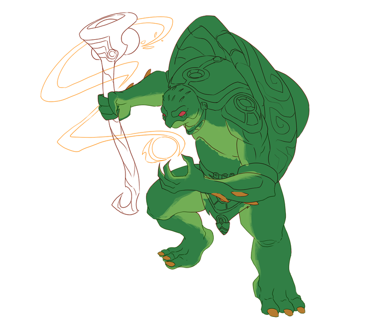
Next part of the process is adding the base colors. Usually I just put it all in just one layer, but here I do it in every separate layers. Here is the color for the skin.
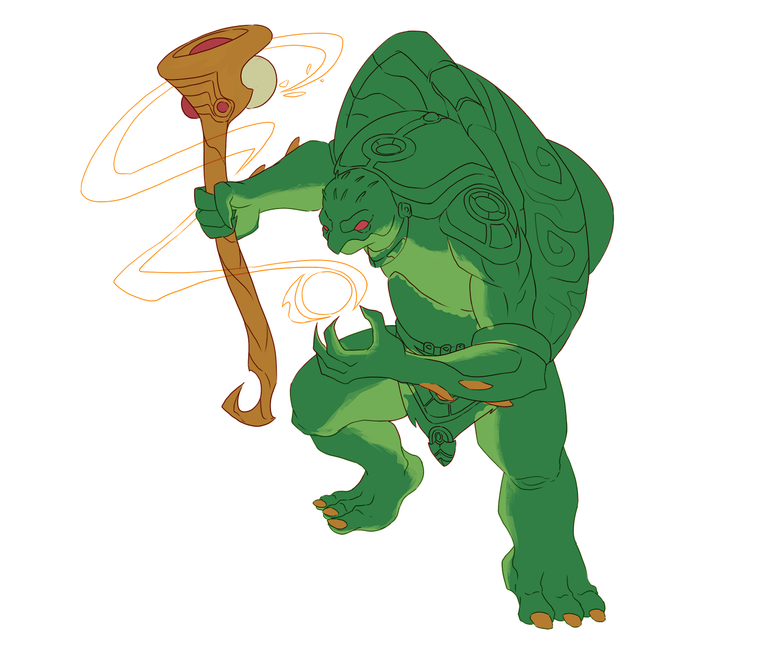
The base color of the staff or wand his holding.
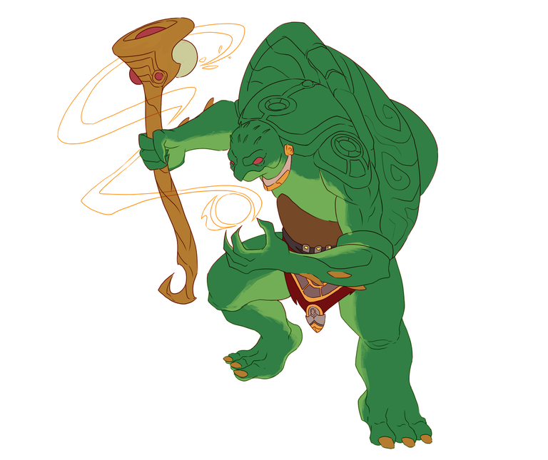
Here is some clothes he is wearing.
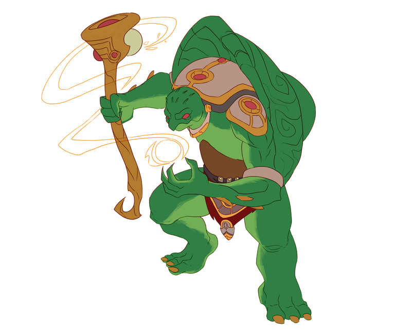
Then some armor I guess at the top of his neck and shoulders.
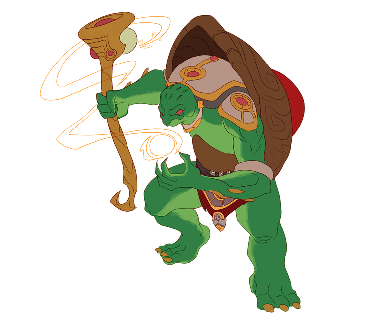
Then the shell at the back.
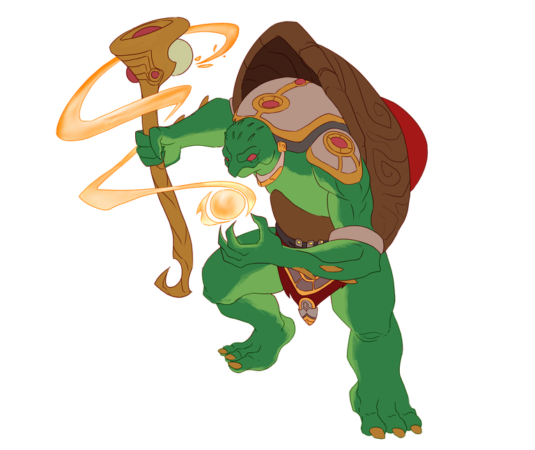
And the magical effect stuff too.
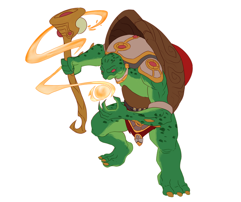
Lastly I add some spots on the skin layer.
✨✨✨
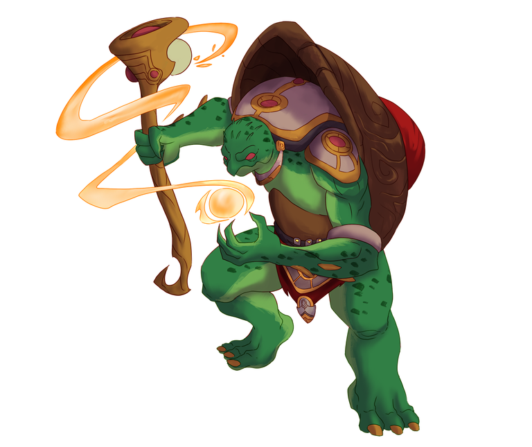
This step is where I add a shadow. I pick a color somewhere blueish to purple area, not so saturated. Then brush in to the surface where the shadow I think might be.
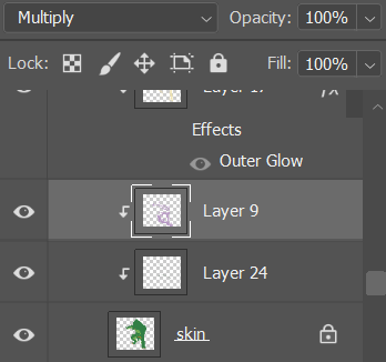
Here is a screenshot of what my layer of shadow looks like. I set the layer to Multiply blending mode then the Opacity is at 100% but you could edit that if the shadow is to dark you could lower the opacity.
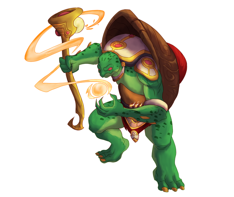
Then I add some light shade. I add a layer above the shadow layer. Pick a light yellowish color or white maybe. Then brush in some parts where light can be seen.
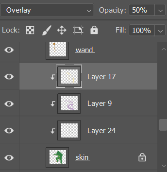
Here is what the layer looks like. Set it to Overlay and I adjust the opacity by 50%.

Then, I add the highlights a normal white color layer above the character.
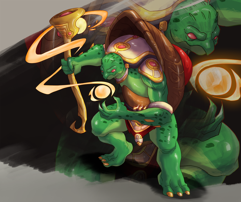
And here, I add some background design with the character that is set to lower opacity. Add shadow below the character and I'm good with this one already.
✨✨✨
Final Artwork

Lastly, for a new look I put the lore text at the side and add the name of the character.
✨✨✨
I'm happy with the result I think it's cool output😁 What do you think?
Software: Adobe Photoshop
Equipment: Huion Kamvas 13
You made it to the end of this post. I really appreciate your time and attention. Keep up the good work and have fun! Until next art illustration stay tuned😁
Thank you very much!
Not playing Splinterlands? Come and join us! Referral Link
Oh! if you're interested to check out my artworks check the links below😌
Checkout our BDVoter Daily Hive Showcase & Participate into our Daily giveaway to win various prize.
Thank you very much for the support BDVoter Team😌
Man what a cool job! 😱😱
I really liked the character design and the ideal background. It's like a kind of magazine page, you're great bro!
Thank you very much bro I'm trying new things glad you like it😁
Wow! What an amazing entry. Indeed you are incredible friend. Keep going!
Thank you very much for the support always it helps me keep motivated😁
It was very cool your digital fanart, I loved the design you gave it and the final result was excellent. The best of luck in the contest...
!DIY
!PIZZA
!MEME
Credit: orionvk
Earn Crypto for your Memes @ HiveMe.me!
Thank you very very much! I'm glad you love the design, best of luck for every participants😁
!PIZZA !DIY
You can query your personal balance by
!DIYSTATSWoahhh the final art looks like a buffering page for the game! Very witty to add the lore text. Galing!
!PIZZA
Thank you very much trying new stuff hope it turns out awesome😁
!PIZZA
!PGM
$PIZZA slices delivered:
@japex1226(2/5) tipped @jijisaurart
dayadam tipped japex1226
japex1226 tipped dayadam
jijisaurart tipped japex1226