Greetings, artists from all worlds and all realities!
I've been into cottages and bucolic environment these last few days, probably because of the rain and the beginning of winter in Tbilisi, but it has inspired me to dig into that style some more. I hope you like it!
The following images were made using my custom build of Disco Diffusion, photo-manipulation and digital drawing through Gimp and Inkscape, and post editing/composition in darktable.
More Artworks
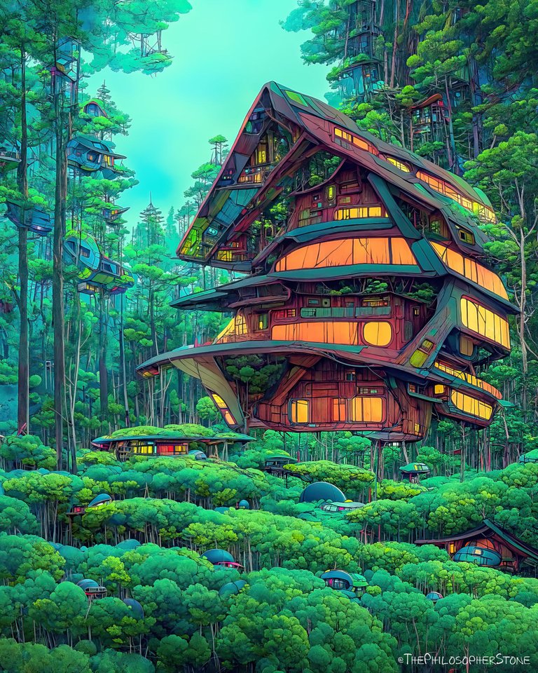

For a change,
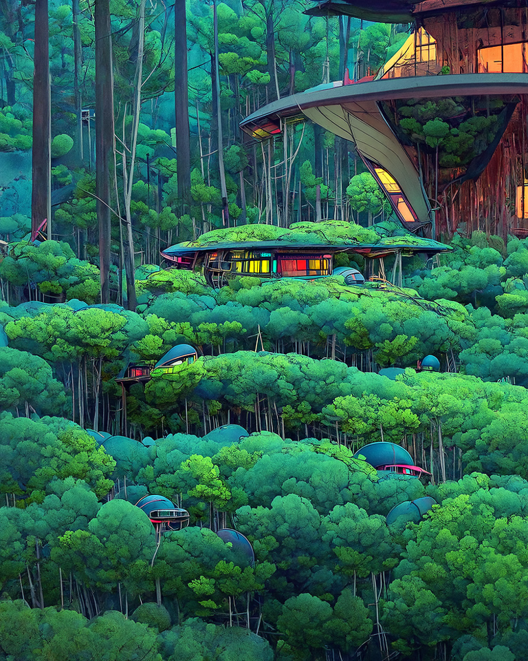
I'm not making creatures these days! Instead of insanely intricate creations, small slices in gimp and too many stitches to create 4K art, I decided to start using colors more, especially to overlay color using Inkscape! So, shading greens and blues to contrast with oranges, I've done a lot of manual adjusting and recoloring of the first image generated by DD, some photbashing, added some details as well here and there (wood, houses, cottages) and back into the program.
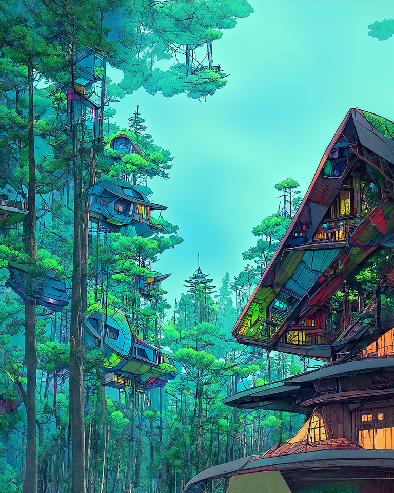

There are 5 different cottages I made,
And this is the first one. Each one of them is simply 3 round of generation, first in SD, then in DD, then sliced in 4 after rework and back to DD. I could technically cut them even smaller and go full 16 slices to add a ton of definition, but I like the "comic book" "graphic novel" aspect of these ones the way they are!
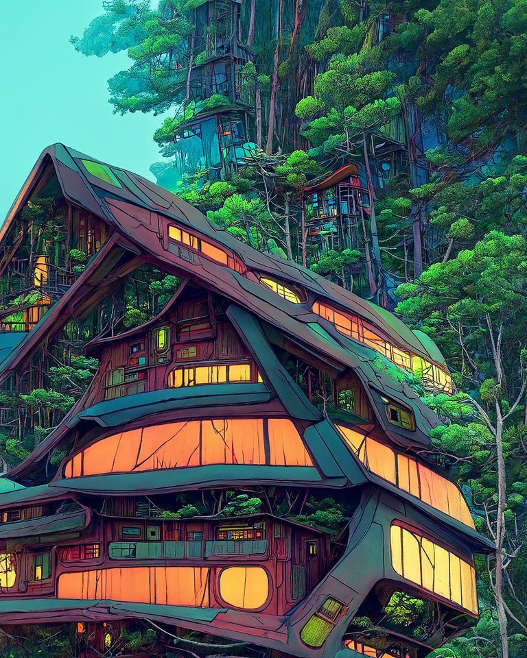

In a way,
It reminds me of the bathhouse in Spirited Away, but in a more tree-dense environment, a secret ghost hotel retreat in the forest for tired spirits. As you can see, I'm kind of struggling with the colors (still) but its getting better, warm colors (red orange yellow on that one, and bits of purple crimson and red) are hard to play around with, and I'm not 100% satisfied with how the windows turned out. But that leaves me room for improvement!
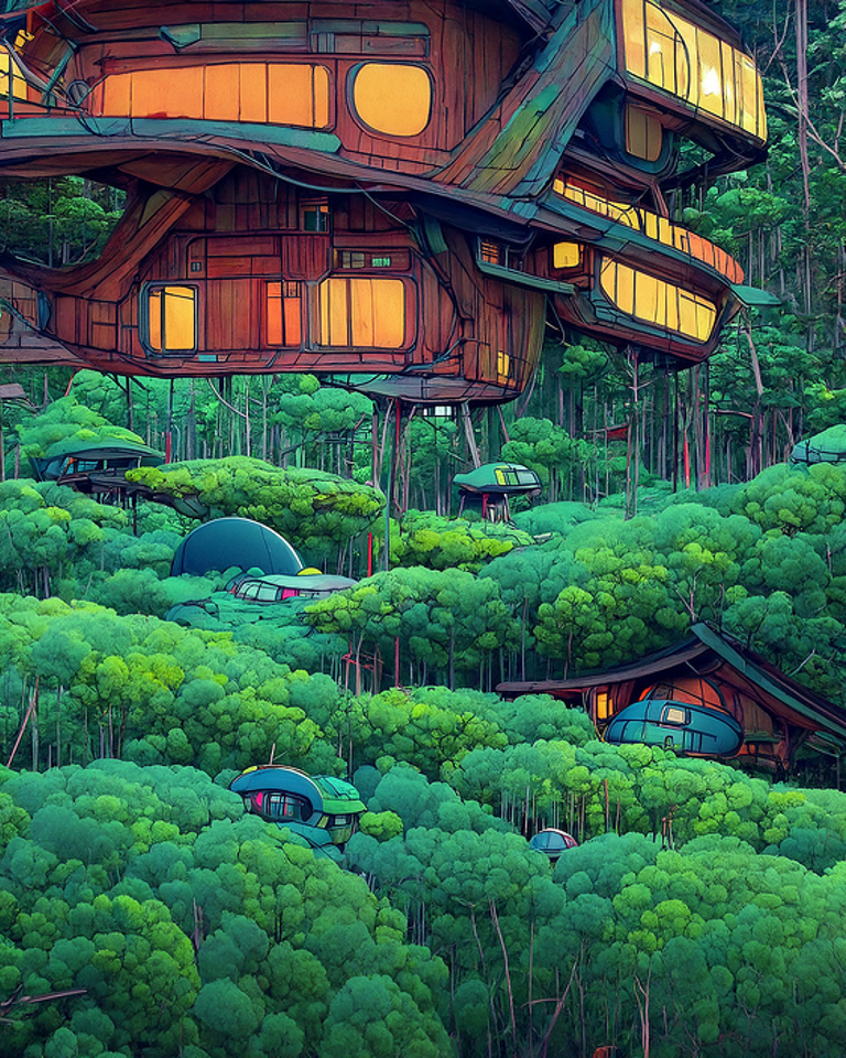

In your opinion,
Is it worse denoising these images, either manually by slicing them into fourths each and re-running them in DD (adding more details and doubling up the resolution in the same move), or by manually painting and photo-editing it to a smoother final result? Or even using an upscaler to get rid of the grain? Or do you also like the grainy aspect of it, as I do? I'm curious to hear your opinion.

I does kind of have that Spirited Away vibe!
That's pretty cool.
Thank you for sharing this post on HIVE!
Your content got selected by our fellow curator priyanarc & you just received a little thank you upvote from us for your great work! Your post will be featured in one of our recurring compilations which are aiming to offer you a stage to widen your audience within the DIY scene of Hive. Next time make sure to post / cross-post your creation within the DIYHub community on HIVE and you will receive a higher upvote ;) Stay creative & HIVE ON!
Please vote for our hive witness <3
Beautiful
!discovery 20
This post was shared and voted inside the discord by the curators team of discovery-it
Join our community! hive-193212
Discovery-it is also a Witness, vote for us here
Delegate to us for passive income. Check our 80% fee-back Program
Magical! I enjoy the orangey colors, it makes the place look beautiful and cheerful.