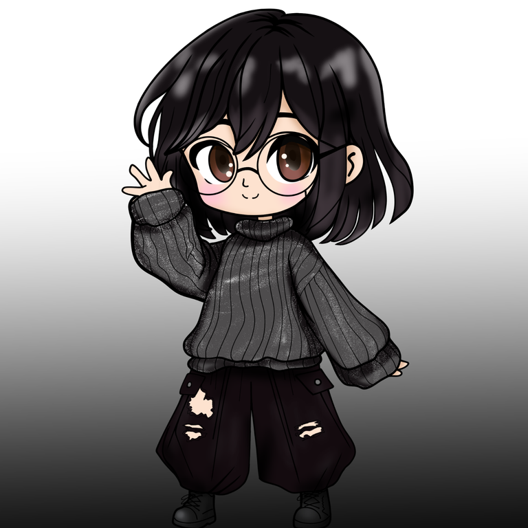
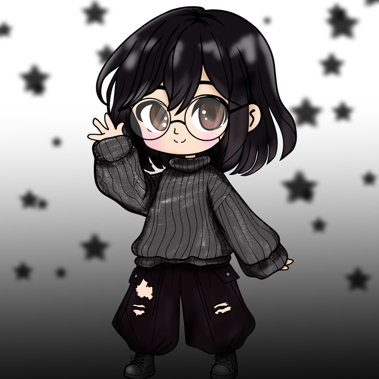
My profile picture was in need of a makeover, there was always time to make different illustrations, but I left it to the end. Today I had a little time and I wanted to create my new profile picture for a well-deserved "glow up"... This is me, Chibi style.
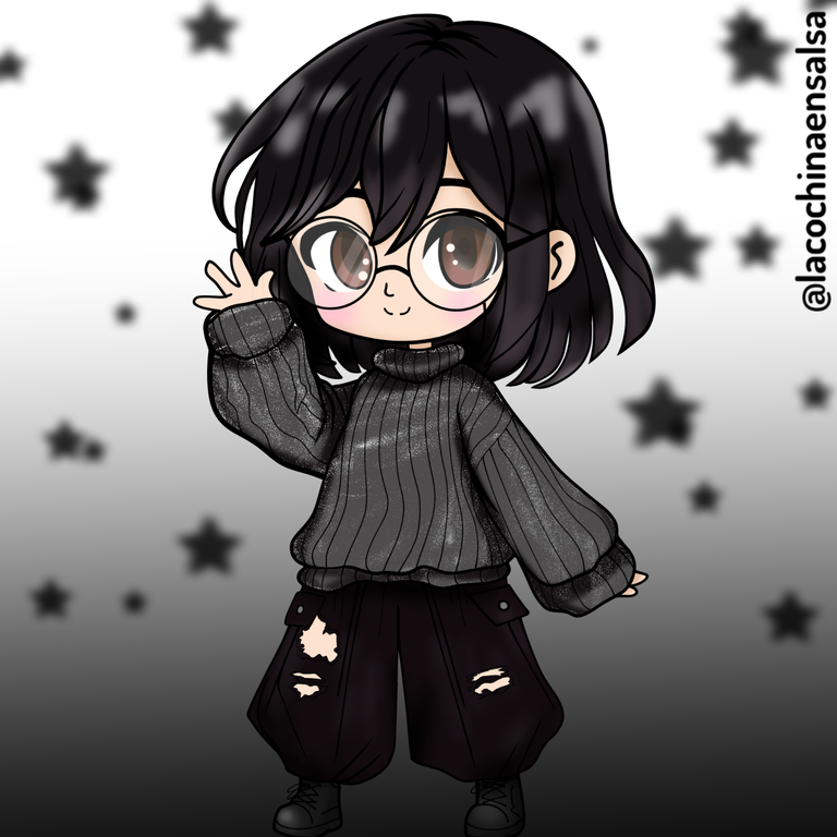
*I've been wanting to do one like this for a long time, but haha, I always limited myself thinking about whether it would turn out well or not. "Sometimes our mind is our worst enemy" - I don't doubt it. But far from it, I'm happy with the result, I love this style, because it's cute and offers a thousand and one possibilities of characterizations if I want to make more versions of myself. In my case, I've drawn myself (is that how you say it?) pretty well, I usually wear dark clothes and my essential glasses because I'm extremely blind. *
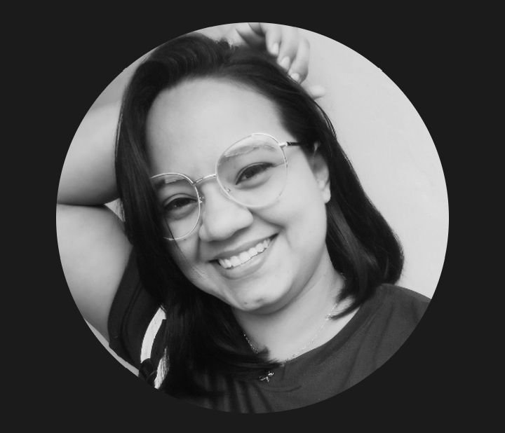
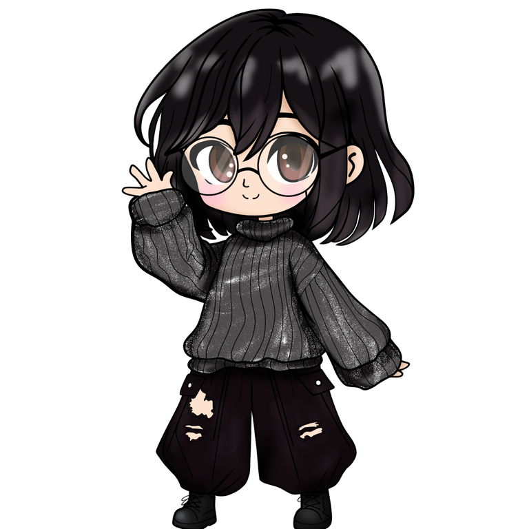
| I, human 🤣 | I, Chibi style |
|---|---|
 |  |
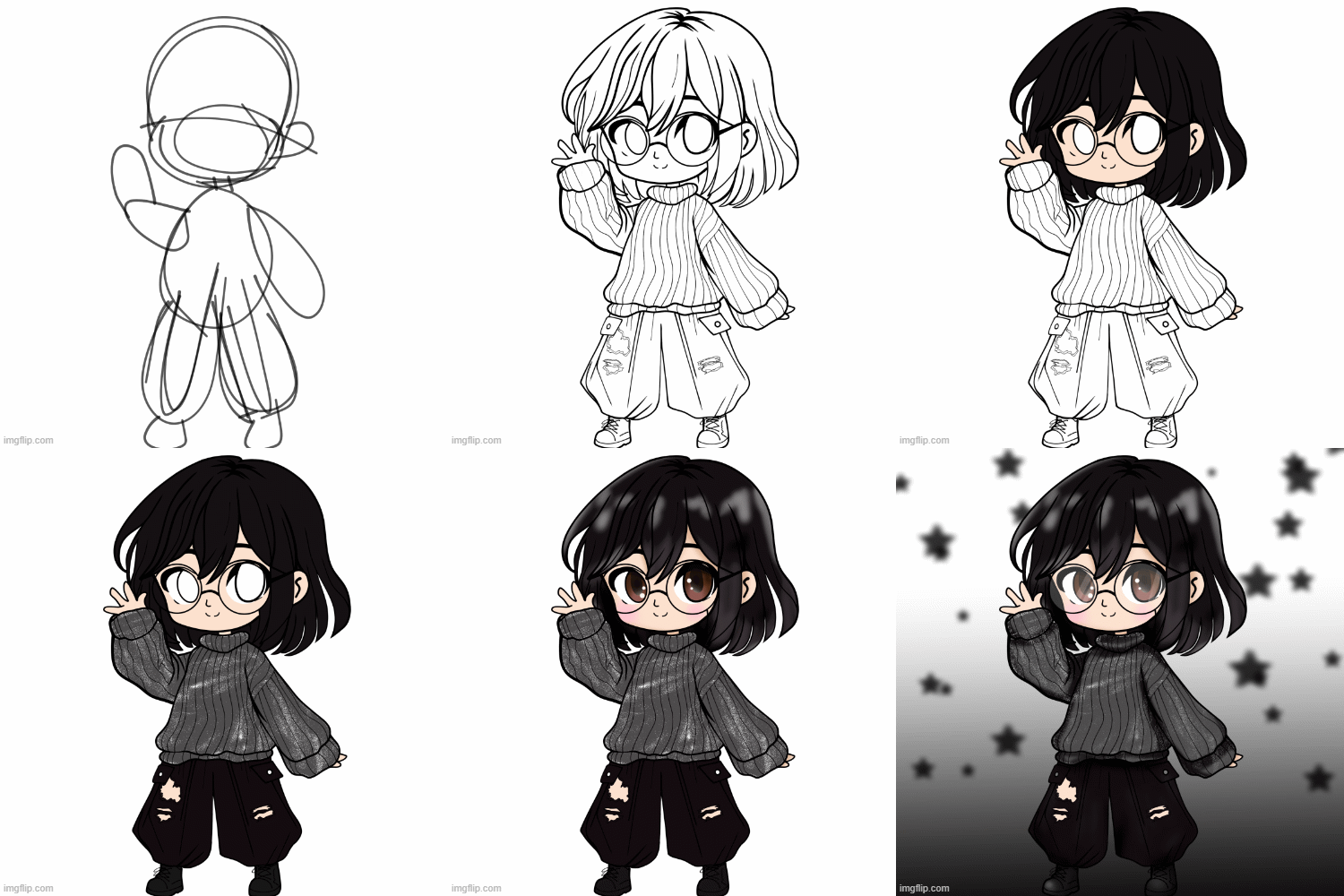
Join me in the creation process:
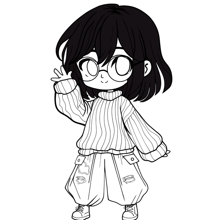
I used my reference photo. I started with a quick sketch of my Chibi, and then I moved on to a semi-careful outline. Sometimes when I'm going to develop the character with different elements or details, I like to do the outline in layers. So that when I clean it up with the eraser, it's easier for me. In this case, I drew the glasses on a different layer. I did a cleaning and arranging phase of the strokes. I like the brush I'm currently using, but I haven't set the endings, so I do it manually. I like adding different thicknesses, it gives me a sense of dynamism.
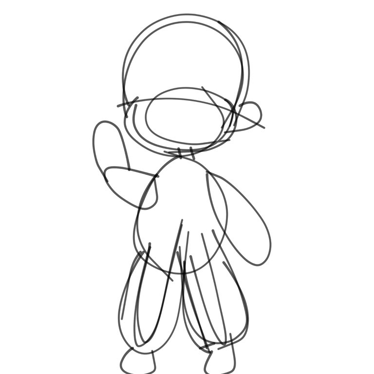 | 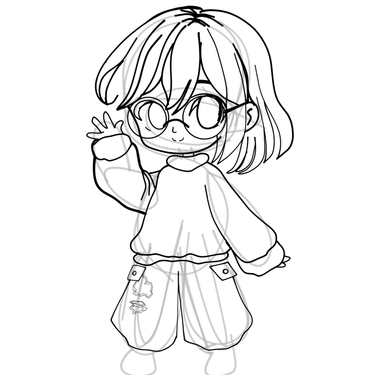 | 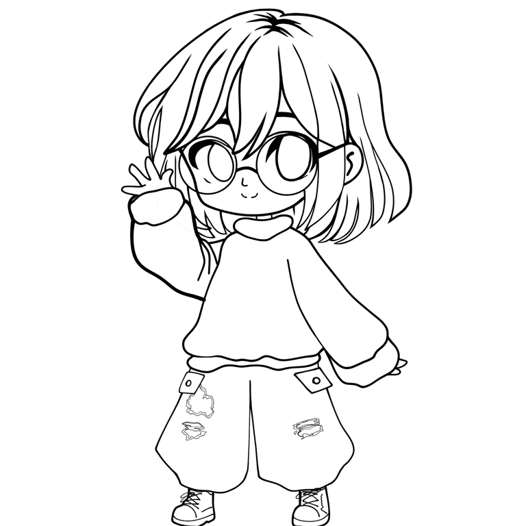 |
After I had my base outline, I moved on to adding more details. I love the ribbed coat-like fabric, so I wanted my Chibo version to have a sweater like that. As well as the boots, haha I need some boots like that in my life, but since I don't have them, I'll have to give my Chibi version a try.
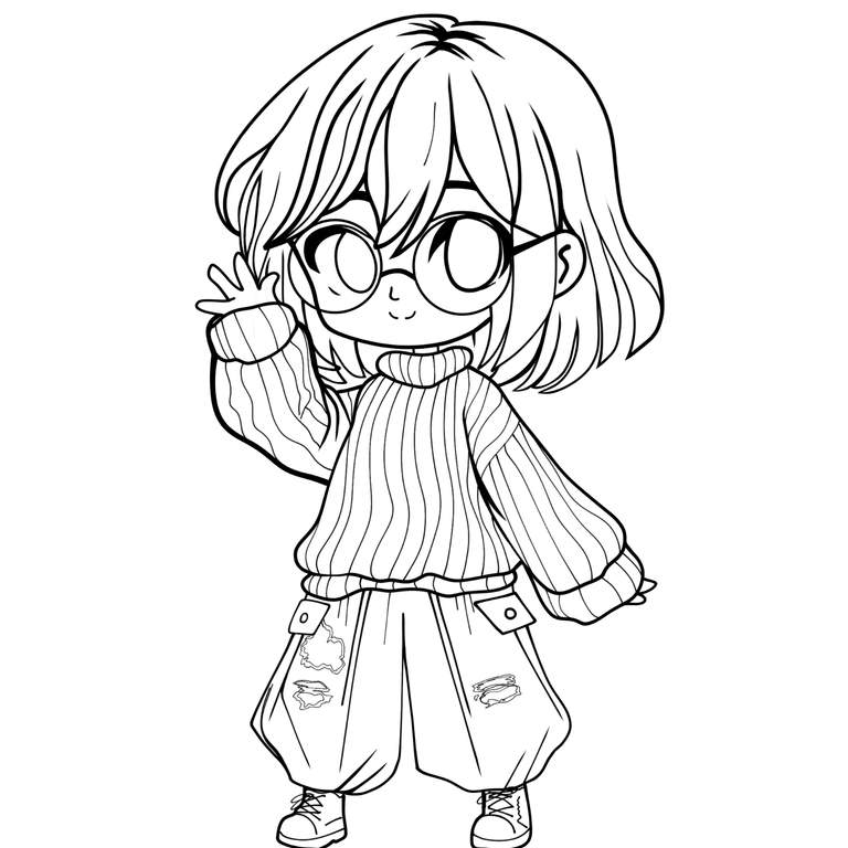
With my sketch clean and ready, I moved on to a base coloring stage. For this stage I used a paint bucket combination, and on the sweater I used the lasso tool. This was because I wanted to add texture with a brush called Chalk. Let's look at the base colors.
 | 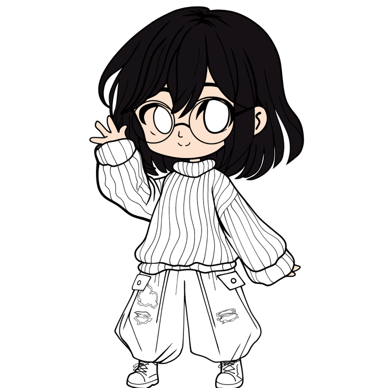 | 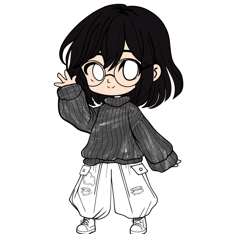 |
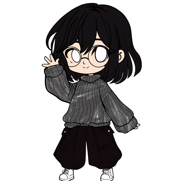 | 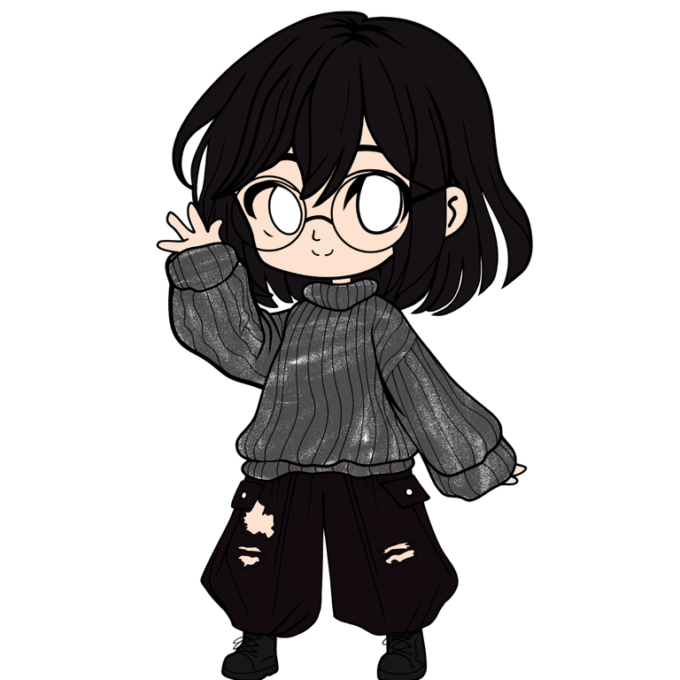 |
Once I had established the base colors, I moved on to more details in painting. I started with the eyes. I consider them to be the ideal starting point. I made them in layers and using a clipping mask. My eyes are brown, with the airbrush I made some shadows and with a blender I softened the tones. To give them the final touch of shine, I used a hard brush called a pen.
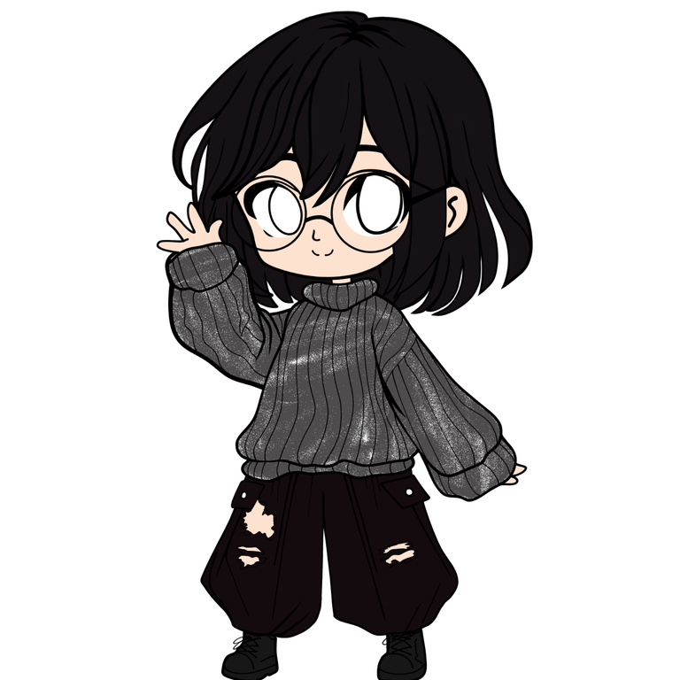 |  |
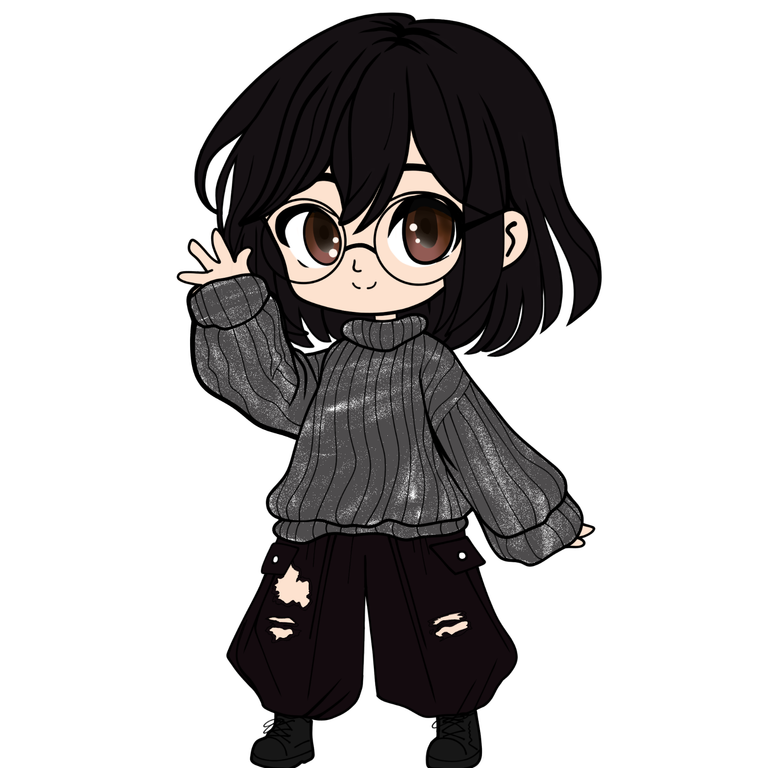
After finishing the eyes, they look pretty good, don't they? I continued with the details, using a clipping mask to make it easier. On the sweater I used a soft blended airbrush, as well as on the other parts. Except for the face, for the shadows I used a hard brush and then a blending brush.
 |  |  |
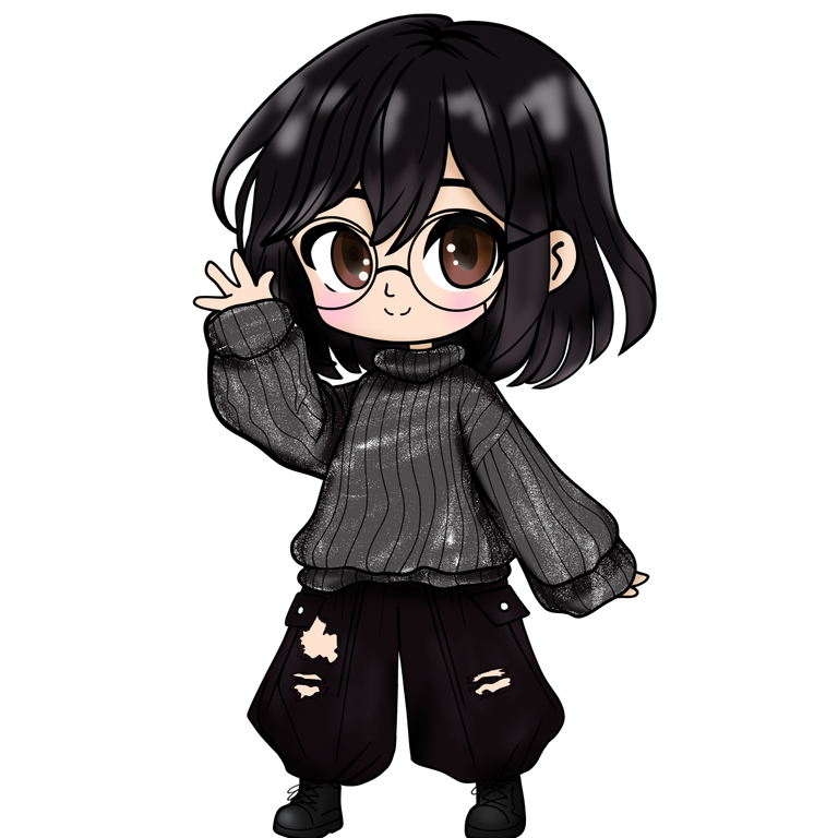
I made a version with a background and another without a background, in case in the future it was necessary to use it with a background. I opted for a simple gradient, with some dark stars, and gave it a touch of Guassiano effect to add some depth. And I almost forgot to place the lenses. To do this, created a new layer, lowered the opacity and colored the inside of the lenses. I brought that layer to Luminosity and Voila!
 |  |
Finished illustration:

 |  |
Drawing Program: HiPaint.
Translation: Google Translator.
Texts, photographs, screenshots and editions of my authorship/original content.
