- PLEASE CLICK FOR A BIGGER IMAGE - The original is 1920x1080 pixels.
You can find the full resolution picture here.
Hello everybody! 😊
How are you doing?
I am totally wasted of 3 days of carneval here in Germany. 😂 I am not used to this anymore. But I had so much fun partying with great people! More to this in another post though.
Time is running away so I need to do this post.
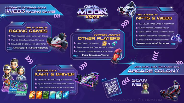
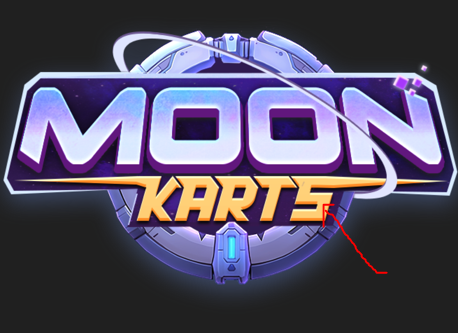
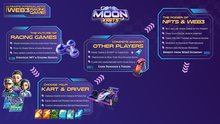
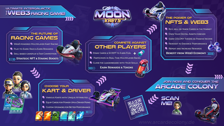
Here is my participation for the MoonKarts Infographic Contest. 🏎
The post will not be as long as I wanted because I am so done 😂 but I want to try to explain at least short how I created it and what my thoughts were about it.
Here are my working steps 📑 (I did everything in Adobe Photoshop).
1.
Took me a while to have the right idea and structure. This was the hardest part for me. So first I tried to figure out the texts I wanted to use and how to structure it in seperate parts.
I changed pieces of the texts like 20 times. 😂 You can also see this in the progress screenshots I made (find these down here in the post).
2.
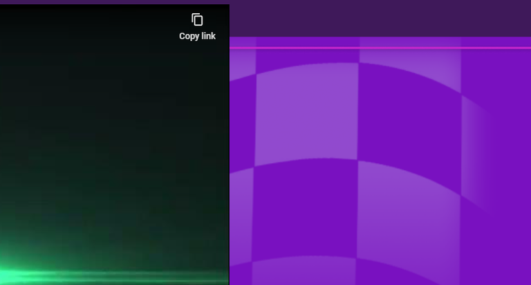
When I had a rough text and structure, I created the background image for the graphics first.
In general I used only colors from the offical MoonKarts colors with two little tweaks. Explaining later.
So I also did so for the background and made a gradient.
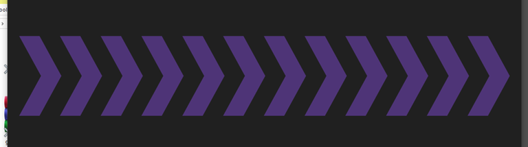
I further went to the Moon Karts website to figure out some typical elements that they used there. I tried to make the arrow style like on the website. and added a racing flag to the background.
WEBSITE:
MY ARROWS:
Then added a racing flag like on the website.
WEBSITE:
MY FLAG:
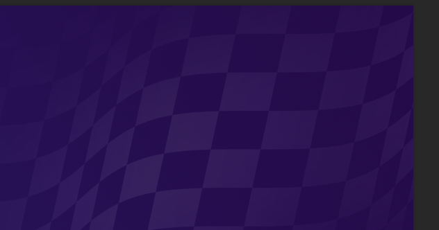
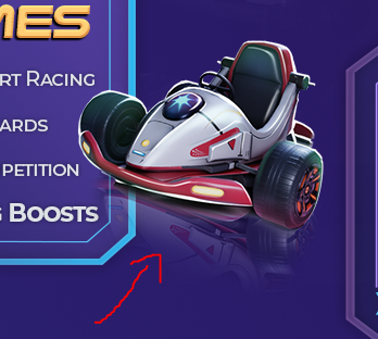
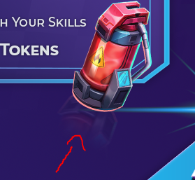
Also added some Karts / Drivers to the background cause there were still some empty spaces (did this later when the graphics was almost done).
This is the final background:

3.
Next step was asking for the official MoonKarts fonts that are used on the website.
After I got them (Montserat & Play) I used a Font Analyzer (https://www.myfonts.com/pages/whatthefont) to analyze the font of the "ARCADE COLONY" in the color scheme.
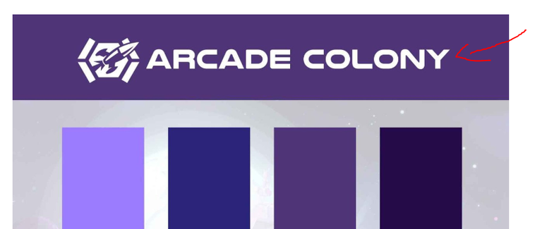
What came out was the font "Nulshock". It is not always working perfect but I was happy with the result, so I took this font for my Headlines.
4.
Now I designed some boxes in Adobe Illustrator as vector graphics, so I was able to tweak them all the time, to adjust the size of them to the texts I wanted to put in.
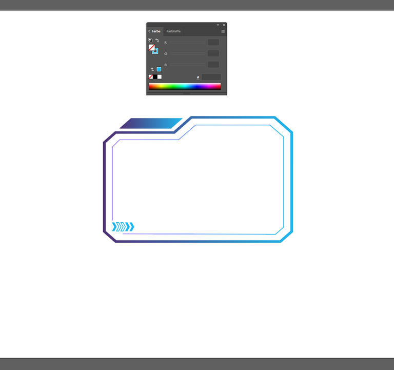
I wanted them to look futuristic to fit to the MoonKart theme. I used 2 colors of the official colors and made a gradient. Further I added 5 little Arrows (see bottom left) in the same style like on the background. These 5 errors were supposed to count up, because I have 5 important steps/boxes in my infographic.
5.
Then I wanted to start writing the Headlines and texts.
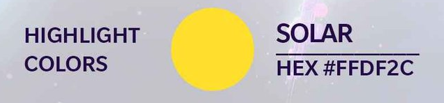
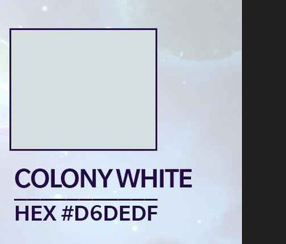
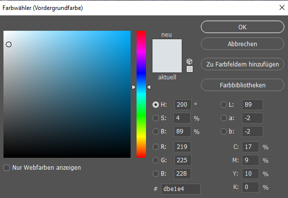
I decided for yellow for the headlines and white/gray for the bulletpoints. I decided against the yellow of the color scheme. Because it is a different yellow than the yellow in the Logo of MoonKarts. So I wanted it to be perfectly consistent (I am a little perfectionistic monk hahah), that´s why I made this decision. Might not be "correct" in terms of the color scheme, but I just like it more this way.
Decision for the texts color: I wanted to use the "Colony White" of the color scheme. But realized it was not readable good enough. The contrast was too low. That´s why I decided to make it a little bit lighter.
6.
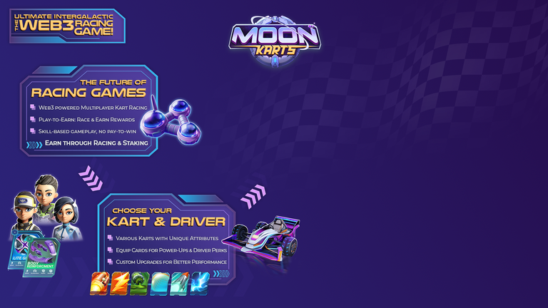
I searched for some little "icons" on the MoonKarts website, that I could use as bullet points. I just wanted to use as many icons and styles from the website as possible.
Found these little squares. So I rebuilt them myself in Photoshop.
WEBSITE:
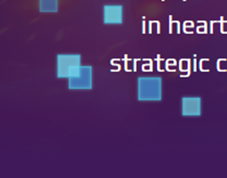
MY SQUARES:
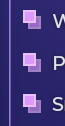
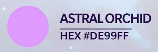
I used the Highlight Color "Astral Orchid" for these from the color scheme. Gave them a little glow outline to make it similar to the website.
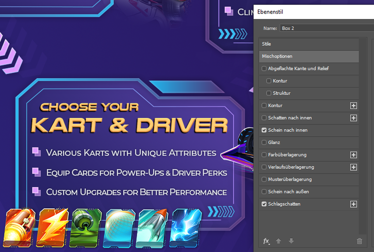
7.
I added some glow effects to the boxes because they were looking to "plain.
WITHOUT:
WITH:
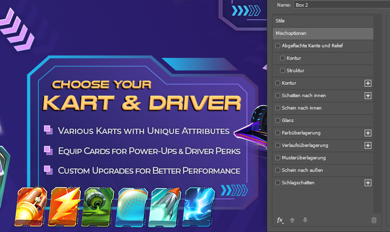
8.
Now I made the first few boxes with texts.
I wanted a big headline for the whole graphics on the top left. Then starting with the boxes on the left, moving over to the right. You can see in my progress shots how some of this changed the longer I was working on it.
9.
I downloaded alot of the graphics of the media kit but couldn´t find everything in there that I needed.
So I screenshotted some elements from the website (I know this is not a good way to do it, but I couldn´t find these anywhere else) and removed the background as good as possible, because all these glowing effects make it hard to get a clean cut. Even with Photoshop AI it was not perfect. But well, I think it´s alright.
10.
Continues with more boxes and texts.
Also added these pink arrows that point from box to box so you are able to see in what direction you are supposed to read.
11.
The karts had this mirror effect below them. So I wanted to do this also with other elements that didn´t have this. Added it for example here:
12.
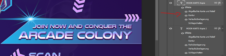
When I was almost done, I changed the text style and also the look of the boxes in the beginning and the end, as I wanted them to stand out.
It is like the headline and the call to action of the graphics. I wanted it to look different than the rest of the infos.
I tried to imitate the style of the "MOON" in the logo for the texts.
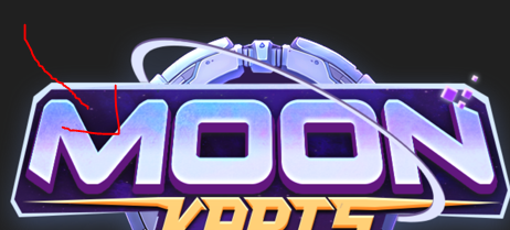
You can see a color gradient with 3 colors in it, and a thick 3d effect in purple. So I tried to imitate this.
13.
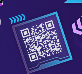
I wanted to add a QR code, so people could just scan and go directly to the website.
Also thought about using a referral code, but couldn´t find it although the whitepaper says there is one.
This was the infographcis so far.
14.
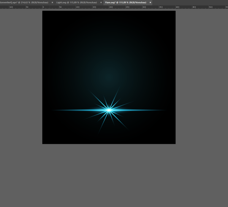
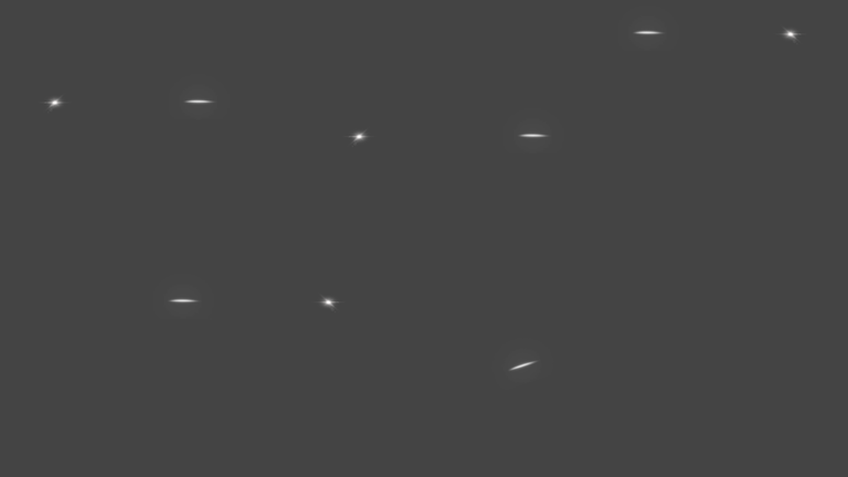
When I was "done" with the infographics, I added some light effects.
Some I just downloaded and adjusted the color of the vector. Like this one.
And others I drew in Procreate on the iPad Pro because this is sometimes easier.
I also wanted to add more light effects on all the headline texts. But to be honest, I am so tired and exhausted from 3 days of carneval, I just can´t get it done anymore. 😂 So sorry! I know it´s not completely finished but it is what it is. Better to send this than nothing. Because it was ALOT of work and it would be bad if all this was for nothing. So yeah it´s not my 100% but I´m ok with it due to the situation. 😅
I also thought about making a little extra version: A moved GIF. I know how to animate so this would have been no problem. But also same here. No more time and energy. I hope this won´t be too bad.
General Points about my Creation
It was a bit hard to find out what was true about the whitepaper and what not. I also tried to check with ChatGPT. But I am not completely sure. So I hope there are no wrong infos in my graphics. If so, sorry about that! I did my best.
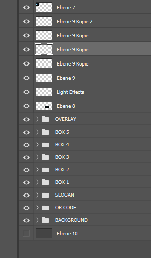
My Project has sooo many layers, definitely more than 100. I needed to organize everything in groups not to lose track... 😄
Well I think that was it. I hope I covered everything. If there is more you need to know, please let me know. :)
Have a nice evening!
Best regards
RAVEN 🐦
@coldbeetrootsoup This is my entry to the contest:

I am very thankful for everyone who supports me on my journey!!
 |  |
| Follow Socials and Side Projects | Listen to and buy Music | Use my Referrals |
|---|---|---|
| Audius - Emanate | Terracore P2E Game on Hive | |
| Hive Music Video Foundation | 3Speak - Odysee | Rising Star Game P2E Game on Hive |
| Brain Candy | Bandcamp | Doctor Who NFT game made by BBC |
it looks nice and suits well for the game imho!
haha you need to cut carinval attends 🤣
!PIZZA
Hive.Pizza upvoted this post.
$PIZZA slices delivered:
(3/15) @davideownzall tipped @ravenmus1c
You can now send $PIZZA tips in Discord via tip.cc!
Nice work ! I love the colour combination. Also, I've bookmarked the link for that font analyser, I wish I'd known about it when I desperately needed something like it a couple of weeks ago..... 😁
!BBH