Emoji to OC challenge!
Hello there guys, I hope everyone is having a great day today.
Today I like to share with you guys one of the artworks that I made for a challenge called emoji to OC (original character). This challenge was held by artpark, a cryptoart community which was founded in the noise.cash platform for artists to share their creative works. To the people who like to test their creativity, I'd like to suggest you guys try it out someday. For people like me who draw OCs most of the time this kind of events are a lifesaver because we run out of ideas most of the time and being part of challenges like this helps to re-ignite the creative part of our brain haha.
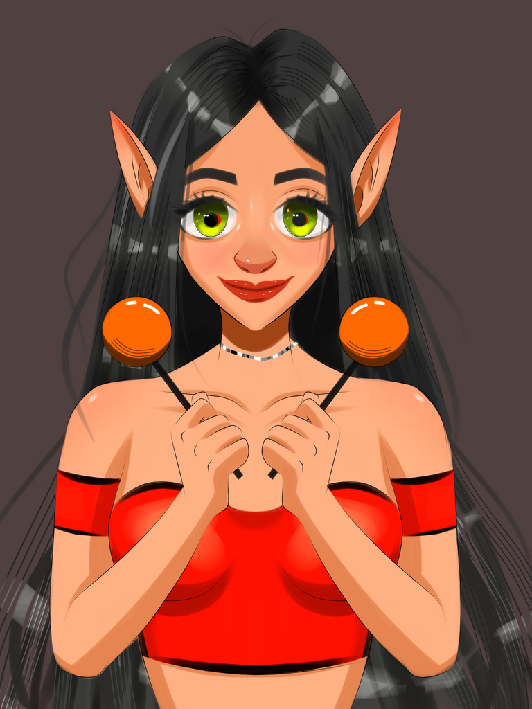
So the emojis given for this challenge were 🧚+🍭+⚔️=?
The Result✨
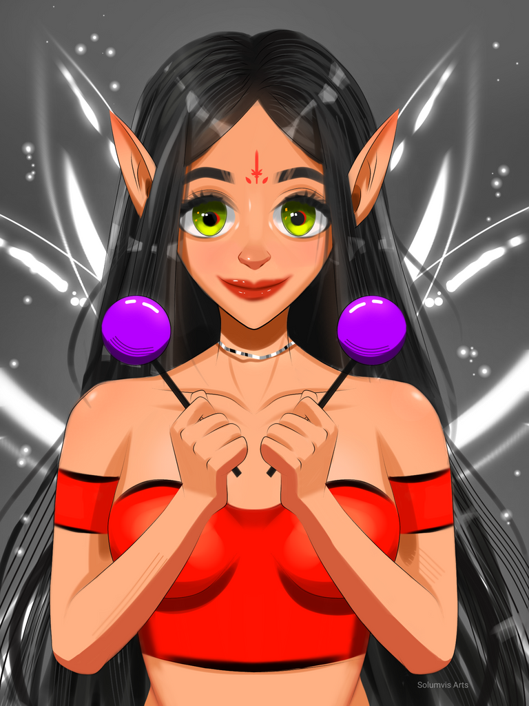
I used to follow anime style but if you have been following my account then you will know that my style shifted a while ago and this is where it began. I tested out adding more details on the face and other parts of the body with a soft shading style without deviating much from the anime style. My foundation is from anime style so moving away from it was not ideal hence this style was formed. I made this in the first week of November but never got to post it here. I do have other artworks with me and I still think about why I don't post them XD. Some of my friends also suggested posting it instead of keeping it to myself so I'm doing that now :)
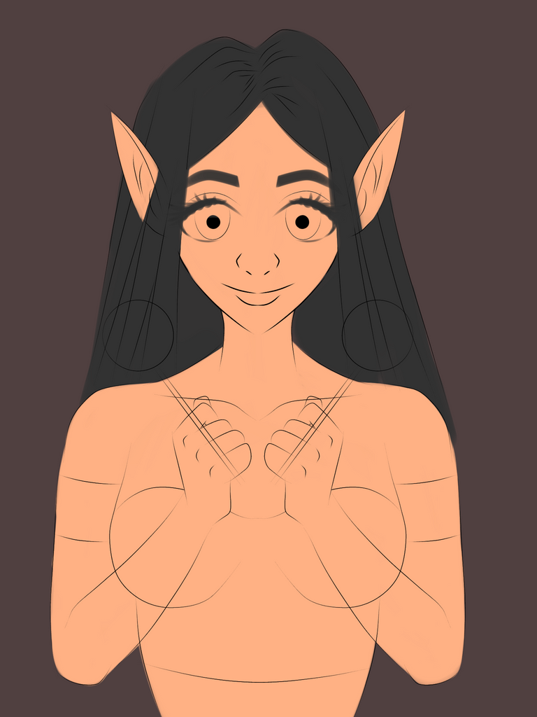
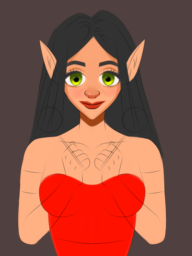
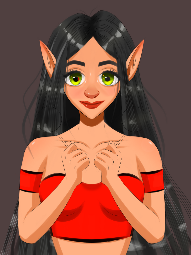
The Process

As usual, I changed the pose again haha!
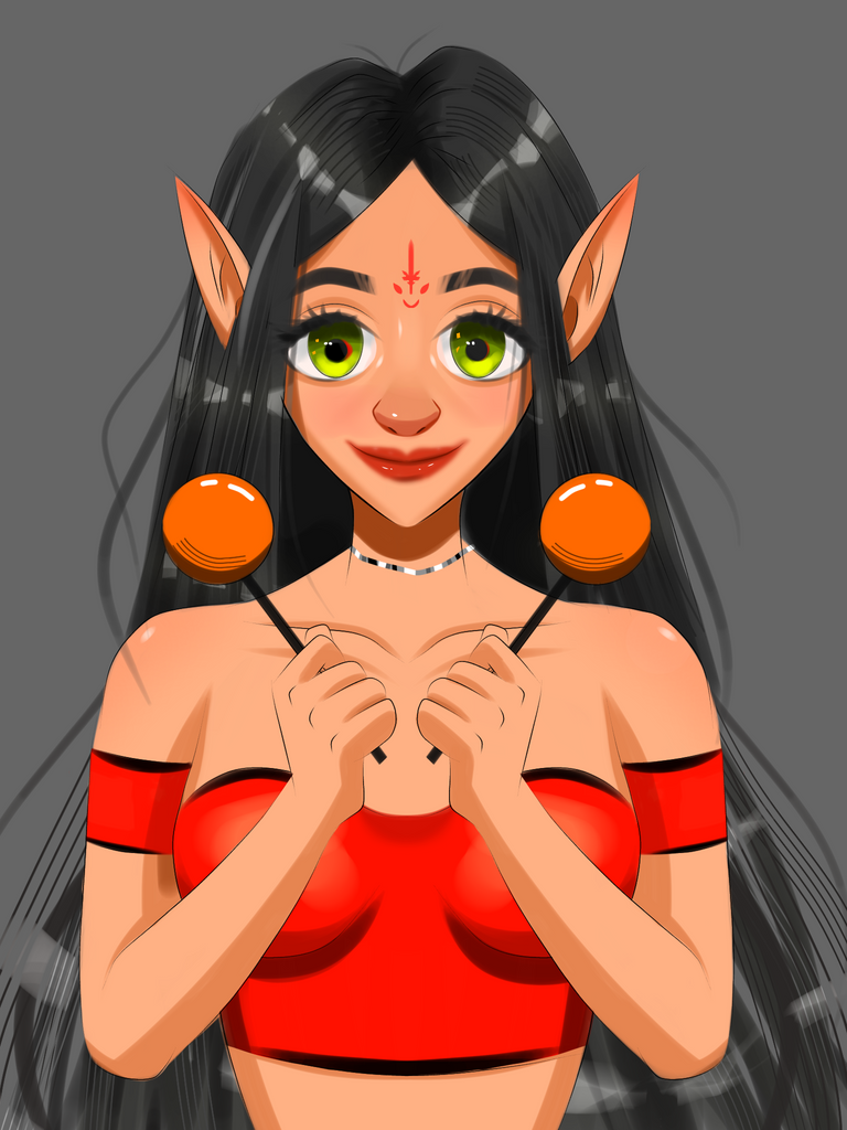
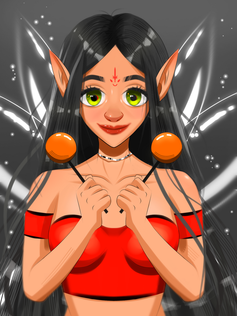
I forgot to save the WIPs of the wing sadly. Sometimes when you are making art you forget to save the progress shots. It's something I dislike XD. Let me explain how I made those wings then. It's pretty simple, I tried coloured opaque wings but I didn't like any of the designs I came up with so I tested a transparent wing design and it worked. I just made a white wing lineart and added some white highlights on it and at the end of the wings, I blurred it to give them a nice feel of movement. That's about it, it's pretty simple, isn't it? So where did the swords go? It's right there on her forehead hehe. Yeah I know I took a shortcut there because I didn't see a position to fit it into the design. It felt a bit crampy as it is.
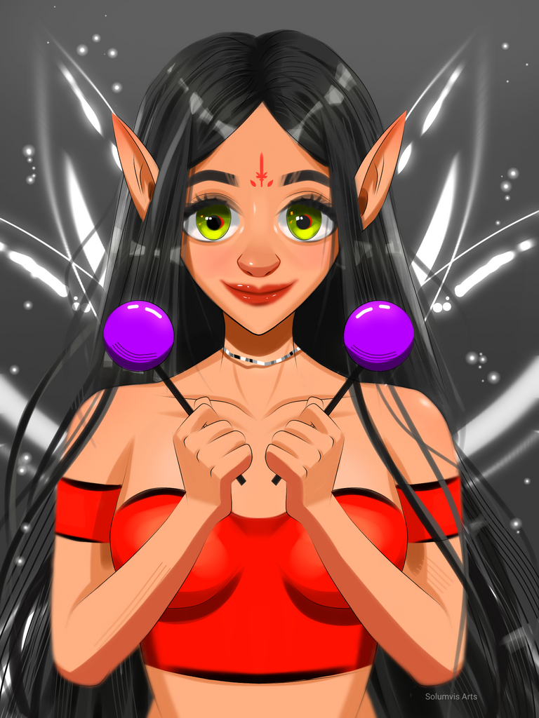
This was also my first artwork to test how complimentary colours look together. I was pretty surprised to see how the red complimented the green in her eyes so I even tried putting a bit of red colour behind her pupil and that worked as well. I studied more about complimentary colours before making this artwork. Some artworks that I made felt muddy before so this had to be done. After this, I started to closely observe the colour palettes that people use in a wide variety of stuff and found out that most of what they use are complementary colours. It's like a safe bet haha. Although I don't want to limit myself to just that so that's why I made one of my recent Splinterlands artwork in purple and black and not purple and yellow.
I understood a lot of things about colour theory after this. I usually play with the hue slider to get a matching colour but that's like an extra step and it's time-consuming sometimes. But that feature is still convenient so I'm not ditching it too haha.
Tools used
- Ibis paint
- Notebook
- Pencil
Duration: less than 6hrs.
Thank you so much for your time ☃️🌲🌲🌲☃️
I like the challenges of Artpark so that I do not have to think of what to draw 🤣 Love the OC, sol! I like the detail on the middle of the forehead. Great choice of colors, too!
!PIZZA
Same here hehe. It's actually a good exercise. We used to do it a lot on noisecash before all the mess. It was a fun time.
Thanks for the pizza :)
I gifted $PIZZA slices here:
(1/5) @jijisaurart tipped @solumviz (x1)
Join us in Discord!
I think your final color selection worked out well. You did great on the highlights and contours! Good luck.
Thank you :)
Those were some of things I decided to try out when I was starting with this style and I'm glad that it's working hehe