Creating a palette of Natural Colors - freely available for download 👇👇👇

Inspiration
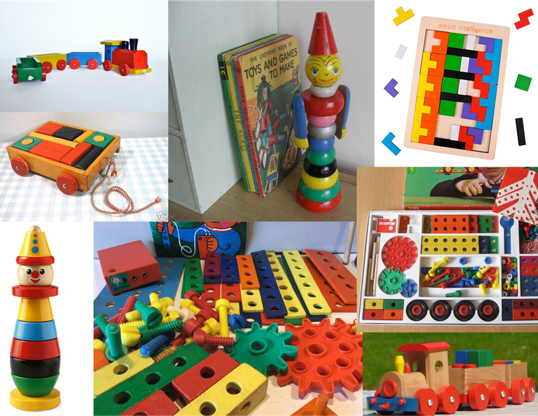
When you were born in the nineteen sixties or seventies, you probably grew up playing with the colorful wooden toys from the Swedish manufacturer BRIO. I suspect that it is still popular with parents who want their children to play with educational, ecologically sound and sustainable toys.
Personally I found these toys quite dull to play with. Their simple, abstract forms weren’t very realistic and therefore not really cool to play with.
What has remained in my memory are the recognizable colors. The wooden toys were - at least in my memory - always painted in the same, not particularly bright, but very unambiguous colors.
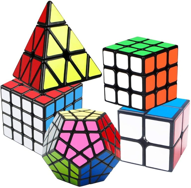
BRIO was not the only toy manufacturer to use this color scheme for their product. The Dutch “sio-montage” basically used the same color scheme for their wooden mechanical construction toys. And more recently practically the same color scheme is still used, e.g. for a 2014 plastic brainteaser puzzle from Kangoeroe and the well known Rubik’s Cubes.

Some Research - Where do these colors come from?
BRIO’s toys were not a one-off unique phenomenon. There were and still are many more toy manufacturer using equivalent color schemes for their products. The Dutch "sio-montage" in the 1970s used basically the same color scheme for their wooden mechanical construction toys. And also more recently practically the same color scheme is still used, e.g. for a 2014 plastic brainteaser puzzle from Kangoeroe and of course for the well known Rubik’s Cubes.
Going further back in time, to the first halve of the 20th century, e.g. the famous Bauhaus Dessau school of design also applied the same color schemes.
Progressive artists also adopted this new scheme. Bart van der Leck and the internationally renowned Piet Mondrian of the art movement "De Stijl" used only the "yellow red blue, black and white" of the limited painting palette of primary colors to create maximum contrast. And that while Theo van Doesburg also included orange and green and perhaps purple as equivalent colors. And so, by using some extra colors, he followed the same toy color scheme!
Ewald Hering - opponent colors
It all seems to come together with a nineteenth century philosofer, Ewald Hering. He formulated the theory of "Opponent Colors". This theory was quite different from the theory of "Prime Colors" applied and monopolized by the fine art painters.
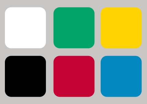
The opponent color theory suggests that there are three opposing color pairs: red versus green, blue versus yellow, and black versus white (the last type is achromatic and detects light-dark variation, or luminance). These opposing colors were directly related to the light-sensitive cells in the human eye. (bron: Wikipedia - Oponent Process).

Apart from the psychology of the eye, this palette of colors is based on the the subjective experience of human perception. The palette is not derived from the physics of light or the craft of mixing pigments, which is why they are often referred to as “natural colors”.
Berlin & Kay - Basic color terms
Interestingly, research published in 1969 by Brent Berlin and Paul Kaye showed that our commonly and unambiguously used terms for colors match these six natural colors for the greater part. They also show that when terminology for colors develops within a culture, along the way there will also appear terms for brown, purple, pink, orange, and gray.
Composing a palette
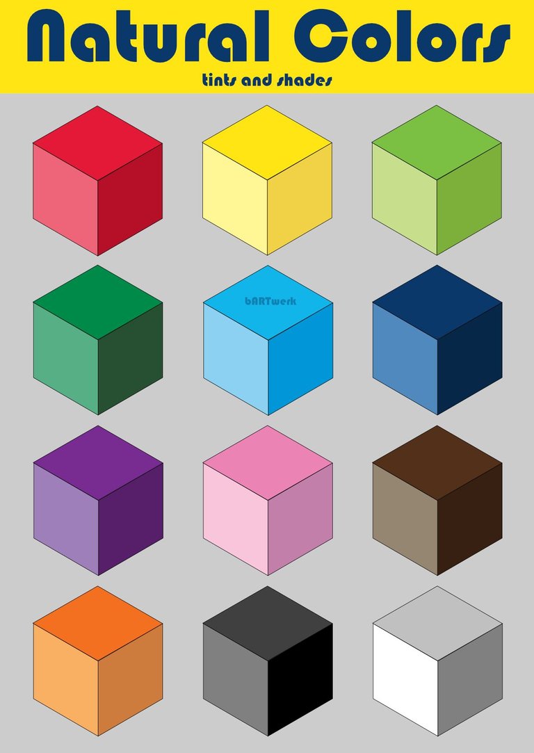
So much for the research; let's get practical. From all the available sources, I compiled a set of ten standard, which seemed to be generally accepted and frequently applied. For this set of colors, I also collected information on tinted and shaded varieties; if I couldn't find them, I just had to make a best guess. To complete the palette I added a series of five neutral grays, including black and white.
Et voilà!! 👇

This simple set of colors seems to cover all tints and shades; it brings together all the sources we found quite well. Plus, it's very useful from a practical point of view, so hurry to download it for your favorite design or drawing program!
FREE download
The palette is freely available for download from Gitlab.
Also read:
If you liked this post, you should definitely read my other posts about color:
- Munsells Color Systems for Digital Artists
- Colors of the roaring 1920s
- Colors of the 1970s
- Pastel colors