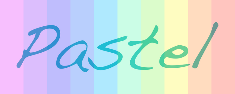
Pastel colors have remained popular over the centuries. Pastel colors date back to the 16th century, when they were used by Italian and German artists. But also in the 20th century popular TV-series "Miami Vice" pastel colors were the trademark of the main character Sonny Crockett (Don Johnson). What are pastels and what makes them so special?
How pastel colors are made
The name pastel color originates from the pastel stick. This art medium consists of a pure, powdered pigment with a neutral colored (white) binder, often chalk or gypsum. Meanwhile there are a large number of variants on the market with other binding material, including eg. oil pastels, hard pastels and pastel crayons.
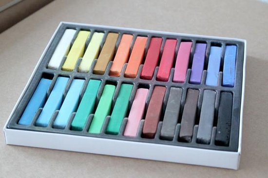
There’s a significant distinction between the painters’ material pastel stick versus the color pastel. While it is quite possible to make bright and strong colors with pastel sticks, when we talk about pastel colors we specifically soft and light tints.
To make things even more confusing, also an artwork produced with pastels is called a pastel!
The ability of these pastel sticks to make very light tints of one pure color pigments, has yielded the name pastel colors.
Properties of pastel colors
As I mentioned already, pastel colors contain pure pigments, which results in very pure color. Light and pure neutral gray is sometimes included, but gray blue, gray green and the like are not considered 'true' pastels.
Looking at the different color systems, pastels have some characteristic parameters (values):
- HSB/HSV: High Value (Brightness) in combination with low Saturation
- HSL: High Saturation in combination with high Lightness
- Munsell: High Value (8-9) in combination with high Chroma
Some example of HEX-code of pastel colors; all three values for R, G and B are relatively high:
Some well known pastels have specific names: Pink, mauve, and baby blue, as well as magic mint, peach, periwinkle, and lavender. (source: wikipedia-en).
Since all pastel colors are very bright, they lack the dramatic light versus dark contrast. Pastel art works therefor often seem soft, romantic and sweet.
Commissioned work "De Gruyter"
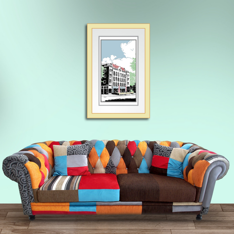
A commissioned work that I make a few years ago as a wedding gift from the groom for the bride. It shows Café P. de Gruyter in Amsterdam (NL), where the couple to-be-married had had quite a few dates, I was told. The pastel colors really matched the location and the overall "love is in the air"-mood of the work.
Historical images
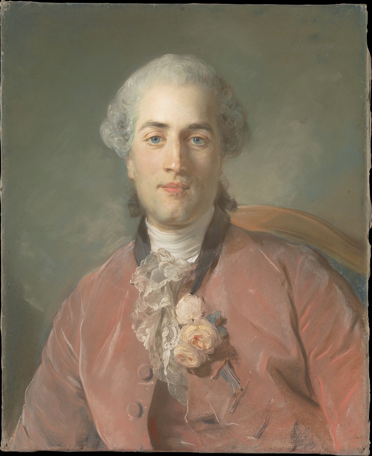
For inspiration I have collected a number of images of pastel artworks through the ages.
18th century pastel portrait
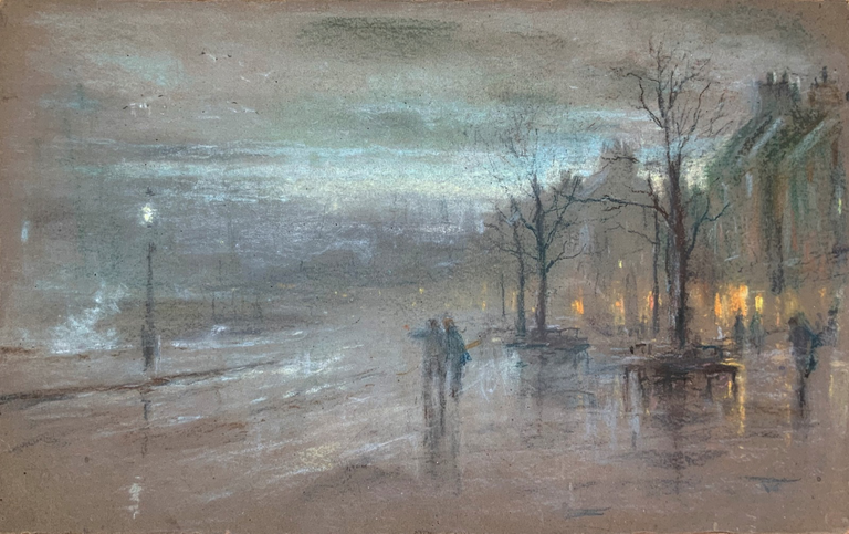
19th century cityscape
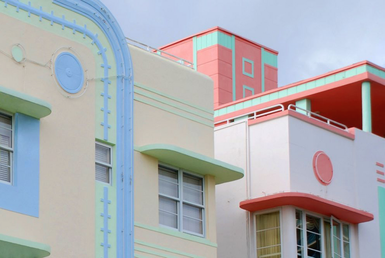
Art Deco Architecture on the Ocean Drive (Miami)
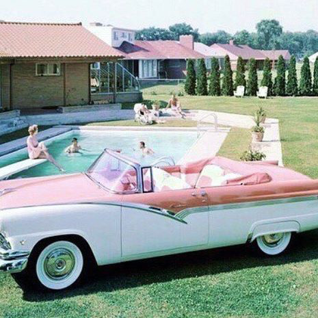
Chevrolet ('Chevy') Bel Air
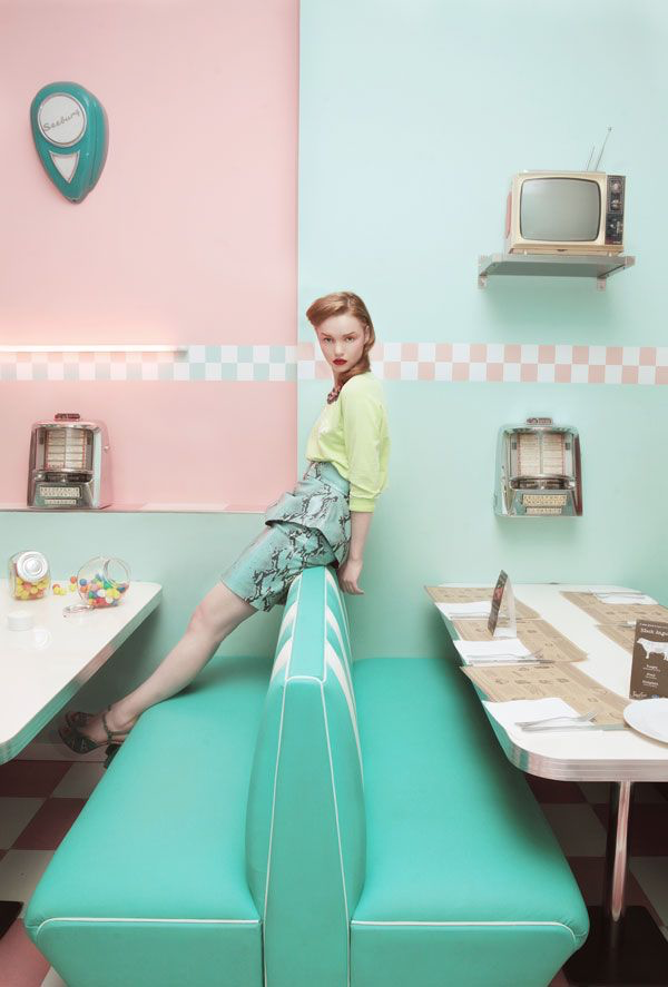
Fifties American Diner
Ice cream
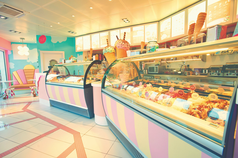
Read more about visiting this restaurant...
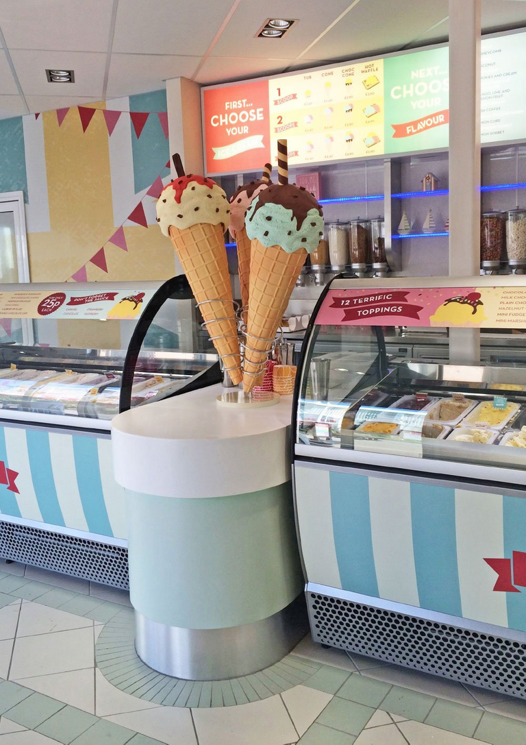
https://thelcstudio.co.uk/portfolio/scoop-ice-cream/
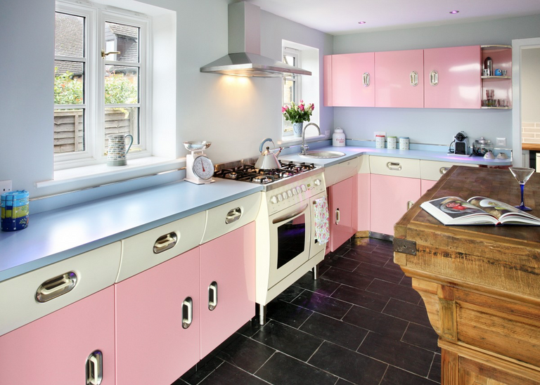
American 1950’s retro kitchen
Don Johnson - Miami Vice
Sonny Crockett changed the "sweet baby image" of pastels...

More fashion tips from the 80's/90's...
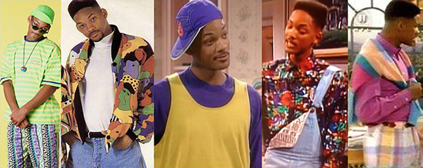
Fresh prince of Bel Air
In this series you can watch the fashion slowly changing from pastel to neon colors!
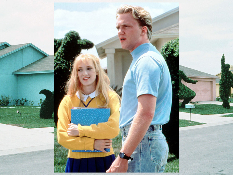
Pastel movie
The colors really fit in with the storyline of the movie.
This post was shared and voted inside the discord by the curators team of discovery-it
Join our community! hive-193212
Discovery-it is also a Witness, vote for us here
Delegate to us for passive income. Check our 80% fee-back Program
!discovery 15
Congratulations @bartman67! You have completed the following achievement on the Hive blockchain and have been rewarded with new badge(s) :
You can view your badges on your board and compare yourself to others in the Ranking
If you no longer want to receive notifications, reply to this comment with the word
STOPDo not miss the last post from @hivebuzz:
Love this post! I had a lot of pastel coloured clothing in the mid-late 80s... :-D