OK one follow up...
If you have some examples of social media type sites that put title before name that would be helpful for us. We went looking but couldn't find any. (which surprised us of course) we did see lots of use of small username and much larger title fonts of course.
Also navigational element IDEA is a HUGE rework of the site technically speaking (i am told) and huge experience change from the last 3 years we would love to see more conversation and input around it from a few places we'll try on our end to get opinions of course. It was of course a really fun thing for me to think about and discuss... i could see the vision just need to assess and discuss.
Sure, happy to!
YouTube Home Feed - Thumbnail, then title, then tiny name.

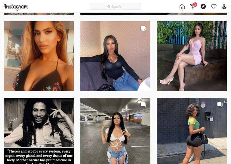
Instagram Explore Feed - No names whatsoever, content discovery only.

Hope that helps!
But do whatever you guys decide is best, I'm sure it will be great and PeakD will keep getting better!
(P.S. If ever in doubt about anything I've suggested, I highly recommend proper, adept, data-driven split-testing to clear up any concern and doubt, and resolve all speculation.) 🙏
I understand and appreciate the idea of split-testing... we're not really staffed to be able to do split-testing which more than doubles the work load. But we'll get there some day. But put the word out we're looking for really good employees if you know of any haha
I totally understand, all good, just floating ideas and I'm sure you'll get there! Split-testing is an extremely valuable thing to have when developing projects, and similarly to how I volunteered UX/UI insights... perhaps someone else will volunteer split-testing help for you as well. PeakD is beloved by many, and putting the word out may very possibly attract volunteers for you. Fingers crossed! 🙏
Thanks for your input.