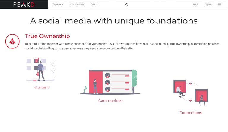
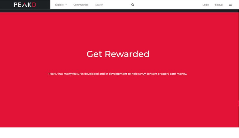
congrats on new design/homepage, like the new post layout :)
also the homepage looks neat, but I have some suggestions:
1 make the splash screen (the gray part) full screen, responsive full screen designs look super cool and immersive
2 the homepage has still way too much information imho and could be confusing for new users, I would make it more simple, only one sentence per chapter. UX and connection diagram looks cool. less is more.
What do you think?
Quick Mockup (full screen splash screen, smaller button icons, less text)
Mockup page 2 (less text, more whitespace)
Mockup page 3 (less text, more whitespace)


Very interesting mockups! I like the direction you're taking towards simplicity and clarity, I could see these inspiring even further refinements. Definitely food for thought. Personally, I've made a bunch of landing page mockups in my life and it's great to see another Hiver contributing ideas and visions for 'em, thanks @vikisecrets ! :) 🙏
💖
Thanks for the feedback. We'll discuss about this for the next update :)
So is your idea to just remove the text? Or where are you putting the text?
I would just remove it or make it appear on mouse hover or something like that.