We are off and running here, ain't we?
But let's be clear that this here community ain't just for pros or people wanting to break into the industry, this is for people who are interested in comics. Post a review, post about something you bought, a con you went to, something you're looking forward to reading or seeing ( in the case of a movie or show about a comic).
The point here is a general appreciation of comics!
Comics are king of pop culture right now, so there's no reason posts about comics shouldn't be the first thing new people see when they come to steem...because frankly, they are going to find that more interesting than a bunch of crypto talk amirgiht?
As a little jumpstart, and since I'm the admin ( a title that you get handed if set the thing up), I'm gonna have a contest/raffle. EVERYONE who posts in this here community this week ( starting....NOW...ending one week from now) gets entered in a raffle to win this here rough sketch of an upcoming cover of the multi award nominated comic book series Arsenic Lullaby! This is 5 by 6 inches or so. and I'll include a copy of a recent issue!
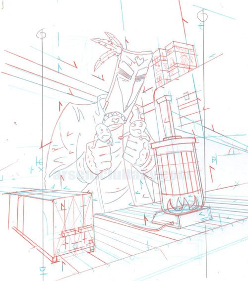
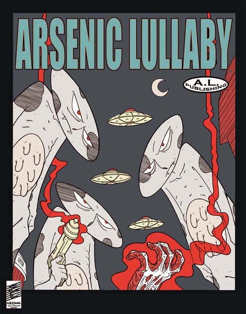
all ya gotta do to qualify is join ( subscribe?...I dunno this communities thing is new...I'm doing my best to figure it out) and post what you have to say about comics ( fyi you can then resteem the post to your own page, that's like double dipping!)
Not too bad for posting about stuff you like anyway. I mean, I could offer some small quantity of steem...but any group can do that. We're here for comics, the prize should be comic related. AND the prizes'll get bigger the more we grow. I'll do another one once we reach 100 people in the group.
NOW THEN- Me just posting about my own work ain't much of an example for people who don't draw, write comics as far as things to post. So this post is me just showing a bit of appreciation to a couple of comic book illustrators from back in the day that you might not have heard of!
First-Luke Mcdonnell illustrated a lot of landmark issues of Iron Man where James Rhodes had taken on the role. You know the character are War Machine in the MCU movies ( the grey Iron Man armor) but in the comic he first took on the role of Iron Man when Stark had become a dysfunctional alcoholic (ain't comics magical? what a beautiful utopia)
He drew one of my favorite stories of all time Iron Man Annual no7. Which focused on a lower level villains side of the story.
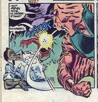
THIS page here is from Iron Man no.177 (1983). McDonnell was all around solid at drawing things but not competitive enough with details or refinement as Marvel comics illustrators like Byrne or Perez or Hall but he took a lot of chances and did interesting stuff on the visual storytelling. Even now when I flip through an issue of his, about 5-6 times per story I'll think to myself " wow, that is a cool way of doing that". The man could tell a story and layout a page so well that even a child could tell there was something about it that was above and beyond the rest.
Showing this page here because it's the easiest to explain but this issue is full of wilder layouts that work very well.
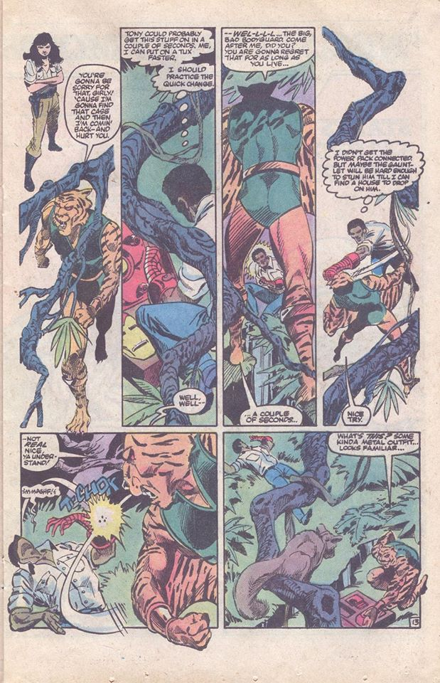
First, it's divided up in the golden ratio, that in itself is something you don't see enough anymore. Moving on, panels 1 and 4 are great use of "no background" the background is absent so the scene change is clear, and so the punch is clear without zooming in AND they bookend the row nicely.
BUT what I really want to point out here is the use of background objects to bring the page together, (see the branches, existing right though the boarders) Using the background to mask the boarders or bring unity to the page is something he did often and well...though Carl Barks (Donald Duck comics) perfected this technique back in the late 40's...at the time and even now you don't see it done as well as McDonnell. It serves a purpose, and isn't distracting.
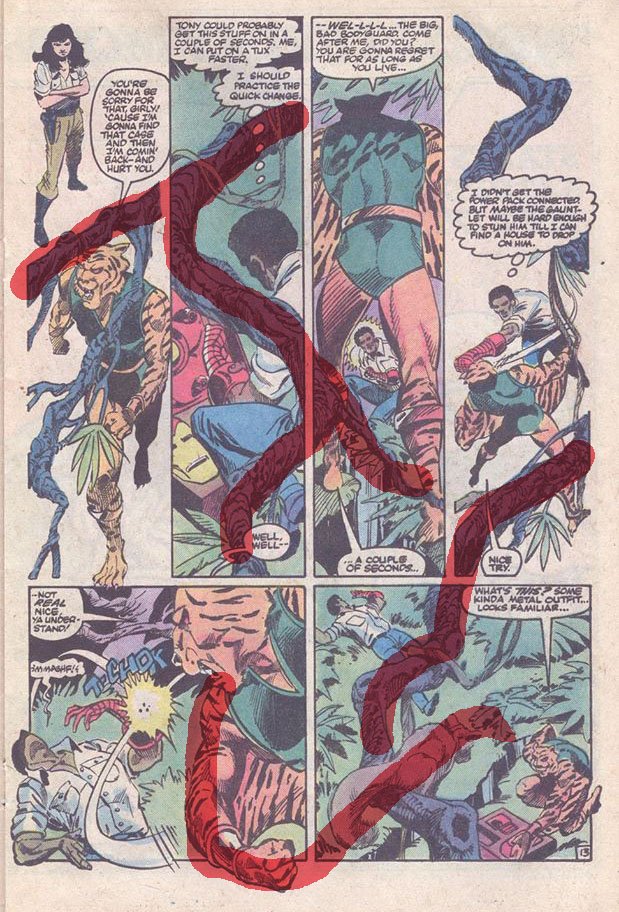
I use this technique from time to time, and I can tell you it's effective but not easy. Making a tree or a pole or power lines or whatever cross through and combine panels despite being from different camera angles but NOT becoming the central focus of the eye...that's tricky stuff. Not for McDonnell apparently.
SECOND - Frank Robbins. To this day I can't make up my mind if I love or loath his work. It was a strange mix of cartoonish and visceral.
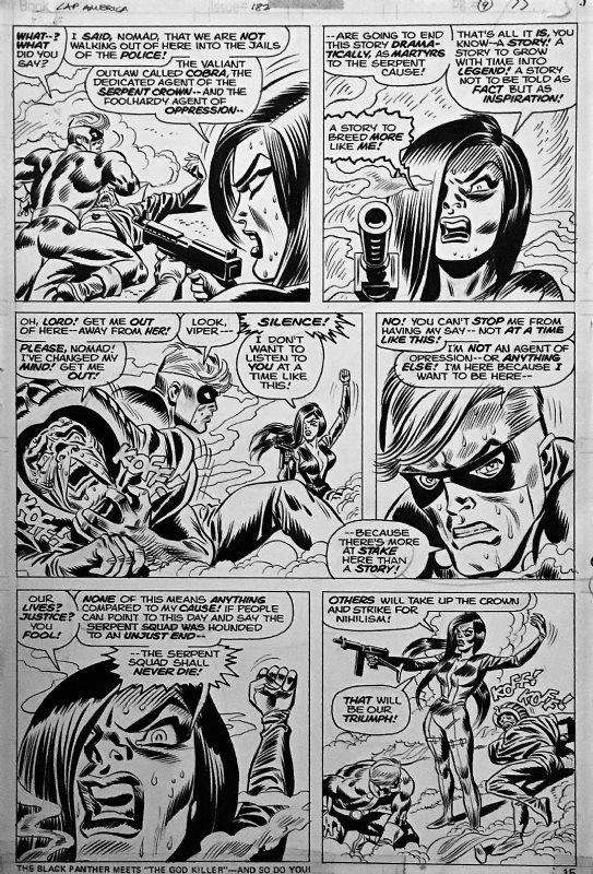
He did a lot of non-super hero stuff during his career and his work was better suited for that...sort of...the wild poses and postures of comic book violence did not suit it, but the stories of more ordinary action ( like say crime) did not show off his ability to have energy pouring off of the pages.
"Lethally middled" is the term I'm thinking of.
Of course everything is relative...were it not for Marvel comic fan favorites George Perez, Bob Hall and others being SO masterful at the time, Robbins might be as well known as any illustrator from this era.
and there you go...you don't have to post anything that in depth, I kinda go carried away. Probably could have just showed you the covers of those books and told you how I almost got in trouble for shoplifting them...I was stupid kid shrug
So...you have a favorite illustrator who doesn't get enough praise?
what comics do you remember most? what are you working on? what's a good convention to go to? Who your favorite character and why? what comics do you recommend?
Let's hear from ya!
The dream quest of unknown Kadath. I will try to make a review this week:) Best of luck with the community, i am sure it will take of:)Thats a really cool prize for a contest:) @nyarlathotep gave as a present and amazing graphic novel based on HP Lovecraft's book
oh cool! That'd be good to read about! That doesn't sound familiar, ( although my brain is tired...could be on my very bookshelf and I wouldn't remember at this point, haha) you happen to know who published it?
Its a selfmadehero publication and the illustrator is Culbard. Really good publication, nice paper, thick pages:)
ah cool!
Hello!
This post has been manually curated, resteemed
and gifted with some virtually delicious cake
from the @helpiecake curation team!
Keep up the great work!Much love to you from all of us at @helpie!
Manually curated by @georgeboya.
Community Witness.
@helpie is a
awesome! Thanks!
This post was shared in the Curation Collective Discord community
community witness. Please consider using one of your witness votes on us here for curators, and upvoted and resteemed by the @c-squared community account after manual review.@c-squared runs a
very cool, thank you!
Love this idea! Also, what an insanely awesome prize! I resteemed it.