Designing is so much fun as I enjoyed every bit of designing the Leofinance App store layout, though it took me hours to finish the design, I am happy I could help with my little knowledge of design.
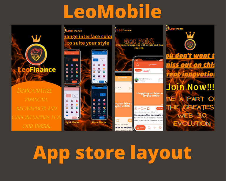
First of all designing this Leofinance app store layout I tried to think about what would entice me to download an app and I resulted to: the design of the app layout will entice me first and also the shorts word written with the design are what will entice me into downloading an app, so I tried as much as possible to put my effort into creating something that would entice the people in general.
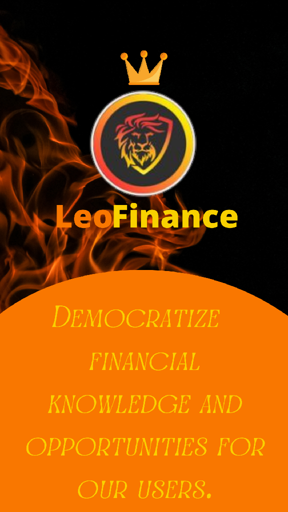
First is the intro of the vision of the Leofinance community and their mission, and I also tried to top it up with a crown image to show that it is actually the best web 3.0 platform.
As we can see that the main colours used in the design are black,orange and yellow as the main colours this made the design neat because too much colours can scare away a user😊.
After that I moved to the signing up page where they can sign up and have an account in less than 30 seconds, here I tried to make use of the example of the LeoMobile for Android phones.
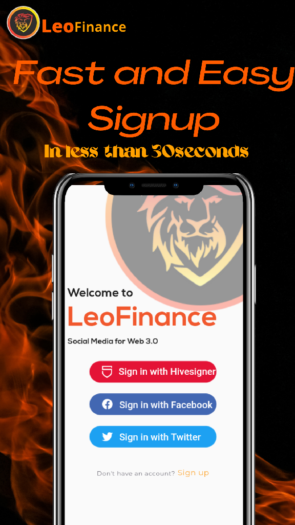
After the signing up and the user sees that he/she can register within 30seconds I am sure he/she will be convinced a little while the next texts and images are what will convince him/her finally to Download the app and give it a try.
This is where I Shaked things up to quickly catch the attention of the user so that he/she will be interested in reading the rest of the layout.
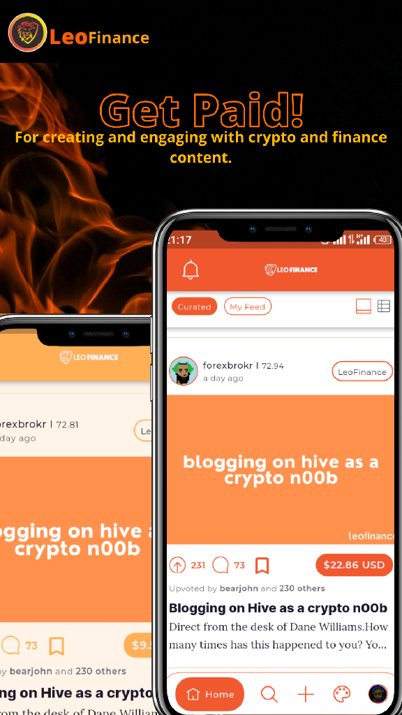
Many people tend to become interested in something when they find out that money is involved. So this layout explains that the user can get paid if he joins the platform.
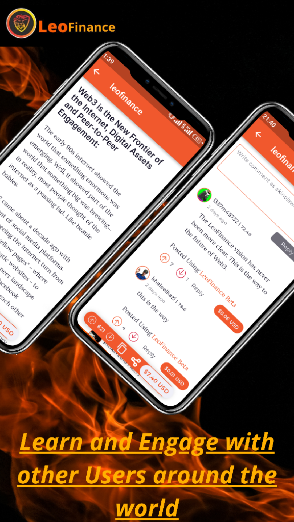
Here is where we talk about how the user can learn and interact with like-minded people around the world and know more about crypto and finance.
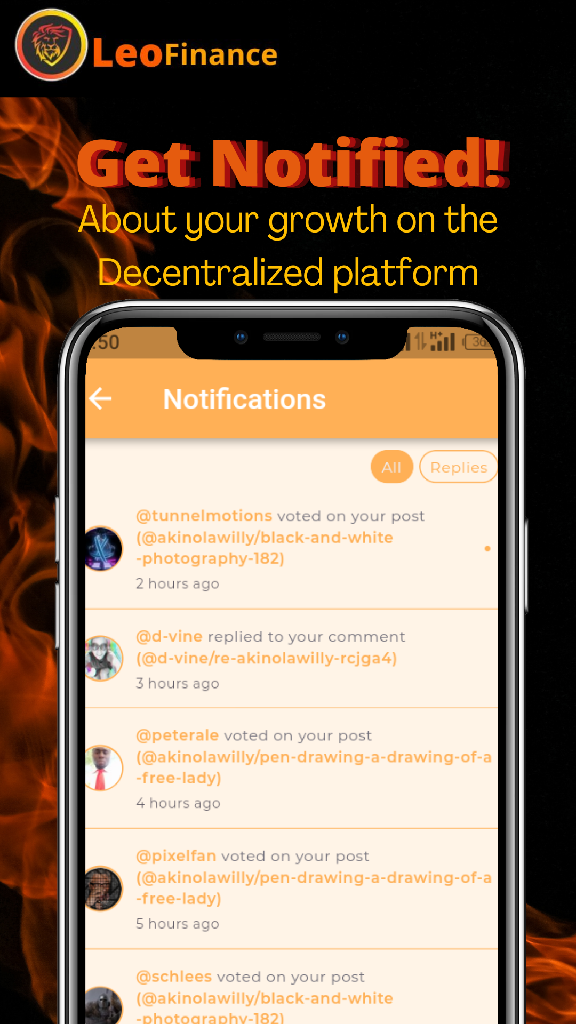
The user will know here that he/she can easily track his/her growth in the platform through the notification page.
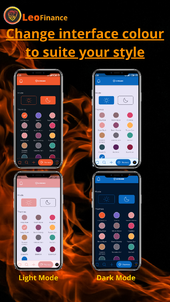
Many users nowadays especially me, I do like to put apps I use to dark mode and I am sure many users to like having dark mode in theme to suite their style so I tried to pass the message that the app is capable of changing theme which will suite his/her desired style.
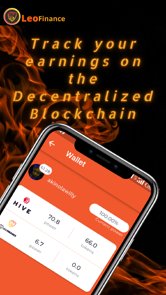
Here is where the user will ask questions about how he can know where his earnings are and how they stored, so I used my wallet in the Leo mobile for Android phone to tell the user that he can actually track his earnings and manage it according to his will.
Now this last part is where I tried to convince the user the most do that he can surely with no doubt download the app and make use of the Blockchain, where I explained why the user must join so as not to lose out at the end.

I hope you like the design layout 😊.used the Canva app
Thanks for viewing my post and do have a lovely day.
Posted using LeoFinance Mobile
Nice job bro. I love your use of color.
Thanks man, I really appreciate 🙏
Actully fire, the orange text on the post info though might be a little hard to see and focus on but besides that it's a solid build!
Posted Using LeoFinance Beta
Thanks alot 😊, I tried to darken the fire colour at the back but if you think it's hard to see,I think that's why we can edit😊
I can see leofinance on fire, that's a true definition of the progress right now.
Good job, well done.
Posted Using LeoFinance Beta
You really got the concept of what I was trying to depict and I also added the crown image to show that it's the best and the king in all the web 3.0 platforms out there😊.
Thanks for checking up on my post.
great work man
Thanks bro😊🌹🙏
You are welcome
Good luck to you on your layout proposal :) Quite a lot of awesome entries :)
Posted Using LeoFinance Beta
Thanks a lot @ifarmgirl , yes their are alot of awesome design layout and entries, it's wonderful as people responded to the contest well😊.
Yes :) Always fun to see how people in the community respond to things hehe
Posted Using LeoFinance Beta
This is really stylish :D congratulations for your great design.
Posted Using LeoFinance Beta
Thanks @fabian98, I am glad to have participated in helping the community 😊.
Fantastic work. Some good thought into the slogans. :)
Posted Using LeoFinance Beta
Thanks alot, I think the design should hold the mission and vision of the Leofinance community, so that they can be aware of it.
Good luck with the competition!
Thanks 😊👍
Very lovely @akinolawilly
Thanks ma'am 😊🌹
Good job this is lovely, keep the good work going bro I see you on top
Posted Using LeoFinance Beta
Thanks bro, I am happy you like the design😊.