Nice post 👍
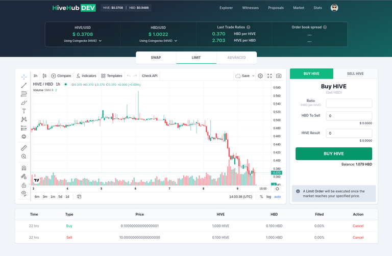
Small preview of the next page that we plan to release. Still work in progress but maybe you have feedback or suggestions:

Nice post 👍
Small preview of the next page that we plan to release. Still work in progress but maybe you have feedback or suggestions:

Wow, amazing! Finally we have an internal exchange that looks like one!
Thank you 👏
The next page looks awesome.
The only recommendation I could think of off the top of my head is for there to be a dark mode option. As soon as I thought of that, I explored the page more and realized the feature already exists under options/settings.
Night mode is not perfect yet, but at least usable on most pages 😄
At least it is already there, so much easier on my eyes after dark.